Our Strategy
The Thinker Approach
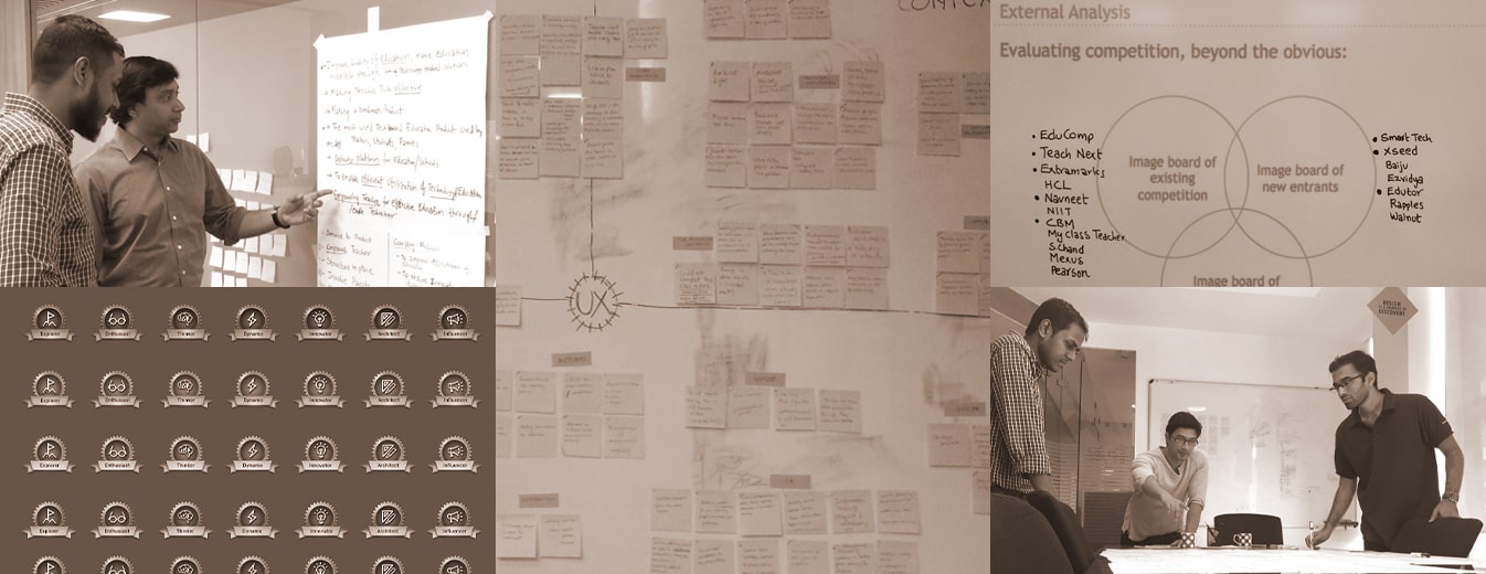
We were inclined towards conducting extensive UX research for education to completely understand the need for redefining the product. When the Tata Group affirmed our strategy, using our proprietary golden grid, we identified the ideal research methods.
Audit, Usage Analysis, and In-Depth Interviews were used to understand the existing product. Shadowing and Contextual Inquiry in classrooms was conducted to understand the challenges, pain points, and perspectives of the actual users.
Our key inferences shaped our approach to the education app UX design of Tata ClassEdge.
Insights We Drew/ Insights Inferred
The research led us to understand the shortcomings of the current platform with respect to the requirements teachers had. We revamped the system to suit the Indian education system and teachers better.
Key Strategic Interventions
Quick Activity Descriptions
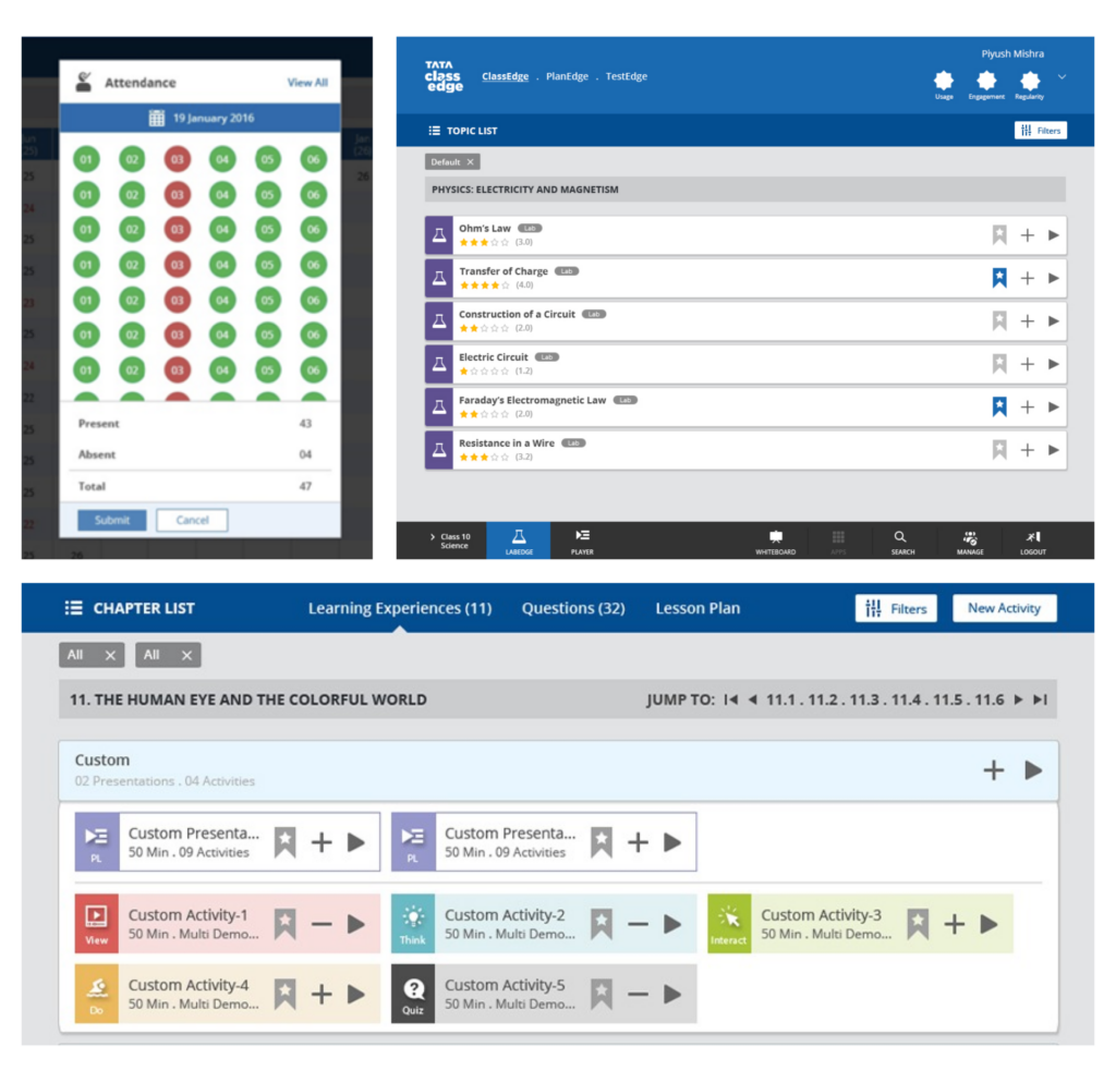
Descriptions that facilitate a quick glance at the data without having to interact with the dropdowns.
Accessibility to Content
Framework Templatization
Default presentations as per the MLEX framework, designed for lessons and topics for every level.
Improved Navigation
Efficient bottom-up navigation implemented across the platform for users to stay on relevant content while having the option to view history.
Unified Design System
Unified design implemented throughout for a consistent and seamless cross-module interactive experience.
KEY FEATURES
01
Whiteboard
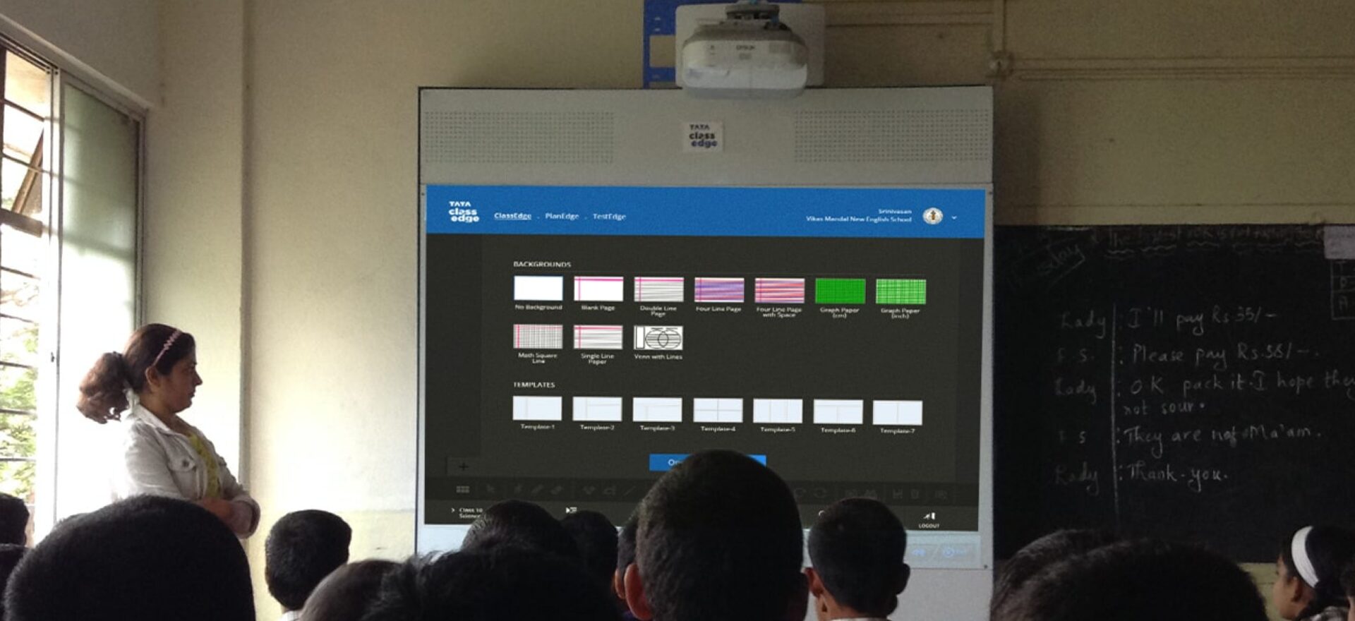
The feature-rich whiteboard was designed to eliminate the need for additional input devices such as mice and keyboards, making it easier for teachers to teach using only a pen. Troubleshooting for any errors was made significantly simpler.
The menu and controls were embedded into a simplified and efficient layout, strategized to ensure no teacher has trouble working on the platform at any given time.
02
Player
Player was integrated into the platform to enable teachers to play video lectures and simultaneously create custom playlists, allowing efficient learning experiences.
Issues related to screen-to-text contrast and sound were also handled while building the education app UX design.
03
Customized Lesson Plan and Sharing
With the use of a custom lesson plan builder UX, teachers can now create their own plans, refer to the same through an accessible tab on the whiteboard, and share it with others involved, such as teachers, coordinators, and the school organization.
04
Reports
Originally done offline, generating reports was a tedious task prone to human error. Reports was a new section integrated into the platform that allows real-time reporting of the teachers’ use of the tool and performance that could be accessed by both, the teacher and the organization.
This helped in improved the education app use, bill generation, and much more.
05
MLEX Instructional Framework
This model was developed on-premises to allow students to perceive information through multiple senses using a variety of planned and structured activities. This was designed to inculcate enhanced learning methods into their learning experience.
This multi-sensory learning experience is supported by a flexible platform that involves worksheets, debates, simulations, games, quizzes, and more.
06
App Integrations
The Player was integrated with additional applications to maximize the output of the platform. Calendars, notes, task manager, and more are now easily accessible to the user.
DESIGN ACTIVITIES
Primary &
Secondary Research
Consulting
Stakeholder
workshop
Product definition
UI UX Design
Prototyping
Dev. Coordination
Product Impact & Outcomes
The new version of Tata ClassEdge was launched in its market before the academic year 2017.
The new design revived the position of Tata ClassEdge and re-established it as a leader in the domain.
