Our approach to Data Design
At the cusp of qualitative and quantitative
We intend to bridge the gap between what the decision makers want and analysts think they must want, By understanding the needs of the users and co-relating stories that need to be told, we help make the data interactive, insightful and actionable.
Understanding hierarchy
There is a hierarchy implicit in the usage of data visualization. For example, discovering KPIs (Key Performance Indicators) precedes the nuts and bolts that make them (drill downs). Understanding the domain and business needs from the POV of data users go a long way in making hierarchical configurations that are meaningful to users.
Interactivity
Dashboards, Reports, Data Products, Portals et al... there is always an intent of user interaction in them. While we focus on appropriateness of information and metrics to serve the right insights, we also emphasize on how users interact with each element to derive insights on their own. User research comes in handy to understand the analytical and interaction needs of the users.
Using appropriate visual charting
While there are a host of data charts available, understanding which ones to choose in which context relies on having a theoretical understanding of the method and the experience of actually applying them. The framework allows us to choose the appropriate chart type, based on the information one has and the insight one needs to gain through the chart.
At Think Design, we took the initiative to create a simple yet very powerful framework that design practitioners in our organization and outside can immediately use. It aids in making design choices that will allow users to quickly understand the insights you’re trying to convey through the right visual data discovery.
Think Design’s Data Visualization Framework
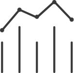
Discover DISTRIBUTION
Understand how your data is spread across regions/median and determine inconsistencies.
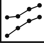
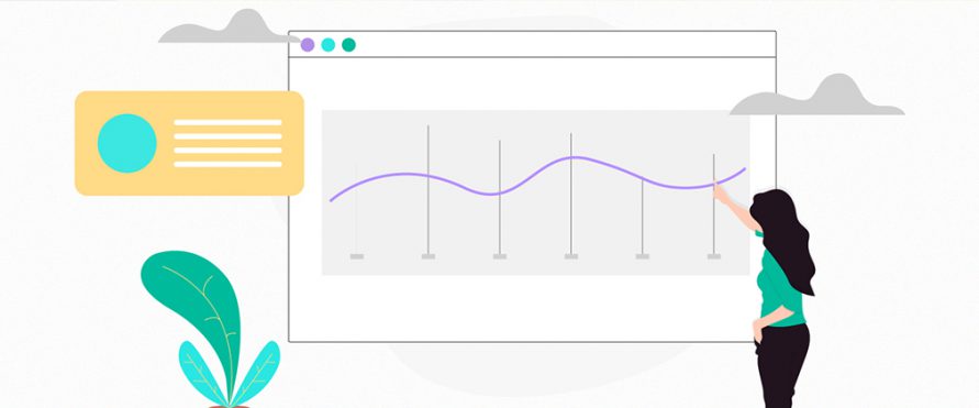
Discover CHANGE
Understand how your data changes with changes in other factors and predict trends.
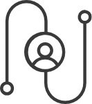
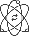
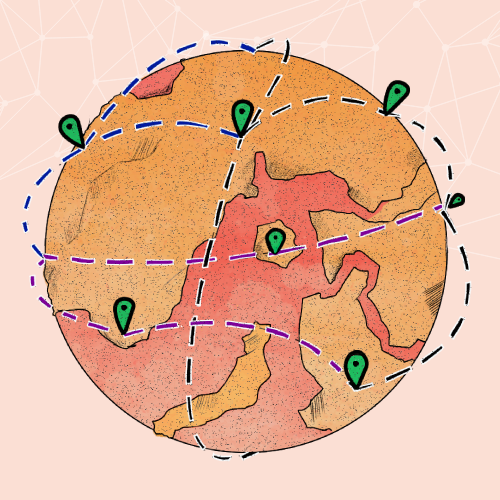
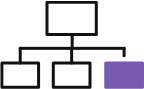
Discover INTERCONNECTION
Understand what your data is interconnected to and discover the way it flows.
Discover RANK
Understand how your data points are comparable and the way they can be ordered.
Discover PROPORTION
Understand what your data is made up of and see the parts of the whole.
How to use the framework
For any business use case, it is of value to pick at least one data chart from each of the different 5 nodes available. To analyze and gather insights comprehensively, discover change, composition, distribution, rank, and interconnections in data.
For example, looking at Climate Change data, one can gather various insights. Some of the questions we can ask and find answers for, through a chart from each category are:
CHANGE
How has climate changed over a period of 10 years?
PROPORTION
What is the percentage contribution of different factors which has led to climate change?
RANKING
What is the comparison of carbon emissions from developed countries. Who is the top contributor and who is the least?
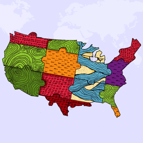
DISTRIBUTION
What is the distribution of temperature rise across the globe?
INTERCONNECTION
What are the interconnections between risks associated with climate change (economic, societal, technological, environmental, geopolitical)?


