History of Stacked Bar Chart
Stacked bar charts evolved from early bar charts popularised by William Playfair. Over time, they expanded into more complex forms such as grouped and stacked bar chart variations to handle multi-dimensional comparisons.
When to Use a Stacked Bar Chart?
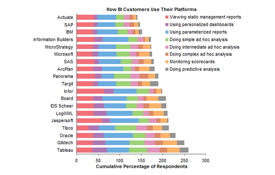
Compare category totals and subcategory contribution
Use stacked bar graphs when you need to understand how parts contribute to a whole across multiple categories.
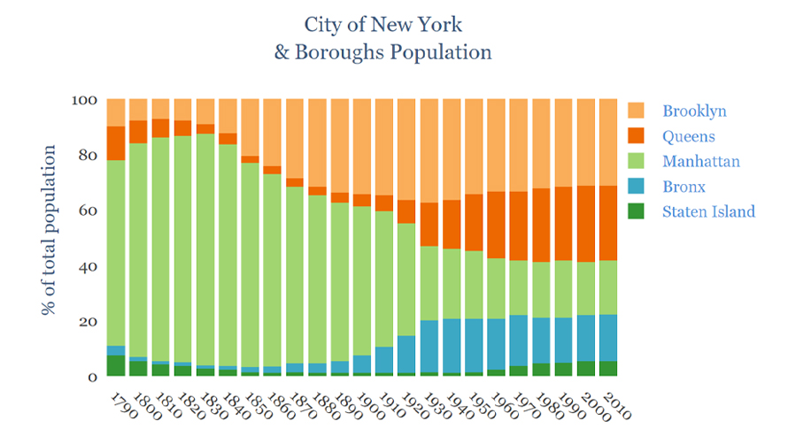
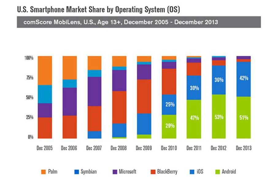
Compare relative proportions across categories
100% stacked charts help analyse proportional differences between groups, making them ideal for part-to-whole comparisons.
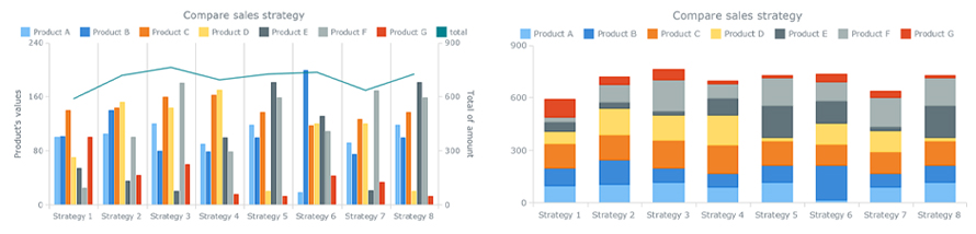
Simplify dense grouped comparisons
When grouped charts become cluttered, stacked bars offer a cleaner way to compare totals and internal distributions simultaneously.
Types of Stacked Bar Charts
1. Simple Stacked Bar Graphs
Shows absolute values, where each segment contributes to the total bar height.
2. 100% Stacked Bar Graphs
Normalizes values to percentages, making it easier to compare relative proportions across categories.
When Not to Use a Stacked Bar Chart?
Too many segments
Too many segments reduce readability and make comparisons difficult.
Precise comparisons between subcategories
Since segments don’t share a common baseline, comparing them accurately is harder—consider alternatives or refer to clearer stacked bar graph examples for guidance.