History of Cartogram
In 2025, cartogram maps continue to evolve as powerful tools for visualizing complex spatial data. Modern cartograms not only distort shapes to emphasize data patterns but also incorporate advanced techniques such as color-coding and interactive features, enabling users to explore data dynamically. These maps are widely used in fields like politics, economics, environmental studies, and public health. They reveal insights that traditional maps often miss by showing data in proportion to its importance rather than land size. Advances in digital mapping now allow cartogram maps to integrate with interactive platforms and applications. This improves user engagement and enables real-time data visualization.
The term “cartogram” was first introduced by the French engineer Charles Minard in the mid-1800s. Minard was a pioneer of statistical graphs and charts in the mid-1800s. Although maps that distort geography to show data existed before, one of the earliest uses of a cartogram in an English-language publication appeared in The Washington Post in 1929. There, Joseph R. Grundy used a cartogram to highlight how state voting powers were unfair because states had very different populations.
In the 1960s, Waldo Tobler from UC Santa Barbara took cartograms a step further by creating them with the help of computers, opening new possibilities for visualizing data. Even today, cartogram maps can be made by hand or with computer assistance, but modern software has made it much easier to generate these maps quickly and accurately. Cartograms remain a powerful way to visualize data by reshaping maps according to variables like population or economic factors, helping people see patterns that traditional maps might hide.
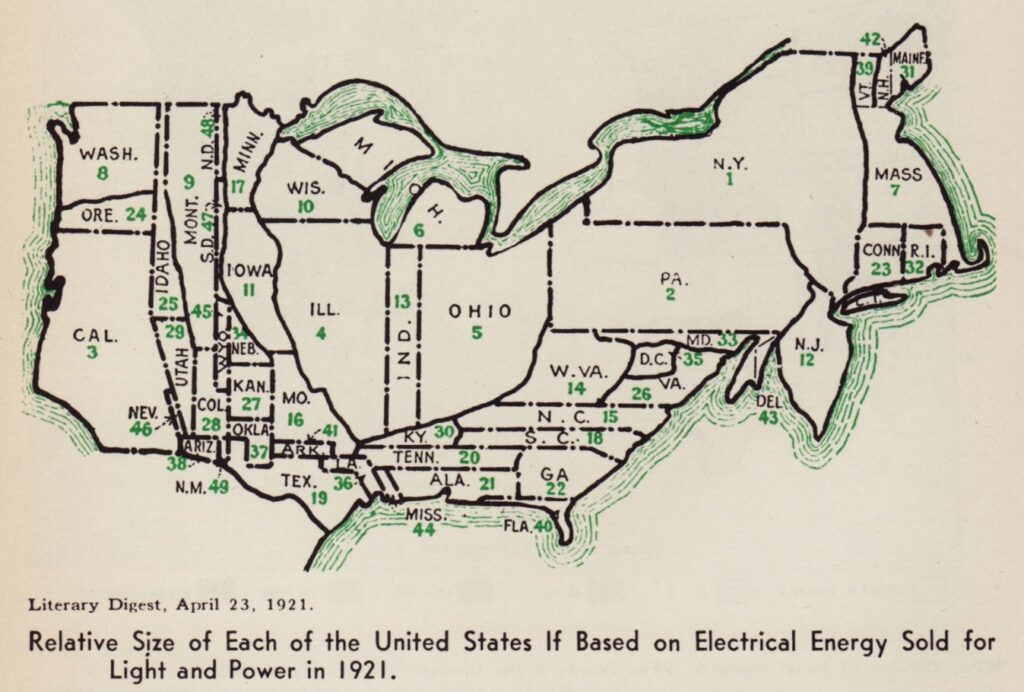
1921 cartogram of USA based on electrical energy sold for light and power
When to Use Cartogram Maps
1
Represent Population with Area Cartograms
Use cartograms to represent areas scaled by the value of a related variable, making them ideal as isodemographic maps. Population cartograms, for example, resize countries proportionally to their population while preserving their shape and relative location as much as possible. Typically, cartograms display a single variable, but additional data can be incorporated through color, textures, or glyphs.
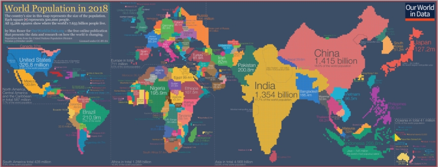
Cartogram showing the distribution of the global population. Each of the 15,266 pixels represents the home country of 500,000 people – cartogram by Max Roser for Our World in Data
Source
2
When Shape and Topology Preservation Are Less Critical
Cartogram maps are useful when accurately preserving shape and topology is less important than showing data values for comparison. For instance, Dorling cartograms replace regions with circles sized by the data, arranged to roughly maintain original topology. Demers cartograms use rectangles instead of circles and try to keep visual cues while allowing some distortion. Schematic maps based on quadtrees also serve as non-shape-preserving cartograms when some neighborhood relationships need to be retained.
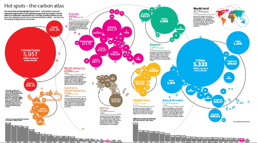
Carbon atlas of the world using a Dorling Cartogram
Source
3
Visualizing Distances and Proximities
Distance cartograms distort maps to reflect travel times or proximities from a chosen origin point. This allows quick assessment of relative travel costs, as distances are adjusted according to travel time rather than physical space, making it easier to compare accessibility to various locations.
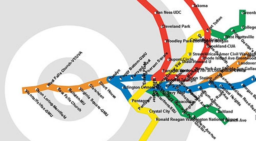
A distance cartogram distorting distances to show actual travel times
Source
Types of Cartograms
1. Contiguous Cartograms
Distort geographic regions proportionally to data values, enlarging areas with higher values while maintaining region connections.
2. Non-Contiguous Cartograms
3. Dorling Cartograms
Replace regions with circles sized by data, arranged to approximate the original map layout.
4. Demers Cartograms
5. Mosaic Cartograms
6. Cartogram Hex Maps
Use hexagons instead of squares, created with tools like Tilegrams.
7. Distance Cartograms
Distort maps based on travel times from a specific location rather than geographic distance.
When Not to Use a Cartogram
1
When Statistical, Geographic, and Topological Accuracy Are Crucial
Avoid cartograms if you need precise geographic or statistical accuracy. Cartograms distort real-world geography, which can lead to incomplete or misleading representations when accurate scale and topology matter.
2
When Simple, Unbiased Interpretation Is Required
Cartograms rely on symbols and distortions that require interpretation and may introduce bias. Since maps are designed by different creators with varying focuses, not all information may be represented, which can complicate straightforward understanding.