Our Strategy
The Thinker Approach
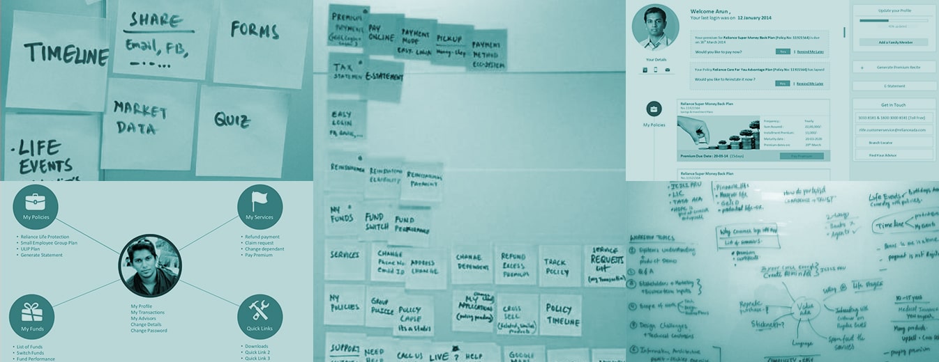
Starting with a thorough inspection of the existing platform and project requirements, we ideated for an appropriate design approach. With a moderator-led visioning team including participants from the client’s team, we defined the vision and strategy for the life insurance self-service portal’s UX.
We also mapped user profiles covering all cases—frequent, infrequent, general, and other users— to identify user goals, needs, and concerns.
Insights We Drew/ Insights Inferred
Reliance Life Insurance, one of India’s largest private life insurers, caters to over 10 million policyholders and hosts an array of features and functions for its users. For the enterprise insurance portal design, management of these features and policies while providing a seamless experience was a critical requirement as we overhauled its portal.
Additionally, the digital journey across the website had to be comprehensive and simple for RNLI to become a chosen financial solutions provider across the market.
Key Strategic Interventions
Improved Information Architecture
Better information distribution across the portal for simplification of process workflows.
Mobile-First Approach
We ensured a mobile-first insurance application design, enabling access to the portal from any device, at any time.
KEY FEATURES
01
Improved Navigation and Structure
- The design and business teams were aligned on not making the structure too adventurous, given the nature of the products and services.
- We chose top navigation for ease of use and clarity of context to the user. The right column provided suggestions and quick access to tools across the site.
- A value-add feature in the life insurance self-service portal UX, Timeline View, was introduced to enhance the overall browsing experience.
02
Cohesive Visual Language
The visual language was made consistent and polished, while retaining the brand identity, to highlight and focus the services on the insurance management platform.
03
Customer Dashboard
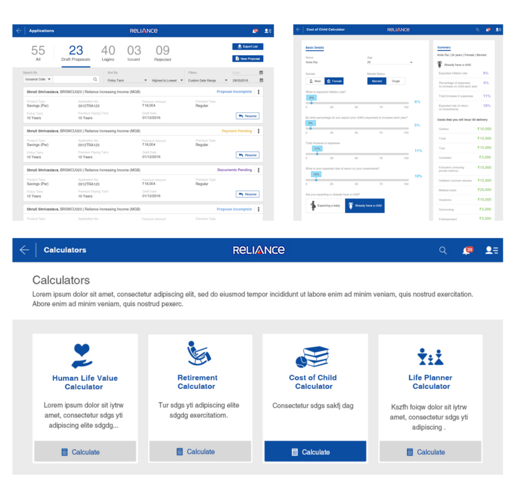
The Dashboard displayed an overview of their activities, informing them of previous actions, flagging timely alerts, and providing a quick guide for help. This made navigation simple and seamless while boasting of transparency and visibility of every workflow.
04
My Funds
The fund tracking interface design, became a key placeholder to view, track, and manage funds with a consistent design language that ensured the right column placeholder for suggestions.
DESIGN ACTIVITIES
Consulting
Stakeholder
Workshop
Wireframing
UI & Visual Design
Front End
Development
Dev. Coordination
Product Impact & Outcomes
Reliance Life Insurance’s revamped self-service portal was launched in early 2016.
