Our Strategy
The Thinker Approach
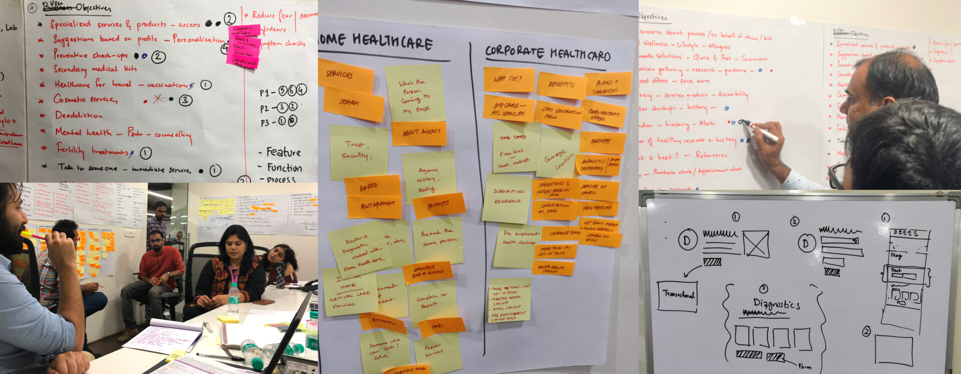
Think Design team evaluated the project requirements and adapted the User-Centred Design (UCD) approach as per context. Think Design formed a visioning team with its moderator and participants from the client's team to work together in defining the UX vision and strategy.
The leading market players for both platform-wise and service-wise offerings were analysed, with competitors compared based on navigation, typography, iconography, graphics, colour scheme, mobility (website) and onboarding options. Post competitive analysis, our team created a list of KPIs and parameters, identifying key takeaways that would inform strategic design directions.
Insights We Drew/ Insights Inferred
Customer segmentation and persona creation were undertaken to identify key user concerns, pain points and their goals through obtaining inputs from stakeholders. Key user flows were identified through persona and scenario mapping, designing the User Experience through User-Centric Design Process.
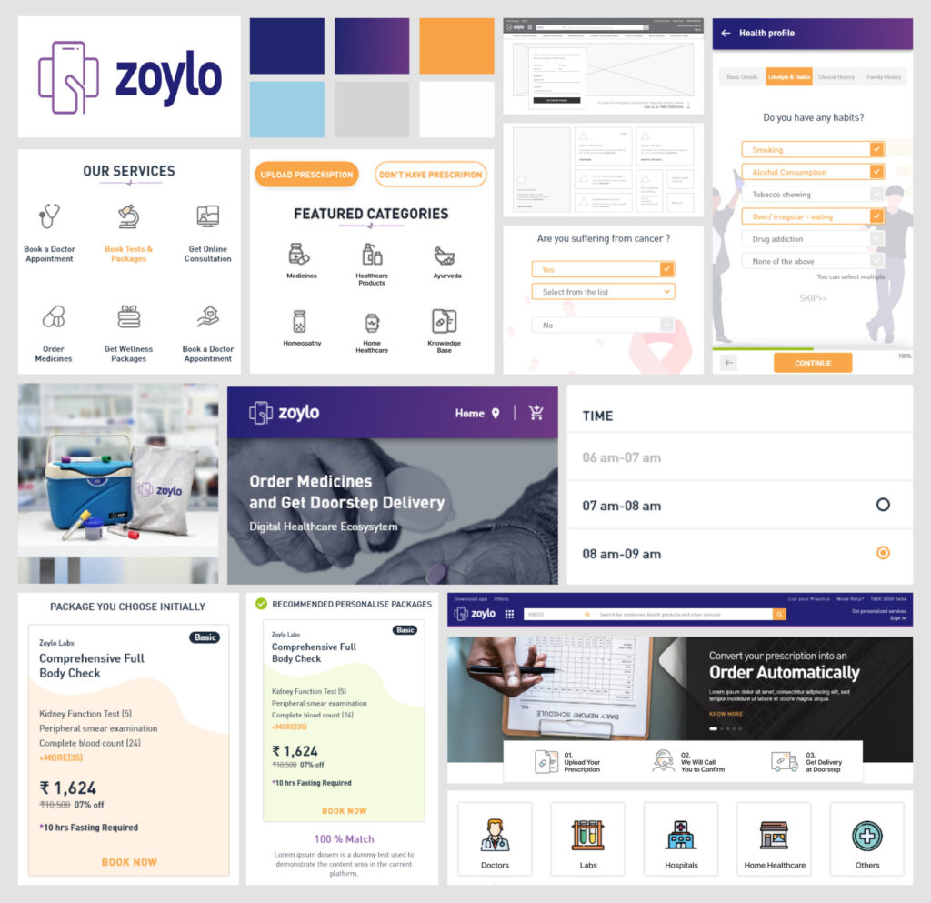
Benchmarks were set for the digital healthcare service design for the platform to be transactional, service-oriented with an ease of use, with incremental improvements suggested based on insights gathered. Design directions for UX indicated the need for a platform to be personalized, service-focused keeping Brand Zoylo, device-agnostic, mobile-first and humanistic in its essence. Brand guidelines were decided, indicating the color palette and typography, with key modules and priorities defining the direction for communication and tech stack.

Key Strategic Interventions
Unified Healthcare Ecosystem
We designed a single platform that caters to different medical and healthcare-related needs across locations throughout India, consolidating fragmented touchpoints into one cohesive experience.
Persona-Led User Journeys
Key user flows were identified through comprehensive persona and scenario mapping, ensuring the platform addresses specific user concerns, pain points and goals through User-Centric Design Process.
Transactional and Service-Oriented Benchmarks
Strategic roadmap established benchmarks for the platform to be both transactional and service-oriented with ease of use, implementing incremental improvements based on gathered insights.
Device-Agnostic, Mobile-First Design
Platform designed to be personalized, service-focused, device-agnostic and mobile-first while maintaining Brand Zoylo identity and establishing humanistic connections with users.
KEY FEATURES
01
Better Integration of All Services
Stakeholders can now understand the complete flow through comprehensive efforts in listing and defining all user journeys, content cataloguing, research and content gathered and tagged by geo, disease and doctor.
02
Generates Actionable Insights
Through analytics, extracted data can target audiences as per attributes, encourage second opinions across doctors and diagnosis, and generate qualified leads to service providers.
03
Allows for Personalization
Suggestions based on profile, demographics, medical history, browsing history and searching history allow users to access personalized healthcare as per health profile—services and products.
04
Engages Users Throughout
The platform enables quick onboarding, is simple to use and learn, provides analytics and reports, enables quick transactions, and facilitates user feedback, creating a comprehensive ecosystem for accessible healthcare.

DESIGN ACTIVITIES
UX and Strategy
Workshop
Competition
Analysis
Wireframes
Visual System
Front-end
Development
Prototyping
Product Impact & Outcomes
The new avatar of Zoylo was launched to the market in January 2019, successfully creating a unified digital healthcare ecosystem that addresses the fragmented touchpoints and makes quality healthcare accessible to users across India.


