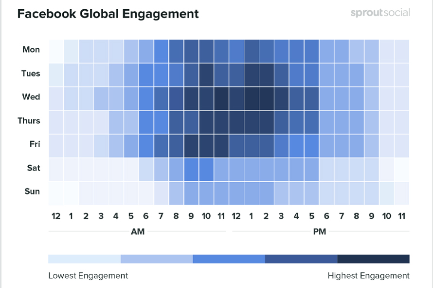
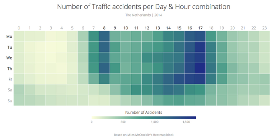
Heat Maps are most commonly used to display a more generalized view of numeric values as a graphical representation of data where the individual values contained in a matrix are represented as colors. It is commonly used as an isopleth representing regions of similar value using color splotches. Heatmaps use color the way a bar graph uses height and width: as a data visualization tool.
[chartdesc]
History of Heatmap
Heat maps originated in 2D displays of the values in a data matrix and were earlier known as shading matrixes where larger values were represented by small dark gray or black squares (pixels) and smaller values by lighter squares. Loua (1873), Sneath (1957), Robert Ling in 1973 created and improvised on heatmaps in different contexts while Leland Wilkinson developed the first computer program in 1994 (SYSTAT) to produce cluster heat maps with high-resolution color graphics. It was software designer Cormac Kinney who trademarked the term ‘heat map’ in 1991 to describe a 2D display depicting financial market information.
[chartimg]
When to Use a Heatmap?
1When you need a direct overview of key web performance
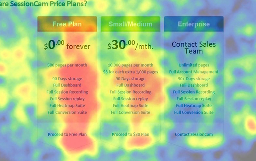
Use website heatmaps to visualize the most popular (hot) and unpopular (cold) elements of a webpage using colors on a scale from red to blue. With heatmaps, you can immediately spot what your users are scrolling through, clicking on or ignoring. Heat maps can give an at-a-glance understanding of how people interact with an individual website page by aggregating user behavior, which helps identify trends and optimize for further engagement using scroll maps, click maps, move maps, geo heatmaps etc.

2When you need to optimize performance by overviewing trends over time
Use heatmaps to compute performance to enable decisions that drive better business results making knowledgable choices that improve the bottom line. As heatmaps can conceptualize interpret data and patterns, it is easier for designers and analytics specialists to talk with commercially-focused clients by showing them clear and easy results. One can garner insights by getting an overview of different performance parameters captured across time as well.

3When required to visualize complex data
Use a heatmap to easily analyze and make decisions of complex information through the color-coding. The use of color-coding is user-defined to make the heatmap tool easy to understand, even if you are not that familiar with analytics. Through Heat Maps get a more generalized view of numeric values, when dealing with large volumes of data, as colors are easier to distinguish and make sense of than raw numbers. Can be used to represent population density, per-capita income, average temperatures, molecular biology data and so on.

Types of Heatmaps
1. Click heatmap
Visualization of the most clicked or tapped elements on a webpage. Helps to easily determine the element or type of content that interests your users the most.
2. Desktop & mobile heatmaps
Allows comparison of the performance of digital content on different devices.
3. Scroll map
Visual Representation of how far users scroll down on the different pages of a website, which can help determine the right length for content.
4. Hover heatmap
Showcase where the visitors hover their cursors on the screen. This gives a glimpse of which elements attract visitors the most.
When Not to Use a Heatmap?
1When you need to shows a change across discrete geographic landscapes
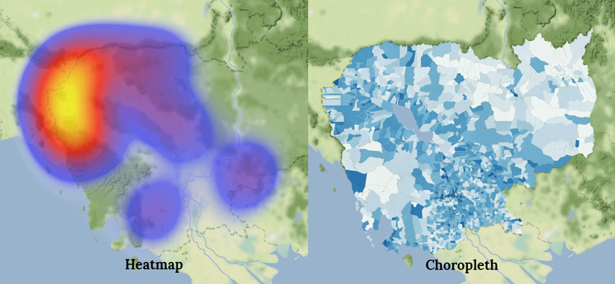
When you need to showcase different shading or patterns within geographic boundaries to show the proportion of a variable of interest(within enumeration units such as countries, states, or watersheds) use a Choropleth map instead of heatmaps. A heat map (in a map context) does not correspond to geographic boundaries but conforms geography to an arbitrary, but usually small, grid size.

2When you need to analyze dynamic web applications and need absolute statistics
If you are working with JavaScript-heavy single-page applications, one should avoid using heatmaps as heatmaps don’t work well with dynamic applications where the page changes. And also if you need exact number statistic (eg. quantitative data from your page views, the average time on the page) to track performance heatmaps would not be a way to go, as they give a broader overview.
3When you need to represent hierarchies and part to whole relationships
Do not use heatmaps when you need to represent social connections or hierarchies. Treemaps can be ideal in such scenarios which represent hierarchal data in the form of nested rectangles. Nested rectangles mean that hierarchy levels in the data are expressed by larger rectangles (above in the hierarchy) containing smaller ones (below in the hierarchy).