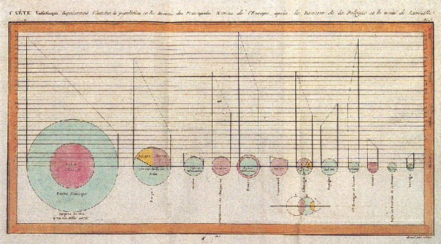
History of Pie Chart
William Playfair first wielded pie charts in his 1801 Statistical Breviary, mapping the Turkish Empire’s land across Asia, Europe, and Africa. French engineer Charles Joseph Minard advanced them in 1858, tracing cattle flows to Paris. Florence Nightingale then popularized the form through her famous polar area diagrams showing mortality causes—proving pie charts’ persuasive design power.
When to Use a Pie Chart?
Comparing categories in small datasets
Pie charts thrive with limited categories, offering visual simplicity over complex series graphs. They let readers grasp proportional distributions instantly, comparing any single slice against the whole with effortless clarity.
Understanding part-to-whole relationships
When one category nears 25-50% of the total, pies outperform bars for holistic single-chart views. Start the largest slice at 12 o’clock and flow clockwise—always summing to 100% for intuitive wholeness.
Layering additional parameters circularly
Doughnut and polar variants unlock richer narratives—central text, multiple
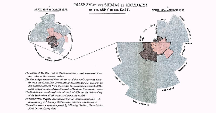
Polar chart by Florence Nightingale, 1858, If the death count in each month is subdivided by cause of death, it is possible to make multiple comparisons on one diagram
Types of Pie Charts
1. 3D/Perspective Pie Chart
Adds visual depth for aesthetics, though it muddies accurate perception.
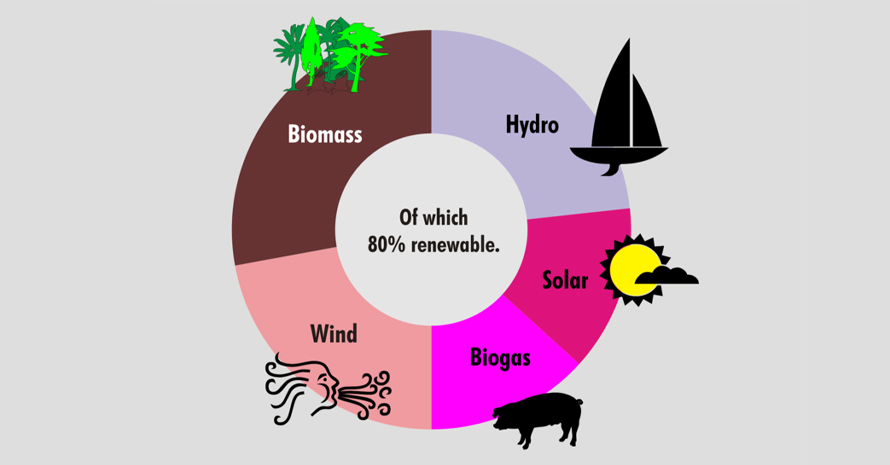
2. Doughnut Chart
Opens the center for total/summary information.
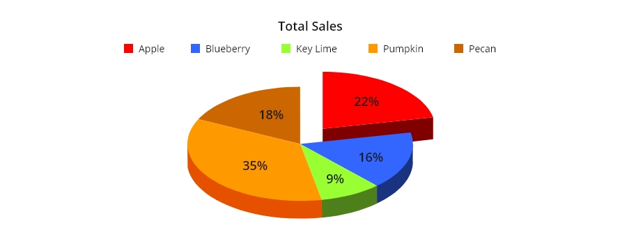
3. Exploded Pie Chart
Separates key or tiny slices outward to draw the eye.
4. Polar Area Diagram
Fixed angles with variable radii—perfect for cyclic patterns like monthly data.
5. Ring/Sunburst/Multilevel Pie Chart
Concentric circles reveal hierarchies through angular inheritance.
6. Spie Chart
Layers standard pie atop polar areas for dual-dataset comparison.
7. Square/Waffle Chart
Trades circles for grid squares, maintaining percentage logic.
When Not to Use Pie Charts?
Too many slices overwhelm
Crowded pies with data labels become incomprehensible, group into “others” or pivot to bars.
Needing precise comparisons
Humans struggle judging angles across non-adjacent slices. Bar lengths enable instant, accurate measurement that pies obscure.