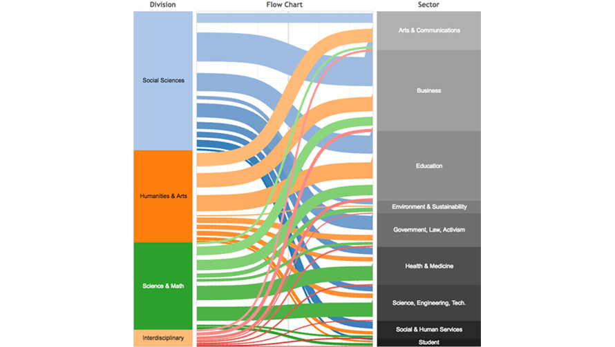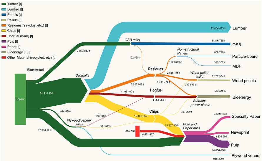
Sankey diagrams are a type of flow diagram which is used to represent energy inputs, useful output, material flows, cost breakdowns and wasted output, etc. The entities being connected are called nodes and the connections are called links in which the width of the arrows/links is proportional to the flow rate and are used to show their magnitudes. Sankey charts are popularly used in fields of science, especially physics.
[chartdesc]
History of Sankey
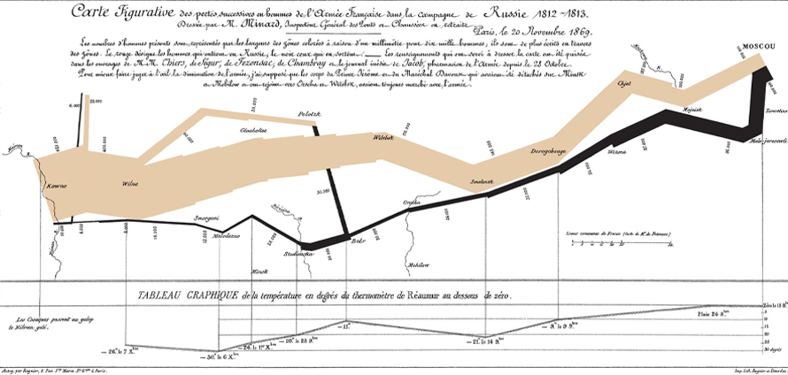
Sankey charts are named after Captain Irish Captain Matthew Henry Phineas Riall Sankey, who created a first created a diagram in 1898 representing steam engine efficiency using arrows having widths proportional to heat loss. The original charts in black and white displayed just one type of flow (e.g. steam); while using colors for different types of flows lets the diagram express additional variables. Another famous Sankey diagrams is a flow map overlaying a Sankey diagram onto a geographical map known as the Charles Minard’s Map representing Napoleon’s Russian Campaign of 1812.
[chartimg]
When to Use a Sankey?
1When you need to show a many-to-many mapping between two entities
Use Sankey diagrams when you need to represent a process, where flow arrows or lines can combine together or split through their paths on each stage of a process. Sankey diagrams can show complex processes visually, with a focus on a single aspect or resource required to be highlighted. Use color additionally to be used to divide the diagram into different categories or to show the transition from one state of the process to another, so the bigger the arrow, the larger the quantity of flow.
2Understand the flow from source to end with multi-level viewing
Use Sankey when you need to understand the breakdown of a total amount, as the diagram shows where it comes from and where it ends up, with possible intermediate steps. Also, Sankeys offer the added benefit of supporting multiple viewing levels where viewers can get a high-level view, see specific details, or generate interactive views. One can drill down with the diagram and can also predetermine the level of depth that works best for your purpose.
3Locate dominant contributions to an overall flow
As Sankey put a visual emphasis on the major transfers or flows within a system, use the width of each flow to determine the magnitude of its contribution to the overall much effectively. As Sankey’s can help see at a glance of not just what is connected to what, but by how much, one can easily focus on where there is greater or lesser flow of anything helping in determining process inconsistencies and optimizing process flows.
Types of Sankey
1. Alluvial diagram
These are a subcategory of Sankey diagrams where nodes are grouped in vertical nodes, also known as steps sometimes. In many cases, these steps represent different timestamp.
When Not to Use a Sankey?
1When datasets are larger making them overly complex and hard to comprehend
When dealing with multiple connections and large datasets over-cluttering in a Sankey diagram can make the figure unreadable. In such a case, Sankey diagrams hide instead of highlight the actionable insight and it is then suitable to dismiss weaker connections. Complex Sankey diagrams may require an explanation that takes more time and energy than they are worth
2When similar valued flows need to be compared
The position of nodes is very important, and hence algorithms exist to minimize the number of crossing between links. Sankey diagrams can make it difficult to differentiate and compare flows with similar values (widths). If these comparisons are essential for your purpose, consider a stacked bar graph instead.