History of Scatterplot
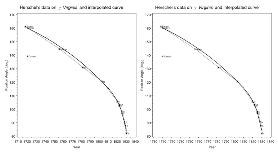
Statistician Edward Tufte notes scatterplots comprise over 70% of scientific publication charts. The first appeared in 1833 by John Frederick W. Herschel, plotting double star positional angles against measurement year to uncover orbital relationships, not mere trends.
When to Use a Scatterplot?
To discover trends in data distribution
Scatterplots visualize data spread and trends; tight clustering indicates strong relationships, enhanced by regression lines. Use color/shape/size for a third variable.
For inferential statistics and trend prediction
Validate hypotheses with regression lines (linear, quadratic, etc.) to quantify fit. Enables interpolation (within data) and extrapolation (beyond data) for predictions.
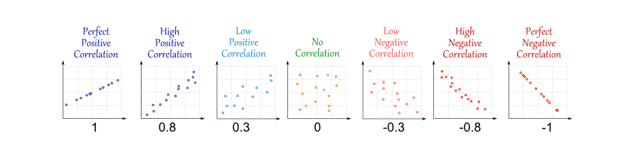
To measure correlation strength
Calculate correlation coefficients: positive (both increase), negative (one increases as other decreases), high (tight fit to line/curve). Closer clustering to best-fit line signals stronger relationships.
Types of Scatterplots
1. Bubble Chart
Adds a third dimension via bubble size/area for multivariate analysis.
2. Rug Plot
One-dimensional marks along an axis to show univariate distribution—like a histogram with zero-width bins.
3. Line Chart
Connects markers with lines for sequential trends (distinguishes from disconnected scatterplots).
When Not to Use a Scatterplot?
With non-numeric or categorical data
Use bar graphs for categories (e.g., departments vs. revenue) or line charts for ordinal data (e.g., scores); scatterplots require paired continuous interval variables.
To show rate of change between points
Line graphs better convey slopes between sequential points; scatterplots emphasize overall trends without direct connections.