History of Spider Graph
The star plot, a precursor to the spider graph, was first used by Georg von Mayr in 1877. Unlike glyph plots, radar charts use multiple variables together to construct the star-shaped figure, which often appears arranged in a rectangular grid for easier pattern recognition. This early use of polar diagrams and star plots laid the foundation for modern spider and radar charts, helping to visualize multivariate data efficiently. Observations arranged in meaningful order enhance the ability to see patterns in data.
When to Use a Spider Graph?
Comparing items with multiple metrics
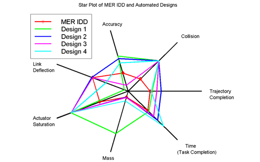
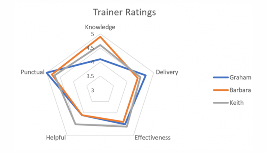
Spider charts are ideal when you need to compare several items using more than five features or metrics. Their radial design allows quick judgment of strengths and weaknesses by observing the shape and size of the polygon formed, showing an overall story rather than exact values. For example, ranking trainers on multiple parameters is easier with a coloured spider chart.
Comparing multiple entities across parameters
Spider graphs enable easy side-by-side comparison of multiple entities across various categories. The larger the area covered on the chart, the better the overall ranking, making it easy to spot differences at a glance.
Identifying commonalities and outliers
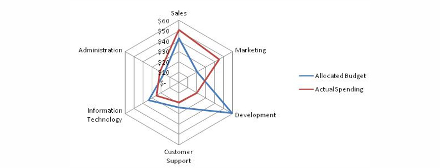
Radar charts quickly reveal similarities, differences, and data anomalies. They are effective for comparing target vs actual performance, with gaps between stars highlighting progress and anomalies.
Types of Spider Graphs
1. Marked Spider Chart
Like a common radar chart, but with markers on each data point to highlight individual values.
2. Filled Spider Chart
Like the radar chart, but with the entire area filled with colour to clearly differentiate between different data sets or entities.
When Not to Use a Spider Graph?
Too many variables clutter the chart
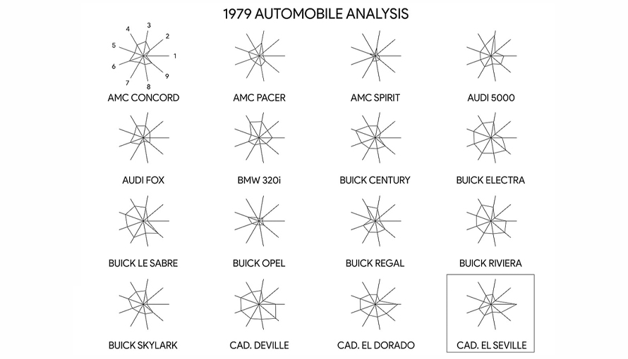
Including too many polygons or variables makes the spider chart confusing and difficult to interpret. Filled polygons can obscure data underneath, and crowded axes worsen readability. Comparing values across several axes also becomes challenging despite gridlines.
When precise comparison is critical
Spider charts are not ideal for accurately comparing lengths of spokes across variables since radial distances are hard to judge visually. For exact value comparison, bar charts or line graphs are better suited.