History of Bubble Chart
Bubble charts were introduced by Fernanda Viegas and Martin Wattenberg as visualizations using labelled circles, where the area of each bubble is proportional to its data value. This design performs a visual square-foot transformation, making it an effective way to display hierarchical or quantitative data. Since their introduction, bubble charts have gained popularity and are now integral to major visualization toolkits like D3.js. The New York Times Visualization Lab has also utilized bubble charts, showcasing their effectiveness in complex storytelling and data presentation.
User-generated bubble charts became accessible through platforms like Many Eyes, allowing users to upload data and create interactive visualizations, further popularizing the technique.
When to Use a Bubble Chart?
1
To Help Navigate Complexity
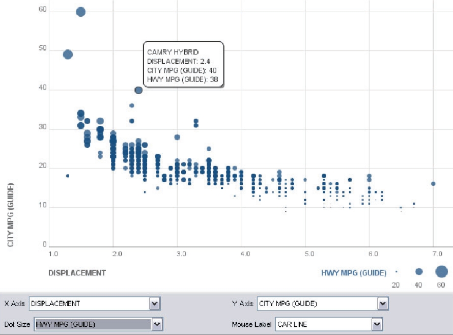
Use bubble charts to visualize three dimensions of data by plotting bubbles based on position and size. This allows for pattern recognition and trend analysis, helping users grasp complex datasets clearly.
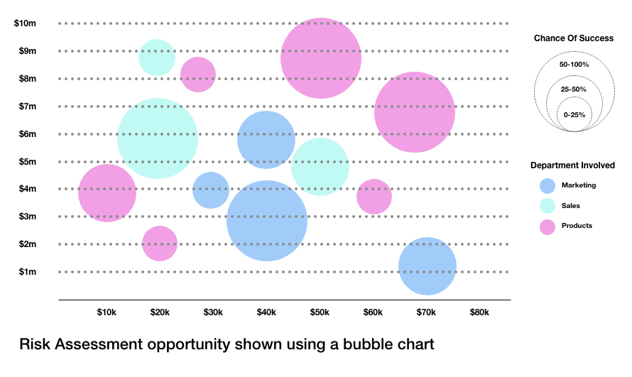
Risk Assessment opportunity shown using a bubble chart
Source
2
To Compare Relationships Across Categories
Use bubble charts to display four dimensions of data — two axes for position, bubble size, and color (often called color temperature) as the fourth dimension. This helps differentiate data points and highlight relationships. When using bubble area to convey values, document the scale for clarity.
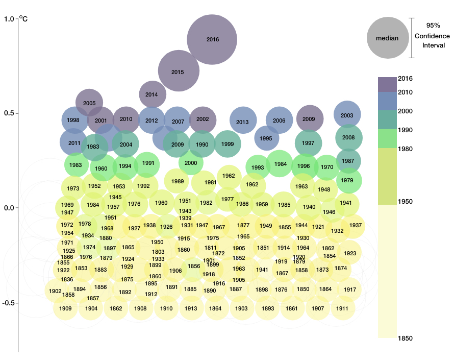
Labeled Bubble chart showing global temperature anomaly compared to 1961-1990 average
3
To Combine Composition and Correlation
Bubble charts can blend features of pie and line charts, ideal for financial analyses where composition and correlations need visualization in a unified view.

Bubble Chart showing composition and correlation together
Source
Types of Bubble Charts
Each bubble is labelled, suitable for smaller datasets.
2. 3D
Shows bubbles in a 3D format without a depth axis.
3. Cartograms
Bubbles placed on maps using latitude and longitude as coordinates.
When Not to Use Bubble Charts?
1
When fewer than three data dimensions exist
If your dataset has less than three variables, avoid bubble charts. Although colorful bubbles are visually appealing, bubble charts require at least three dimensions to meaningfully represent data.
2
When data points overlap extensively
If multiple points share similar x and y values, bubbles may overlap or obscure each other, reducing readability. This limitation restricts the number of bubbles that can be visualized clearly.
3
When exact values are critical
Bubble charts encode size relatively, making precise quantitative comparisons difficult. If exact measurements are essential, consider alternative visualizations such as bar or line charts.
4
When datasets are too large or complex
Too many bubbles can clutter the chart and overwhelm viewers. Use data summarization or different chart types for better clarity.
In summary, bubble charts excel at showing broad patterns and relationships with three or more variables but require careful design to maintain clarity and interpretability.