History of Chord Diagram
The term chord diagram derives from geometry, where a chord is a line segment connecting two points on a circle. Chord diagrams gained prominence in 2007 through The New York Times infographic “Close-Ups of the Genome,” showcasing genomic relationships. Also known as radial network diagrams, they represent a specialized circular chord diagram layout for matrix-based data flows.
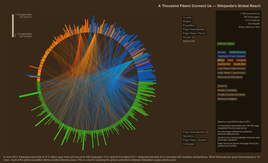
Example: “A Thousand Fibers Connect Us — Wikipedia’s Global Reach,” the winning entry in the WikiViz 2011 Data Visualization Challenge, used arcs to show readership flows between Wikipedia language versions and countries.
When to Use a Chord Diagram?
1
When showing interconnections in large datasets
Use a chord diagram to manage visual complexity when lines between many points would create clutter. Unlike straight-line networks, chord diagrams employ hierarchical edge bundling, grouping related arcs to reveal adjacency in hierarchical data while reducing overlap.
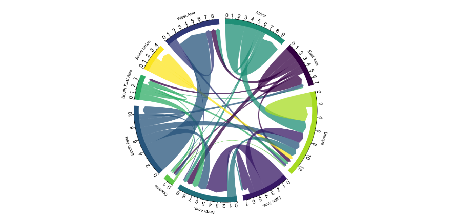
Chord Diagram displaying the number of people migrating from one country to another using data from a scientific publication from Gui J. Abel.
Source
2
When visual appeal and weighted relationships matter
Chord diagrams offer high aesthetic value, drawing attention through their radial symmetry and curved arcs. Arc thickness proportionally encodes relationship strength, making them suitable for scenarios requiring both beauty and precision.
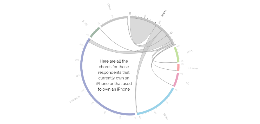
A bipartite chord Diagram
Source
3
When comparing interrelationships between data groups
Interactive chord diagrams shine when hovering highlights connections, aiding comprehension of group-to-group flows. They support detailed exploration of weighted relationships, with tools like Tableau enabling filtering and dynamic views for deeper insights.
Types of Chord Diagrams
Nodes divide into two distinct categories, with arcs connecting between groups but not within them, ideal for source-destination analysis like imports/exports.
2. Flow Diagram (Dependency Wheel)
Represents directed flows using symmetric arcs per pair or dual arcs for bidirectional links, common in chord plot variants for network dependencies.
When Not to Use a Chord Diagram?
1
When large datasets cause arc crossings and clutter
Avoid chord diagrams if numerous arcs overlap excessively, making patterns unreadable. Mitigate by limiting connections, filtering weak links, or optimizing node order around the circle, otherwise, consider chord diagram alternatives like Sankey diagrams for linear flows.
2
When lacking interactivity for complex storytelling
Static chord diagrams require significant explanation due to their non-intuitive radial layout. Without hover effects or progressive reveals, viewers struggle to parse relationships, reserve for interactive circular chord diagram designs or simpler alternatives.