History of Choropleth
The history of the choropleth map dates back to 1826, when Charles Dupin created the first one to depict literacy levels by department in France. These early visualizations were called “cartes teintées” or color maps.
The term “choropleth” was introduced in the mid-20th century by John Kirtland Wright of the American Geographical Society. In his paper Problems in Population Mapping, Wright emphasized choropleths as essential tools in economic and social geography. Unlike isarithmic or area-class maps, which define boundaries based on data-derived zones, choropleth maps aggregate data across predefined administrative boundaries such as counties or states.
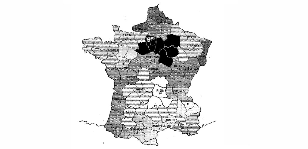
First unclassed choropleth map showcasing literacy data by the Department in France, created by Charles Dupin in 1826.
When to Use a Choropleth Map?
1
To visualize change or distribution across defined regions
A choropleth map is ideal for displaying data variables with colour progression across regions, such as districts, states, or countries. Colour gradients, ranging from light to dark or transparent to opaque, show how intensity varies spatially. This format helps readers see geographic trends immediately.
2
To represent standardized or ratio data
Use choropleth maps when data is standardized to show rates or ratios rather than raw counts. For instance, population density rather than total population provides a fairer comparison between regions. Standardization reduces bias caused by polygon size and reveals real distribution patterns.
Applications of this method are common in data visualization tools like Tableau or Folium, where map layers dynamically represent ratio-based datasets.
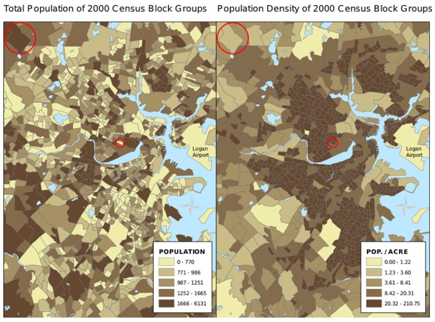
Normalization: The map on the left uses total population to determine color. This causes larger polygons to appear to be more urbanized than the smaller dense urban areas of Boston, Massachusetts. The map on the right uses population density. A properly normalized map will show variables independent of the size of the polygons.
Source
3
To highlight classes or general geographic patterns
Classed choropleth maps are useful when you need to group data into classes for better visual comparison and decision-making. Meanwhile, unclassed maps show subtle gradients, offering a continuous, less-filtered view of data. Interactive versions, such as an interactive choropleth map, can enhance engagement by allowing exploration and filtering directly on the interface.
Unclassed Choropleth maps, have more of a gradient display and help the reader easily interpret high and low-density areas.
Source
.svg)
Types of Choropleth Maps
Classed choropleth maps divide data ranges into defined classes; each assigned a distinct colour range. They simplify comparisons and are widely used in research reporting and demographic studies.
2. Unclassed Choropleths
Introduced by Waldo Tobler in the 1970s, unclassed choropleths assign a unique color to every data value, enabling more nuanced insights. These work best for exploring continuous datasets without data grouping.
When Not to Use a Choropleth?
1
When accuracy or exact data extraction is needed
While colors effectively communicate trends, they cannot convey precise numerical values. In addition, map viewers may misinterpret color weight, particularly when larger areas seem more dominant than densely populated smaller ones.
2
When mapping non-geographic or absolute data
Choropleth maps are not ideal for visualizing raw values or attributes not tied to defined regions. Phenomena like soil type, disease spread, or age distribution often cross human-defined boundaries and require other techniques. In such cases, dot density maps, proportional symbol maps, or bubble charts may provide clearer insights.
3
Data Considerations and Normalization
Always use choropleth map datasets that are normalized or standardized to ensure fair comparison between areas. Without normalization, large units may appear misleadingly prominent. For example, a raw population choropleth will make vast rural regions seem dense, while density-per-square-kilometre normalization corrects this distortion.