Circular barplots are ideal when you want to present data in an engaging, compact format, especially when dealing with cyclical or grouped data. However, understanding the limitations in readability and axis interpretation is important to avoid miscommunication.
History of Circular Barplot
Circular barplots evolved from traditional bar charts to present data with enhanced visual appeal. Humans are naturally drawn to circular shapes and curves, making these charts popular for catching attention and creating aesthetically pleasing visuals. While the circular layout excels in engaging audiences and providing an aggregate sense of data, it can sometimes conflict with precise data communication due to distortions in comparing bar lengths and angles.
This style typically serves well when the goal is to captivate viewers and highlight overall trends rather than detailed numeric comparisons, making it a favoured choice in dashboards, infographics, and design-forward data presentations.
A circular barplot which adds a second Y scale oriented on the other side: from inner radius to ~0
Source
When to Use a Circular Barplot?
When representing a large number of bars
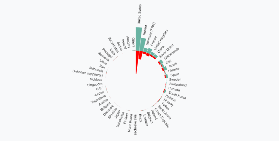
Use a circular barplot when a bar chart with many bars reveals an obvious pattern. This circular format can better utilize space and create an eye-catching visual. However, understanding traditional bar plots is important before converting them to circular ones.
A circular barplot is really eye-catching but makes it more difficult to read the differences between each bar size.
Source
When a stacked bar chart looks cluttered
Stacked circular bar charts are useful for displaying multiple categories and grouping variables, making it easier to compare groups and entities visually. Ordering bars by value improves clarity, especially when categories lack a clear order.
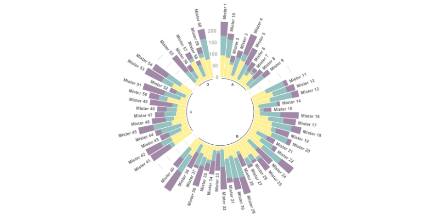
Stacked Circular Barplot
Source
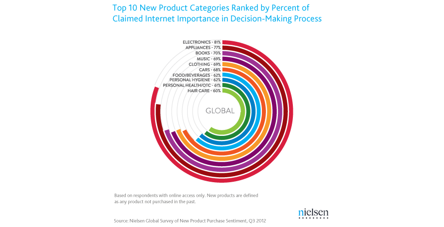
To visualize a smaller number of bars with strong visual appeal
Radial layout barplots work well for fewer bars to add visual interest and emphasize cyclical patterns. Note that bars at different radii vary in length, so comparison should be based on angles rather than absolute bar length.
Radial Barplot based on polar coordinate system
Source
Types of Circular Barplot
1. Stacked Circular Barplot
Charts showing bars arranged by descending incidence or value.
2. Radial Barplots
Barplots plotted on a polar coordinate system rather than Cartesian, creating curved bars.
3. Double Circular Barplot
Charts with two numeric variables per group facing each other for direct comparison.
When Not to Use a Circular Barplot?
When precise bar size values are needed
Circular bars can distort size perception, especially if the inner circle is not large (>1/2), making bars appear larger than they are.
If no clear pattern or enough levels exist (> ~40)
Without many categories or clear patterns, circular barplots can obscure data; alternative plots like boxplots or violin plots may be better.
For intricate data comparisons
Use standard bar charts or lollipop plots for more accurate visual comparison, as straight bars on Cartesian axes are easier for human visual processing.