History of Geographic Network Diagram
Spatial networks emerged in 1970s quantitative geography, building on mathematical graph theory from physics and sociology. Early studies analysed location, activities, flows, and evolving transportation networks, though limited by data and computing power. Today, geographic networks integrate statistics, probabilities, and real-world stochastic processes.
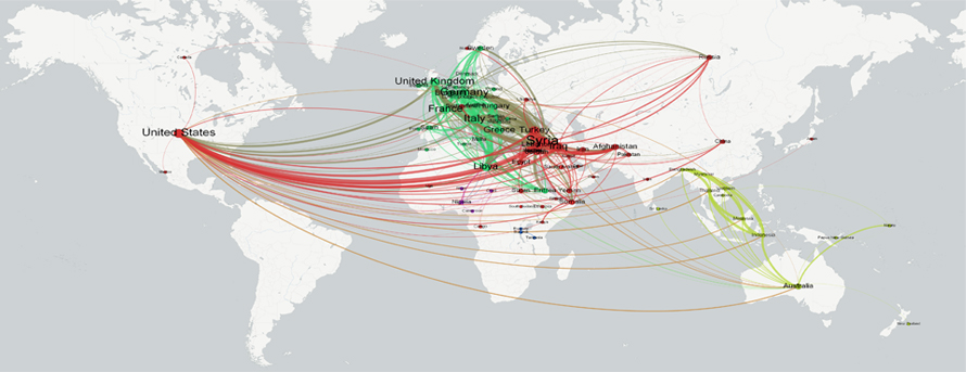
Map showing the Geographic Networks of Global Refugee Flows through a Geographic network Diagram
Source
When to Use a Geographic Network Diagram?
1
To compare link strength in networks
Geographic network diagrams visualize transportation, internet, power grids, or social networks, where space matters beyond topology. Position frequently connected nodes closer, size by degree, and colour by modularity for 3D network map insights.
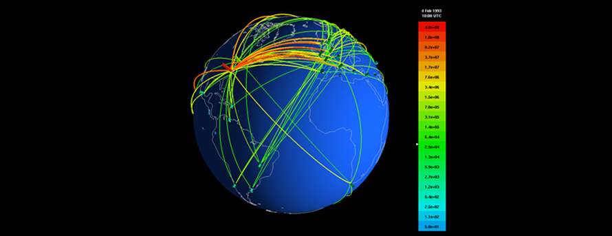
3D Geographic Network Display
Source
2
To decipher network structure and regional flows
Use colour tones on connecting lines to reveal patterns in network map example scenarios. Proper network map design clarifies interconnected regions, though high-density areas may obscure micro-connectivity.
3
To monitor network health via dashboards
Network map visualization provides at-a-glance overviews of system performance, cyber threats, or faults on world maps, with link status indicators highlighting issues geographically.
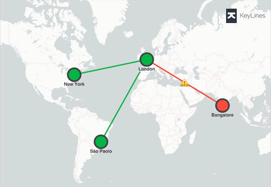
The dashboard view of a global corporation’s IT network
Source
Types of Geographic Network Diagrams
1. Area Cartograms
Thematic maps that resize regions proportionally to underlying data values in vertex-weighted geographic networks. Edges appear as shared boundaries between adjacent regions, creating contact-style representations.
2. Linear Cartograms
Distort geographic distances to reflect edge weights in geospatial location network analysis, emphasizing connection strength over true spatial relationships.
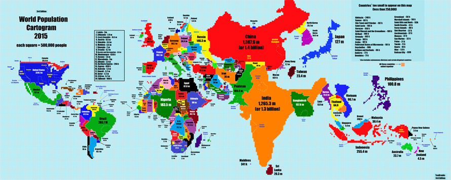
New World Population Area Cartogram: The map resizes countries based on their population. It’s simple: Each square represents 500,000 people. (NPR)
Source
When Not to Use Network Diagrams?
1
With overly complex, large datasets
Geographic networks form unreadable “hairballs” beyond capacity, lacking clear patterns.
2
When geography obscures the network structure
The difference between network maps and network diagrams lies in spatial context, if proximity data is inadequate or arcs wrap incorrectly on world maps, key details hide. Use abstract diagrams instead.