Heatmaps are commonly used as isopleth-style displays to represent regions or areas of similar value using continuous color gradients or colour “splotches.” In digital product contexts, heatmap analysis is widely used to understand user interaction with interfaces, making complex behaviour data self-explanatory for designers, product teams, and business stakeholders.
History of Heatmap
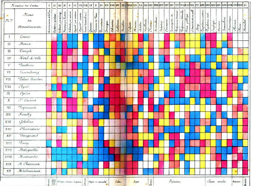
Heat maps originated as two-dimensional shaded matrices where larger values appeared as darker squares and smaller values as lighter ones. Early examples, such as Toussaint Loua’s 1873 shaded matrix of Paris districts, visualized social statistics like origin, profession, age, and class using a color scale from low to high.
Over time, researchers such as Sneath and Robert Ling extended heatmap design into statistics and multivariate analysis, while Leland Wilkinson’s SYSTAT in 1994 produced some of the first high‑resolution cluster heatmaps using computer graphics. In the early 1990s, software designer Cormac Kinney popularized the term “heat map” in finance, using color-based 2D displays to show market information and price movements.
When to use a Heatmap?
1
When you need a direct overview of key web performance
Use website heatmaps when you want an immediate visual overview of how users interact with a page: what they see, where they click, and what they ignore. Heat map analytics tools translate behaviour into colours, with “hot” (warm) zones representing high engagement and “cold” (cool) zones representing low attention or interaction.
Heatmap analysis can aggregate user behavior into scroll maps, click maps, move/hover maps, and geo heatmaps, enabling UX teams to identify friction points and optimize layouts, CTAs, and content placement. This form of heat map data visualization is particularly useful to compare variants in A/B tests or to validate hypotheses about information hierarchy and navigation.
Source
2
When you need to optimize performance by tracking trends over time
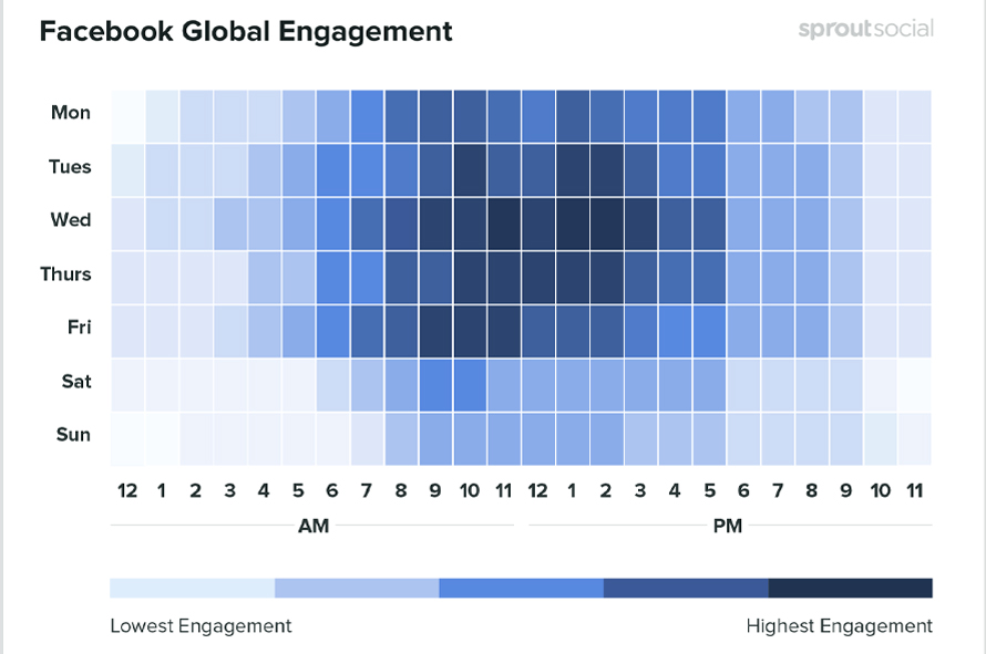
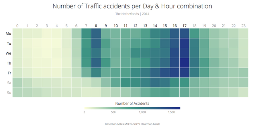
Heatmaps support performance monitoring by revealing temporal patterns such as best times to publish, peak periods of engagement, or recurring weak spots across touchpoints. When used as an application heatmap in analytics dashboards, they can show time on site, response times, error rates, or campaign effectiveness across days, hours, or seasons.
Because heatmap visualization compresses large data volumes into compact color grids, it becomes easier for analytics specialists and business stakeholders to discuss results using a shared visual language rather than dense spreadsheets. This makes heatmap design a powerful decision-support tool for marketing, operations, and product performance conversations.
3
When required to visualize complex or high-volume data
Heatmaps are valuable when you need to interpret complex, high-dimensional, or high-volume numeric data without overwhelming the audience. With appropriate color scales and legends, heat map data visualization allows viewers to quickly distinguish high, medium, and low values, even when the underlying data set is large or multi-factor.
This approach is widely applied beyond UX to domains such as population density, per‑capita income, climate and temperature grids, financial correlation matrices, genomic or molecular biology data, and operational telemetry. Heatmap services offered by analytics platforms often include clustering, filtering, and drill‑down capabilities, extending simple displays into more advanced exploratory tools.
Source
Types of Heatmaps
Visualization of the most clicked or tapped elements on a webpage. Helps to easily determine the element or type of content that interests your users the most.
2. Desktop & Mobile Heatmaps
Allows comparison of the performance of digital content on different devices.
3. Scroll Map
Visual Representation of how far users scroll down on the different pages of a website, which can help determine the right length for content.
4. Hover Heatmap
Showcase where the visitors hover their cursors on the screen. This gives a glimpse of which elements attract visitors the most.
When Not to Use a Heatmap?
1
When you need to show change across discrete geographic units
If the goal is to show how a variable changes across defined geographic boundaries such as countries, states, or districts, use a choropleth map instead of a heatmap. Choropleth maps shade polygons according to aggregated values tied to specific enumeration units, making them better suited for spatial distributions that follow administrative or natural boundaries.
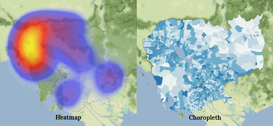
A heatmap in a geographic context typically applies a continuous grid or kernel over space rather than aligning to exact borders, so it is less appropriate when boundary-level interpretation is required.
Source
2
When analyzing highly dynamic web applications or needing exact statistics
Heatmaps are less effective on JavaScript-heavy single-page applications where content and layout change frequently without full page reloads. Unless the analytics implementation is carefully adapted, the recorded interactions may not correctly reflect the dynamic states of the page.
Additionally, if you require precise quantitative metrics such as exact counts, conversion rates, or detailed time-series values, heat map analytics alone will not be sufficient. Heatmaps provide a high-level, aggregated view and should be complemented with traditional analytics reports and event-based tracking.
3
When representing hierarchies or part-to-whole relationships
Heatmaps are not ideal for visualizing hierarchies, networks, or part‑to‑whole structures such as organizational charts or nested categories. In these cases, treemaps or node-link diagrams communicate structure and relationships more clearly.
Treemaps, for example, represent hierarchies using nested rectangles, where larger rectangles contain smaller ones to reflect higher-level categories and their subcomponents. Choosing between heatmap visualization and alternatives should depend on whether your primary goal is to show intensity patterns or structural relationships.