History of Hexbin Visualization
Hexbin visualization was first introduced in a 1987 paper by statisticians D.B. Carr and colleagues as a technique to represent two-dimensional data by dividing the space into hexagonal bins and counting data points within each bin. Hexagonal binning was chosen over traditional square bins due to its ability to better capture density with less visual bias, as hexagons tessellate efficiently and provide a smoother, more natural pattern.
The technique has since become popular for creating hexbin heatmaps and hexbin density plots, especially in geographic and spatial data visualization, helping to reveal patterns and clusters in large datasets. This method efficiently reduces overplotting and enhances clarity compared to scatterplots or rectangular histograms, making it a valuable tool in data visualization.
The hexbin approach is widely implemented in software libraries and used for hexagon data visualization across fields like cartography, environmental science, and urban planning.
When to Use a Hexbin?
Unbiased density distribution
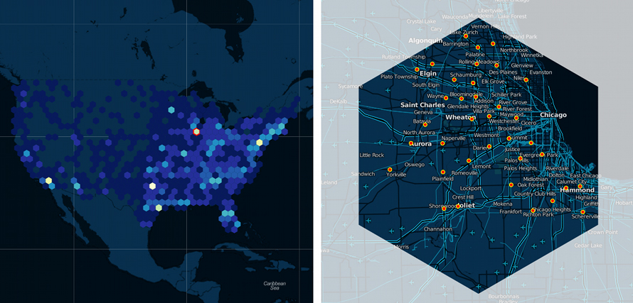
Use hexbin maps when geographic areas vary widely in size, to avoid the size bias common with choropleth maps. Hexagonal bins break the map into equal-sized units, representing data density fairly and uniformly.
An exploded 3D pie chart where one of the slices has been exploded(separately represented to bring attention)
Source
Visualizing large concentrations
Hexbin maps are ideal for showing clusters and dense data points within spatial datasets, providing clarity when scatterplots become overwhelmed with overlapping points.
Analyzing spatial patterns
When exploring spatial distributions and detecting hotspots or trends, hexbins offer clear segmentation with colours representing data intensity, making them effective for geospatial density visualization.
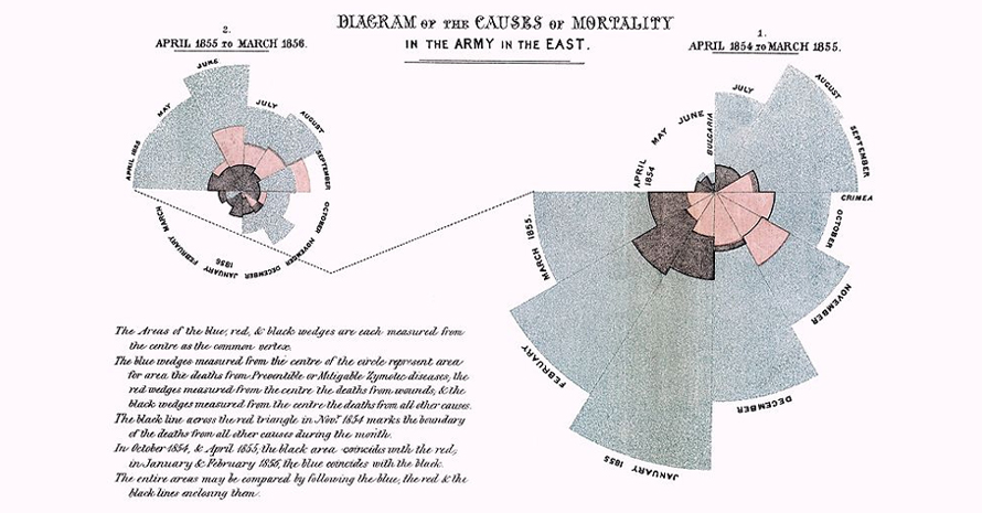
Polar chart by Florence Nightingale, 1858, If the death count in each month is subdivided by cause of death, it is possible to make multiple comparisons on one diagram
Comparing multiple data layers
Hexbin maps can be layered with other visual elements or time-based data to show changes or comparisons across consistent spatial units.
Types of Hexbin Visualizations
1. Standard Hexbin Density Plot
This is the most common type, where the data space is divided into regular hexagonal bins. Each hexagon’s colour or size represents the count of data points within it. This plot is highly effective for visualizing distributions and clusters in large datasets.
2. Hexbin Heatmap
A variation of the standard hexbin plot, this uses a colour gradient (heatmap) to show density intensity visually. Darker or warmer colours indicate areas with higher data concentrations, helping quickly identify hotspots and patterns.
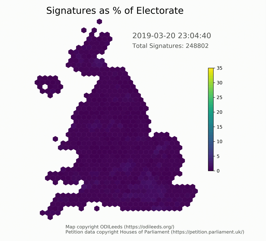
3. Hexbin Choropleth Map
In this type, hexagons replace irregular geographic regions (like states or districts), providing uniform shapes that help reduce bias from varying area sizes. The color of each hexagon encodes a numeric variable, enabling fairer spatial density visualization.
4. 3D Hexbin Visualization
This advanced variant uses hexagons with height or extrusion to represent quantity, adding a third dimension to the density plot. It enhances perception of magnitude differences across hexagonal bins, commonly used in geospatial and statistical analysis.
5. Interactive Hexbin Maps
These allow zooming and filtering of hexbin data layers, often implemented in web visualizations. They combine hexbin density representation with user interactivity for detailed exploration of spatial data.
When Not to Use Hexbins?
When preserving individual data points is essential
Hexbin visualization aggregates points into hexagonal bins, so precise location or value of individual data points is lost. For small datasets or when each data point matters, scatterplots or raw data views are better.
For audiences unfamiliar with the concept
Hexbin maps can be complex and less intuitive than simple heatmaps or bar charts, requiring explanation for non-technical viewers.
When data is sparse or evenly distributed
If data points are few or uniformly spread, hexbin visualizations offer little added insight and may appear uniformly colored, obscuring patterns.
When precise spatial boundaries matter
Hexbin maps divide space into uniform hexagons, which can mask fine geographic boundaries important in detailed spatial analysis.
When display space is limited
Hexagons may leave unused gaps in rectangular display areas, limiting efficient space use compared to rectangular binning or other chart types.