History of Line Chart
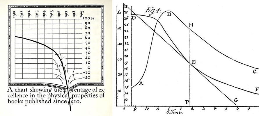
Early pioneers include Francis Hauksbee, Nicolaus Samuel Cruquius, Johann Heinrich Lambert, and economist William Playfair. Playfair’s 1786 Commercial and Political Atlas featured 43 line chart variants exploring economic/political time-series data. Lambert used them in 1767 physics discoveries. By 1919, parody graphs like Dwiggins’ printing standards critique showed their cultural reach.
When to Use a Line Chart?
Analyzing chronological trends for decisions
Line charts visualize time series data—how values evolve continuously. Slopes between markers reveal acceleration/deceleration; mathematical formulas quantify individual segments. Works with scalar or ordinal independent variables like months.
Displaying relationships in continuous periodical data
Perfect for correlations between numerical values—marketing trends, lab results, weather patterns. Reveals how one variable’s change drives another’s through clear pattern recognition.
Measuring rate of change against variables
Slopes provide conclusive growth/decline evidence. Calculate gradients, areas under curves visually. Handles continuous periods (temperature, distance, age) with equal x-axis spacing.
Types of Line Chart
1. Spline Chart
Smooth curved lines (smoothed/curved line chart) emphasize gradual changes over sharp point-to-point connections.
2. Step Line Chart
Incremental steps rather than straight lines—ideal when values remain stable between specific change moments.
3. Stacked Lines Chart
When Not to Use a Line Chart?
Few values as label/nominal variables
Bar charts better handle sparse categorical data at time intervals. Lines suit high-volume/continuous data; bars intuitively show “zero-fill” accumulation (sales) vs. line’s continuous flow (population).
Multiple categories in one chart
Intersecting lines create visual chaos. Use stacked/column charts or split bars for category comparisons—lines excel at individual point-to-point slope clarity.
Emphasizing total change over time flow
When category sums matter as much as individuals, area charts highlight cumulative magnitude. Also superior for percentages summing to 100% where totals need instant recognition.