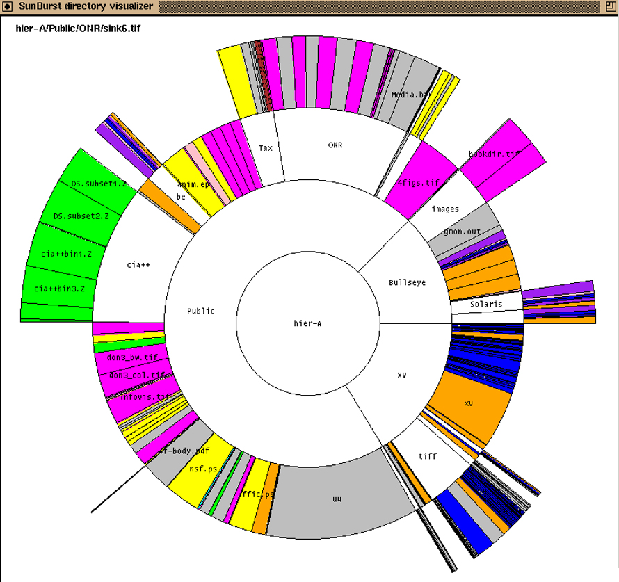
History of Sunburst Visualization
Sunburst charts likely evolved as an extension of pie charts to visualize subunits within primary segments. Also known as multilevel pies or nested pie charts, sunbursts combine multiple pie charts into a single, hierarchical visualization. The earliest known pie charts date back to 1801, first documented in William Playfair’s Statistical Breviary. Sunburst diagrams themselves were first published in 1921 in mechanical engineering literature, illustrating hierarchical data such as U.S. federal government expenditures.
This evolution allowed complex hierarchical data to be visualized clearly and intuitively using concentric rings representing different layers of the hierarchy.
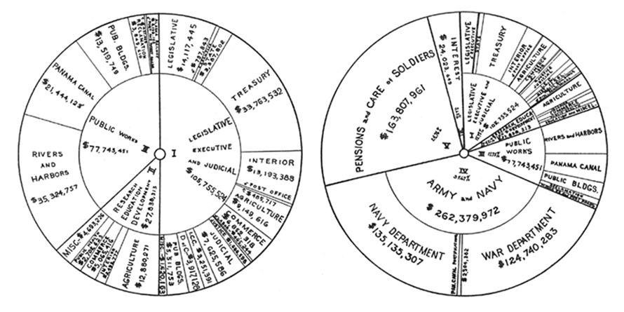
Sunburst diagrams first published in Mechanical Engineering in 1921, showing the average annual net expenditure of the US federal government from 1910 to 1919
Types of Sunburst Visualizations
1. Tree map
A rectangular cousin of the sunburst, tree maps display hierarchy through nested rectangles sized and ordered to represent subunits clearly.
2. Multi-level Pie Chart
This is essentially a sunburst made of concentric pie layers, consolidating multiple pie charts into one, simplifying comparisons across levels.
When to Use a Sunburst Visualization?
Represent Multiple Dimensions Easily
Sunburst charts excel when visualizing hierarchical data with many levels and categories, unlike simple pie charts that handle single dimensions. Their concentric rings represent hierarchy levels, segmented either equally or proportionally, with colours highlighting groups or categories. This makes complex data intuitive and visually accessible.
Effective Hierarchical Comparison
With multiple rings, sunburst visualizations reveal how outer levels relate to inner ones, making it easier to compare categories within a hierarchy. Colour hues can denote organizational branches, with varying shades indicating sub-levels. This circular format enhances comparison while maintaining visual appeal.
Quick At-a-Glance Data Breakdown
Sunbursts add depth by showing sub-categories within parent segments, emphasizing uneven branching to highlight significant portions or features. This makes it ideal for showing detailed category breakdowns in one cohesive visual.
When Not to Use a Sunburst?
For Precise Hierarchical Comparisons
Tree maps, icicle charts, and bar charts are better for exact size comparisons because rectangular shapes are easier for the eye than angled slices.
When Space Efficiency Is Crucial
Sunbursts fit circular charts inside rectangular spaces, leaving unused corners. Tree maps occupy the entire bounding area, thus using space more efficiently for large datasets.