Our Strategy
The Thinker Approach
Our engagement began by understanding how investors interact with financial data and the kinds of insights they seek when managing their portfolios. Stakeholder discussions and exploratory research helped map key user goals, workflows, and the decision-making contexts in which the platform would be used.
Investment platforms often need to balance large volumes of data with usability.
The design strategy therefore focused on structuring information in a way that made portfolio performance, asset allocation, and market indicators easier to interpret.
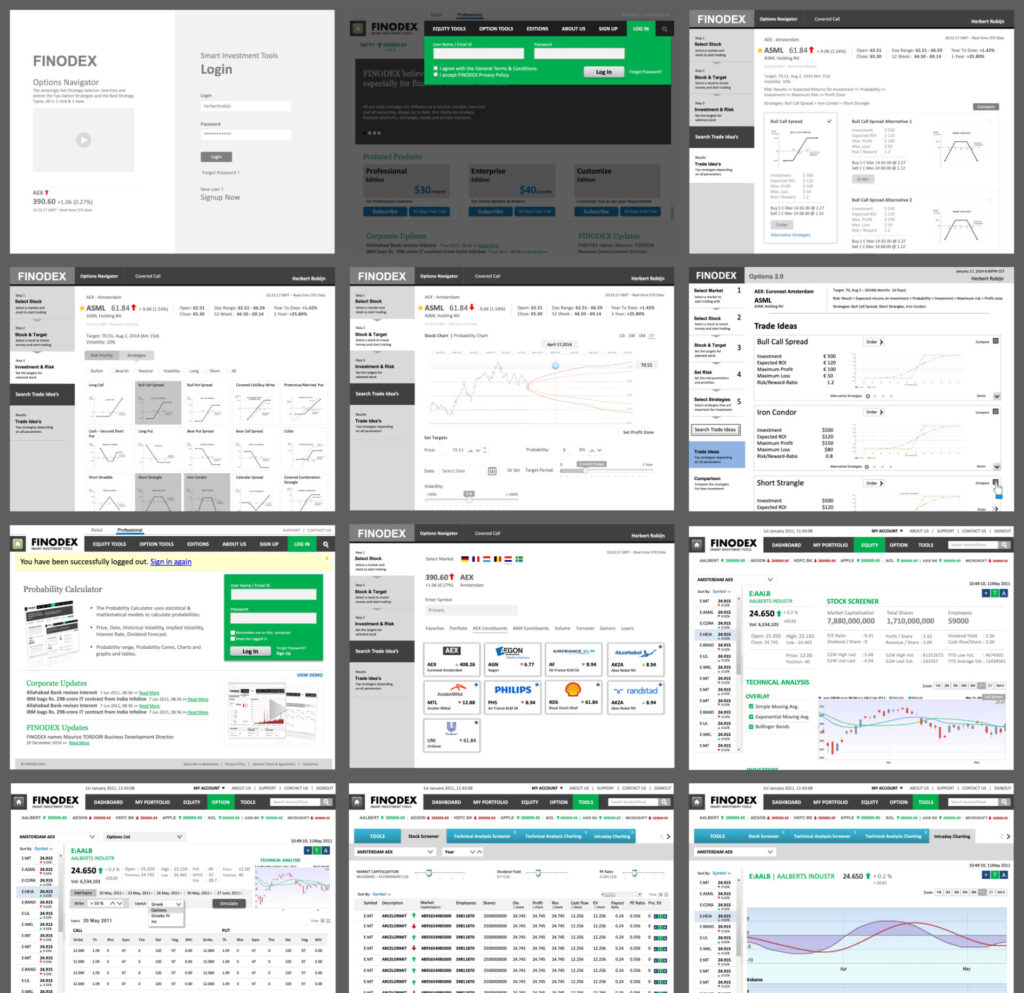
Through iterative prototyping and validation, the investment platform UI UX design evolved toward a cleaner interface that emphasized clarity, accessibility, and meaningful data visualization.
Insights We Drew/ Insights Inferred
Financial platforms frequently present users with dense datasets, complex analytics, and fragmented views of portfolio performance. While these tools are powerful, they can overwhelm users if the information is not structured intuitively.
Our research suggested that investors needed a clearer overview of their portfolio health, easier navigation across investment categories, and better visibility into performance trends.
Rather than displaying data in isolation, the platform needed to help users understand relationships between investments, risks, and returns.
By organizing information around decision-making needs rather than system structures, the platform could deliver a more intuitive and meaningful investment experience.
Key Strategic Interventions
Portfolio-centric information architecture
Structured the platform around portfolio performance and investment insights rather than isolated datasets.
Simplified financial data visualization
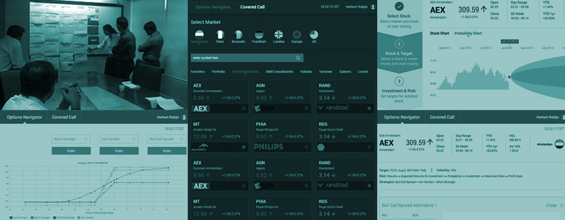
Designed clear charts and dashboards that made complex investment data easier to interpret.
Intuitive navigation framework
Created structured pathways for users to explore portfolio holdings, market updates, and financial insights.
Focused decision-support interface
Prioritized the most relevant metrics and indicators required for investment monitoring.
Consistent design language
Established a visual system that improved readability and usability across the platform.
KEY FEATURES
01
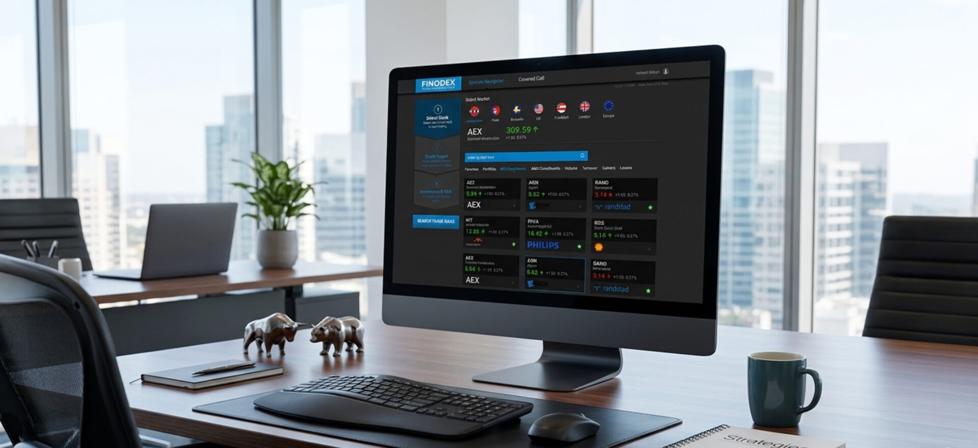
Portfolio Overview Dashboard
A consolidated view of portfolio performance, asset allocation, and key metrics that helps investors quickly assess financial health.
02
Investment Performance Tracking
Detailed visualizations and reports that enable users to monitor returns, risks, and trends across different asset classes.
03
Financial Data Visualization
Charts and graphical representations that translate complex financial data into easily interpretable insights.
04
Structured Navigation for Investments
An organized interface that allows users to seamlessly explore portfolio holdings, investment products, and market insights.
05
Actionable Portfolio Insights
Highlighted indicators and performance metrics designed to support better financial decision-making.
DESIGN ACTIVITIES
Consulting
Secondary
Research
UI/ UX Design
Visual System
Front End
Development
Outcomes and Impacts
The redesigned Finodex platform introduced a more intuitive digital experience for investors seeking to track and manage their portfolios effectively.
By simplifying complex financial information and presenting it through clear visualizations, the platform made it easier for users to understand portfolio performance and identify investment opportunities. The structured interface improved navigation while ensuring that the most critical financial insights remained easily accessible.
The engagement demonstrated how thoughtful investment platform UI UX design can translate complex financial data into meaningful digital experiences – empowering investors to make more confident and informed decisions.


