Our Strategy
The Thinker Approach
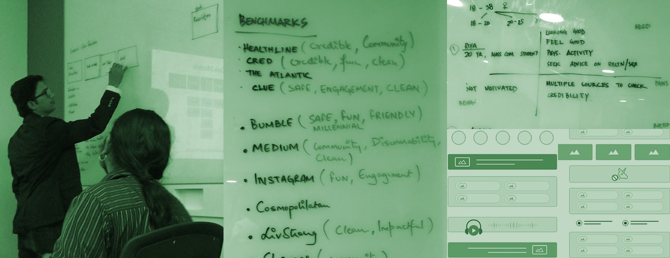
We kicked off the project with active engagement with the business and technology teams from HT to identify the requirements and product vision comprehensively. This helped us consolidate all the business and strategic inputs to come up with the key values that would shape our design directions.
With a unique and specific target segment in mind—the millennial Indian women, we conducted extensive user research to identify them, create personas and define their journeys. This helped us define Healthshots’ USPs too.
We delved into competition benchmarking analysis. Based on the inputs, visual design concepts were created to finalize the strategic design direction.
Insights We Drew/ Insights Inferred
When conducting an audit, we identified the absence of reliable sources for women’s healthcare in common media. Being tasked to create a first-of-its-kind platform led us to pay greater attention to making it accessible.
To encourage users to speak about women’s wellness and health—much of which includes taboo topics, we planned to create an application that facilitated sharing, commenting, liking, and more.
Key Strategic Interventions
Novel Visual Design
Visual design that breaks the norms in terms of color palettes, fonts, and visual elements to provide users with a new experience when consuming content.
Interactive Content Widgets
Interactive widgets embedded in between the content to boost user interaction and sharing.
KEY FEATURES
01
Mood Widget
We developed an innovative and interactive widget for users to explore on Healthshots that functions on different moods. It predefines a playlist to match your mood that runs in the background while they traverse the website.
02
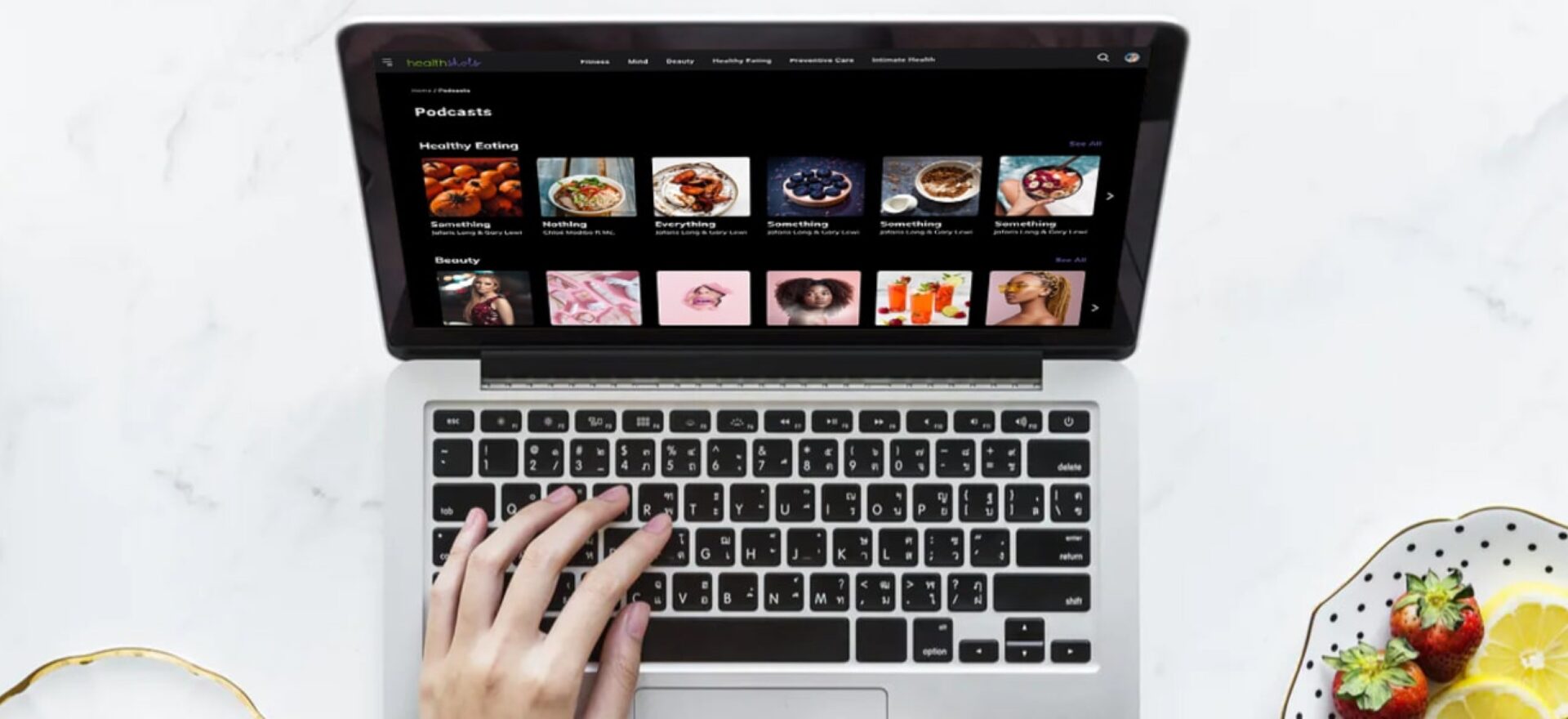
Interactive Content Grid
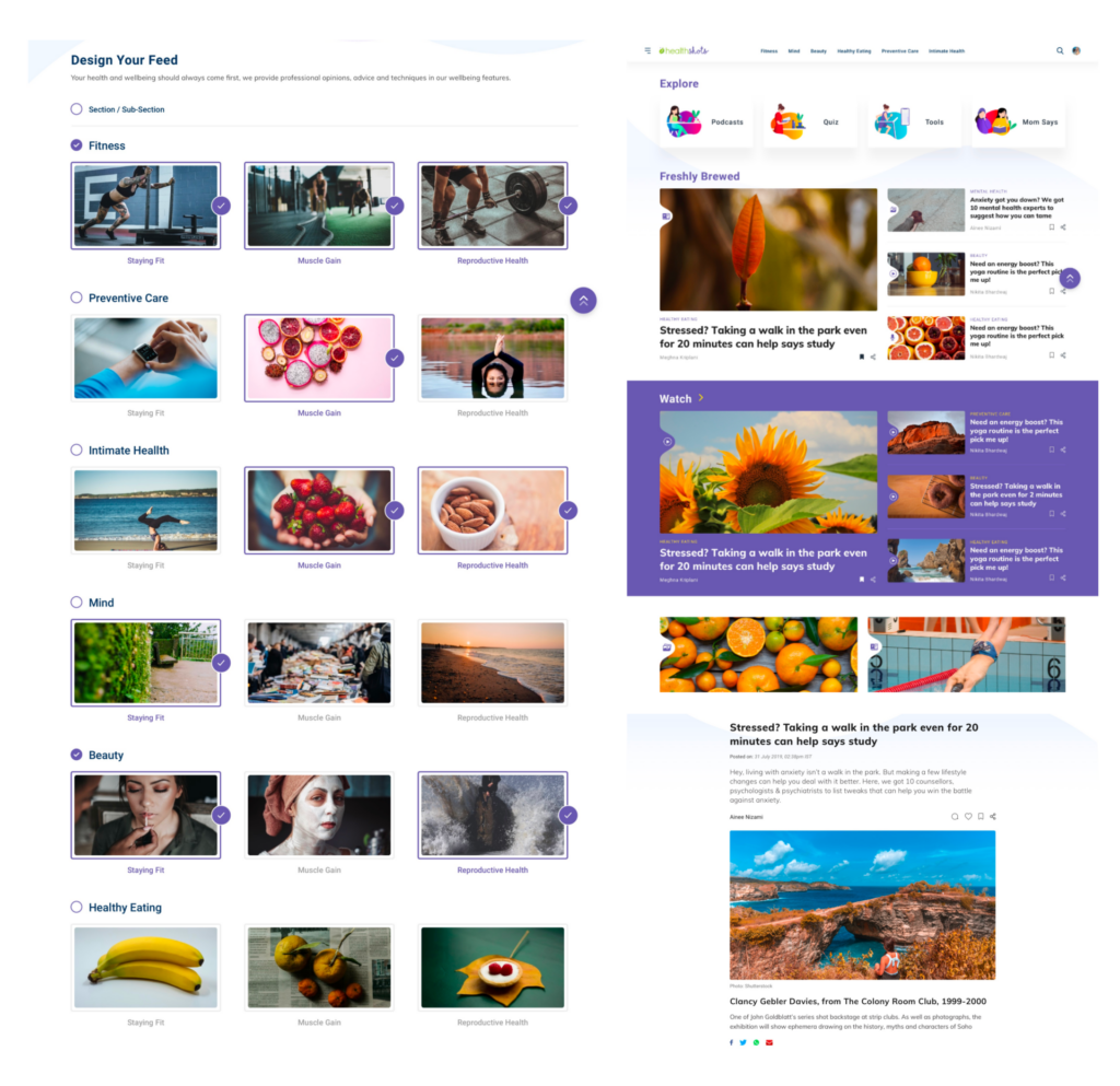
To enhance interface and readability, a core principle of healthcare user experience design, we visually segregated all formats of media across the feed to make browsing intuitive and engaging for users.
The tile-based approach across the website also helps; whether you are navigating through a poll, an article, or forum, the containers are designed differently to capture and bring out the functionality and essence of the content.
03
Content Customization
Being more user-focused than brand-focused, we retained the essence of the platform but crafted the communication differently while keeping in sight the millennial mindset.
04
Innovative Visual Language
We broke stereotypes when designing color palettes and visual elements to keep the visual look and feel fluid and contemporary, allowing the audience to focus on the content easily.
05
Community Interaction Section
The application allows users to share their health concerns every day in context with credible content curated by a slew of doctors and fitness experts.
Based on the content tonality, we designed this interactive segment spread across various topics with a different visual style to connect it with a topic through iconography and illustration.
DESIGN ACTIVITIES
Consulting
Stakeholder
Workshop
Visual System
UI UX Design
Prototyping
Product Development
coordination
Dev. Coordination
Product Impact & Outcomes
The website was launched in November 2019 and is getting a positive response from users across the country, partly due to its strong foundation in healthcare user experience design.


