Our Strategy
The Thinker Approach
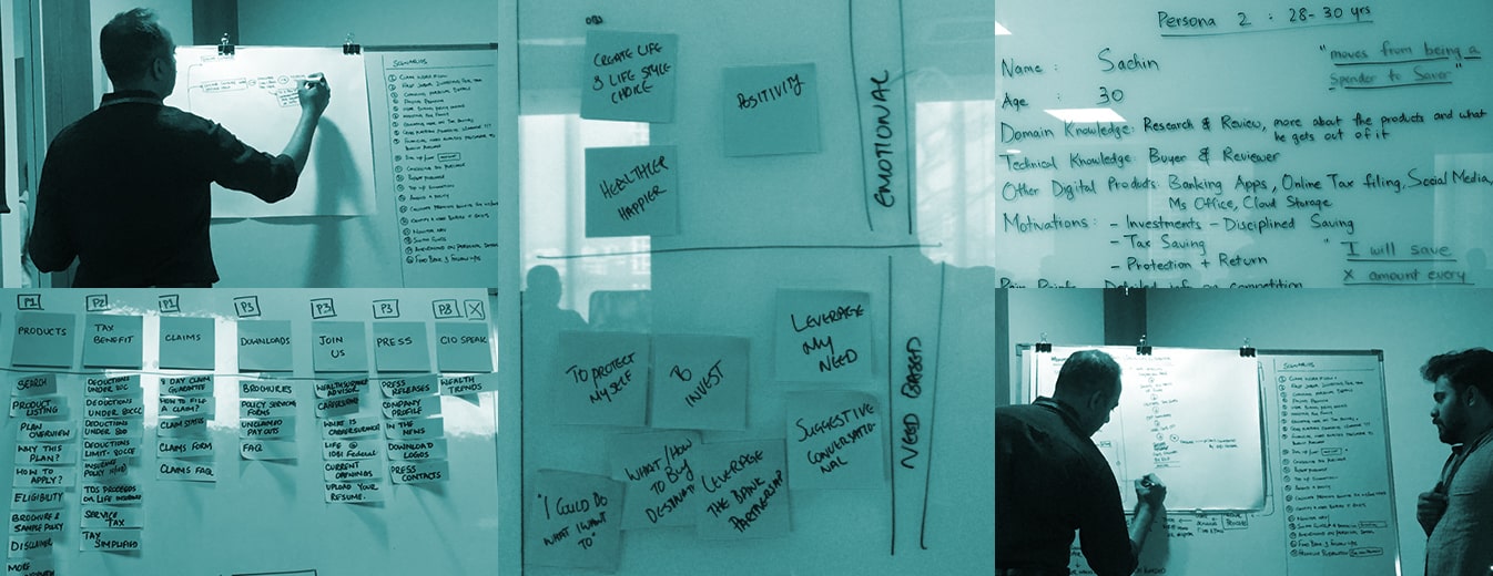
Through a stakeholder workshop at the beginning of the project, we learned more about the users we wanted to target and what they were looking for. This intervention helped us isolate the gaps in the website which were leading to a bad user experience.
Insights We Drew/ Insights Inferred
IDBI hosted products, some of which weren’t relevant to the users’ needs. Users would often feel misguided by the missing or mislaid information across the website, leading to a bad experience. One of our primary goals was to fix the IA throughout the portal.
Key Strategic Interventions
Transformed Legacy Service System
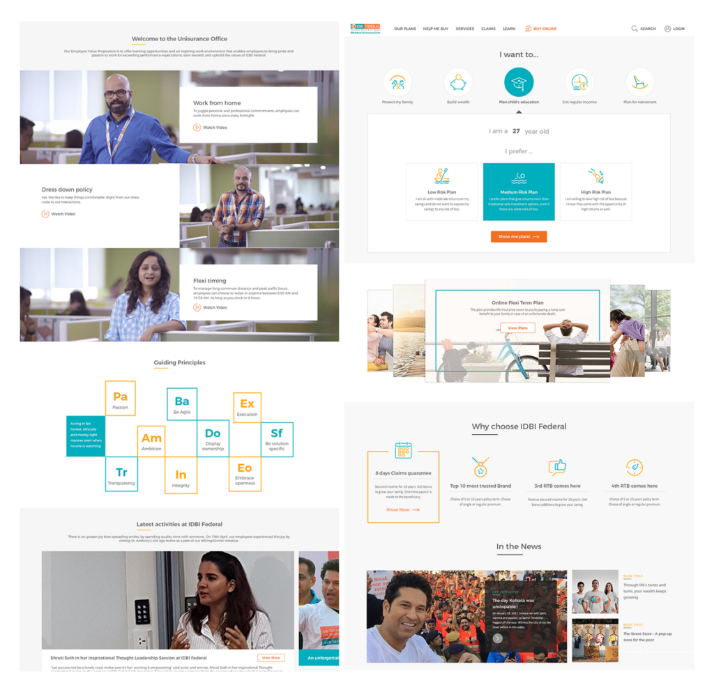
Designing for different customer maturities leading to a complete transformation of the legacy service system, owing to the latest industry trends and new user personas.
Improved Critical Information Arrangement
Implementing visual hierarchy on an enhanced arrangement of information for easy access to critical data.
Policy Customization
Improved accessibility to the policy customization, giving users better access to products from IDBI.
Responsive Interface
Transformation to a responsive website to improve user experience over an array of devices.
KEY FEATURES
01
Information Transparency
The website now contains complete information about the policy in a transparent manner, including everything a customer might wish and need to know.
02
Accessibility
The website allows users to view similar products and grasp the differentiators immediately with a clear display of information. This helps them finalize one quickly.
03
Customization of Policies
The users can check if they’re eligible for a policy without any hassle and get a quote instantly while enjoying the option to customize the policy as they see fit.
04
Insurance Productization
With policies presented as products with USPs, we were able to design a dynamic interface that made it easy for the user to find the relevant product, keeping in mind different sources and reasons of visit. This increased user satisfaction, decreased bounce rate, and boosted engagement.
05
Improved User Support
- Users are provided with support for product and information discovery, policy customization, and application walkthrough across the website to ensure good service quality perception.
- Users get an option to move between online and offline channels, whether they wish to find information on their own or prefer connecting with an advisor. This feature was specifically designed to cater to users who are migrating to digital products but prefer a human connection when making a final decision.
DESIGN ACTIVITIES
Consulting
Stakeholder
Workshop
Strategy and
product Definition
Visual System
UI UX Design
Prototyping
Front End
Development
Product
Dev. Coordination
Product Impact & Outcomes
The revamped insurance portal UX design was launched in October 2017.
There have been several exciting moments through the making of the IDBI Federal Life insurance website and our favorite is when a competitor appreciated us. The client invited bids for conducting usability tests post-launch and one of our competitors remarked that the design didn’t need it. This event was duly celebrated in our studio!
AWARDS

