Our Strategy
The Thinker Approach
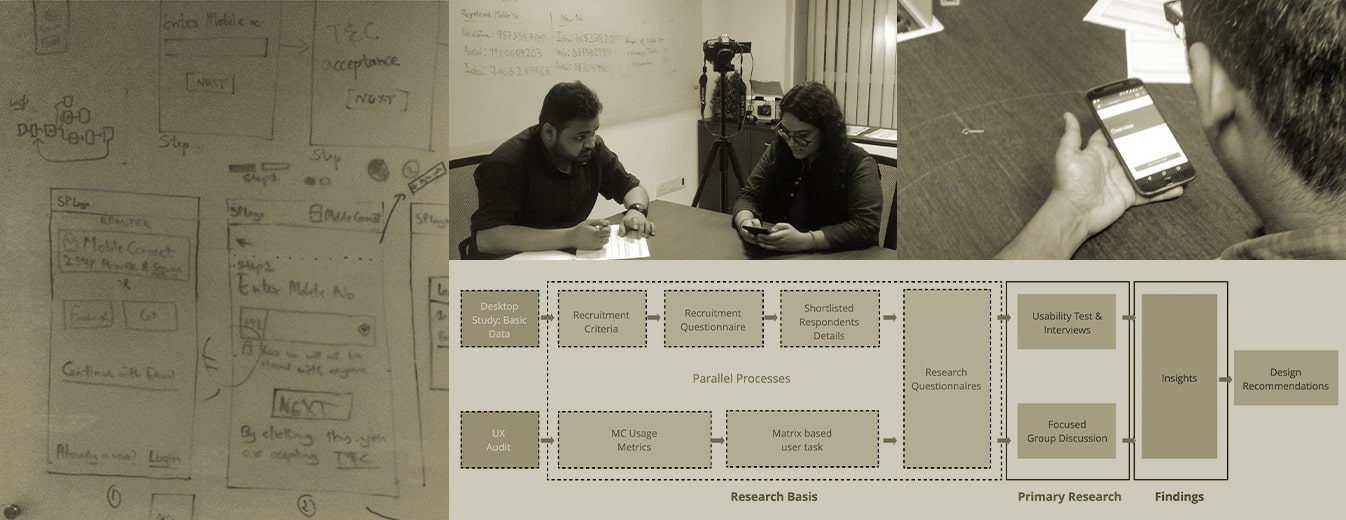
To conduct comprehensive research, our first steps were guided by defining a research foundation and recruitment criteria through a primary basic study.
A UX audit was done to identify and judge the existing product’s UX around the areas of customer onboarding, navigation, and data representation, helping us define user tasks and the product’s usage metrics.
A Research Questionnaire was hence developed drawing from both the study and audit which fed to conduct the primary research.
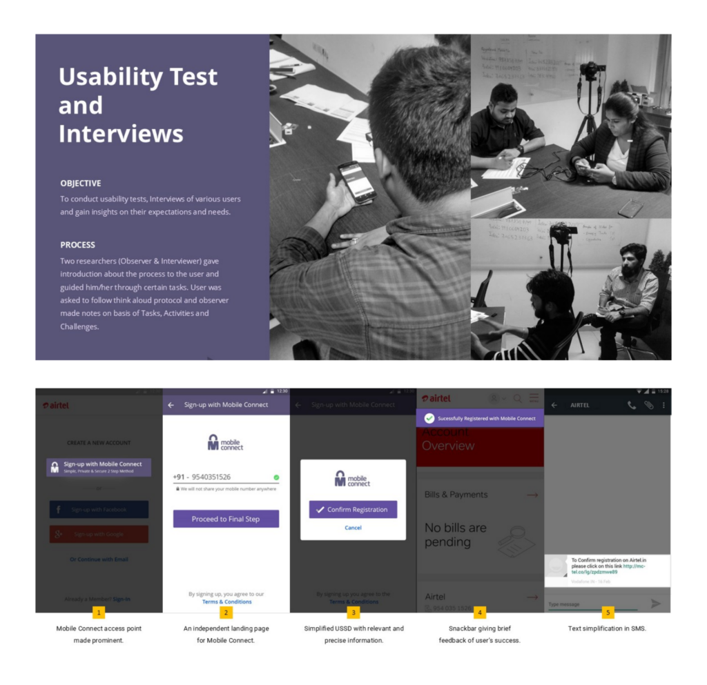
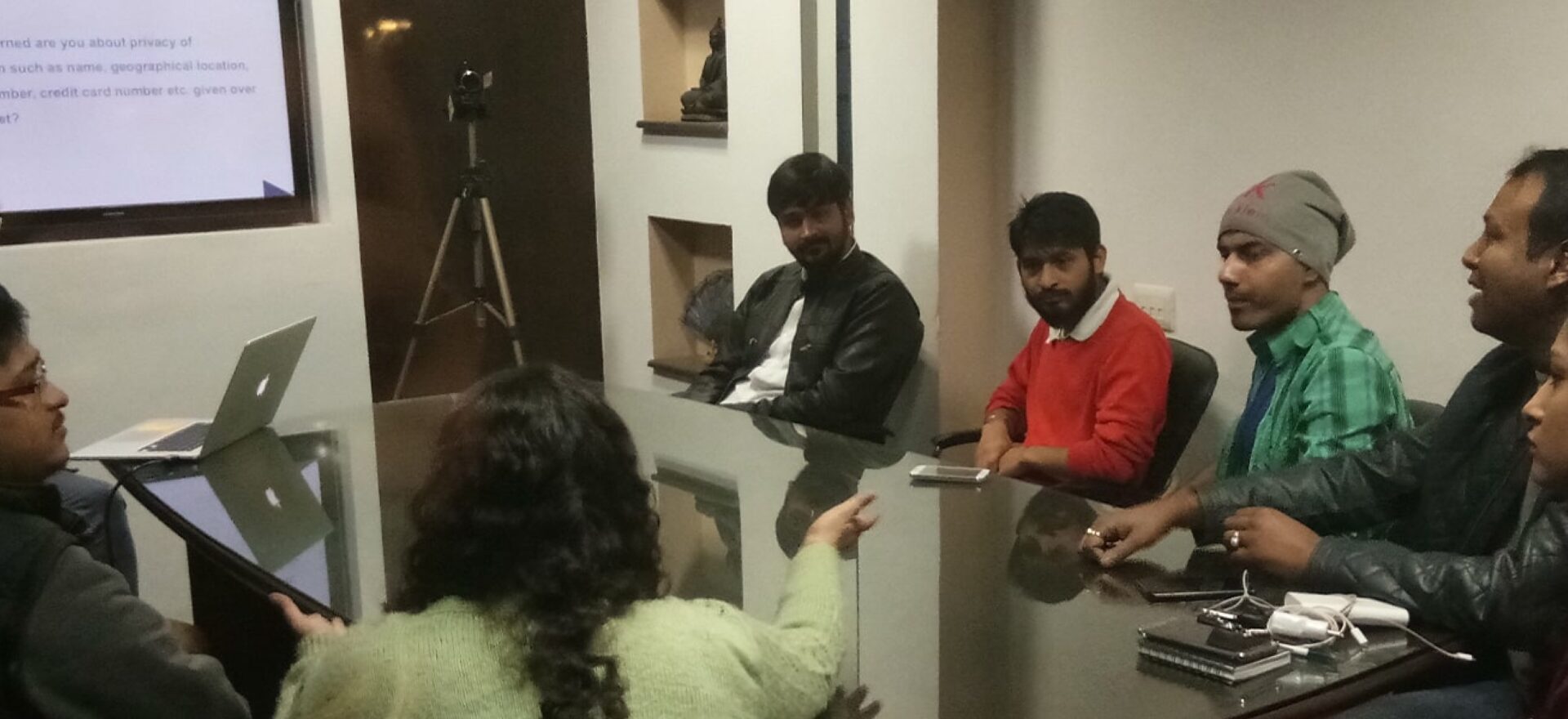
Primary research methods like usability tests and interviews and focus group discussions were employed to gain insights into user expectations and needs. This helped us generate ideas to determine the design directions for Mobile Connect.
Insights We Drew/ Insights Inferred
One of the key insights we attained was the unavailability of relevant information and data for the users. Service providers should display information related to all processes across the platform to let the users know how their data would be used.
Security and privacy emerged as key themes, informed by mobile authentication user research that showed users consistently prioritise clear, trustworthy verification mechanisms over convenience.

KEY FEATURES
01
Information Design and Disclosure
The application was recommended to be revamped considering key features of security, privacy, convenience, and information dissemination.
02
Color Identity
The most preferred colors were gathered from interviews and user perceptions, documented, and suggested, highlighting the reason for their preference amongst the users.
03
Simplification of the Interface
Enhanced, clearer visual elements and iconic representations of error messages were recommended. Additionally, the need for simplification of the wait screen with the use of comprehensive and direct content was emphasized.
04
Improved UX Across Workflows
Design directions for various user workflows were suggested with new changes drawn from the UX audit and user research insights.
05
Comparative Study
A comparison between the UX Audit and the new design suggested was done to highlight the current challenges, providing a way forward with the new design recommendations.

DESIGN ACTIVITIES
Consulting
Research Design
Participant
recruitment
Summary and
Consolidation
Product Impact and Outcomes
The mobile authentication user research activities were conducted and reports were delivered in 2017.


