Our Strategy
The Thinker Approach
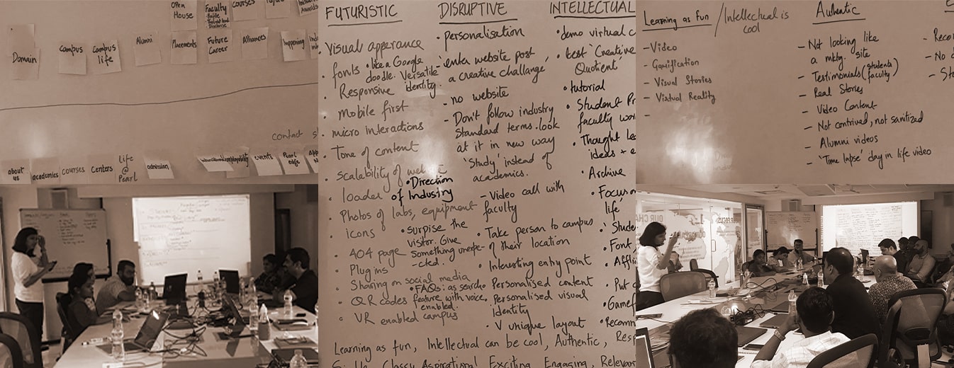
The project began with aligning our team with Pearl Academy’s brand values, vision, and goals. A stakeholder workshop helped us understand business requirements from the revamped platform.
An elaborate competitor audit was conducted to recognize common practices followed by direct and indirect competitors across the industry. Simultaneously, we identified potential and existing user personas that the platform would be targeted at.
This helped us define some visual design directions which were later discussed along with the stakeholders.
Technology vision also served as an important feeder to directing visual design. These helped form the anatomy of information architecture and in guiding the design strategy and development.
Insights We Drew/ Insights Inferred
The need of the hour was to revamp the website along the lines of a communication strategy that establishes design as a path of mainstream future education and careers to attract interested individuals and parents alike.
The brand’s key values were to be emphasized to highlight Pearl Academy as a disruptive, creative, intellectual, and futuristic educational leader.

Key Strategic Interventions
Enhanced Information Architecture
By grounding the information architecture in best practices for education platform UX design, Think Design improved navigation through all verticals of Pearl Academy.
Effective Brand Communication
Making the required impact on the audience by bringing out the essence of the brand’s personality.
KEY FEATURES
01
Establishing Brand Identity
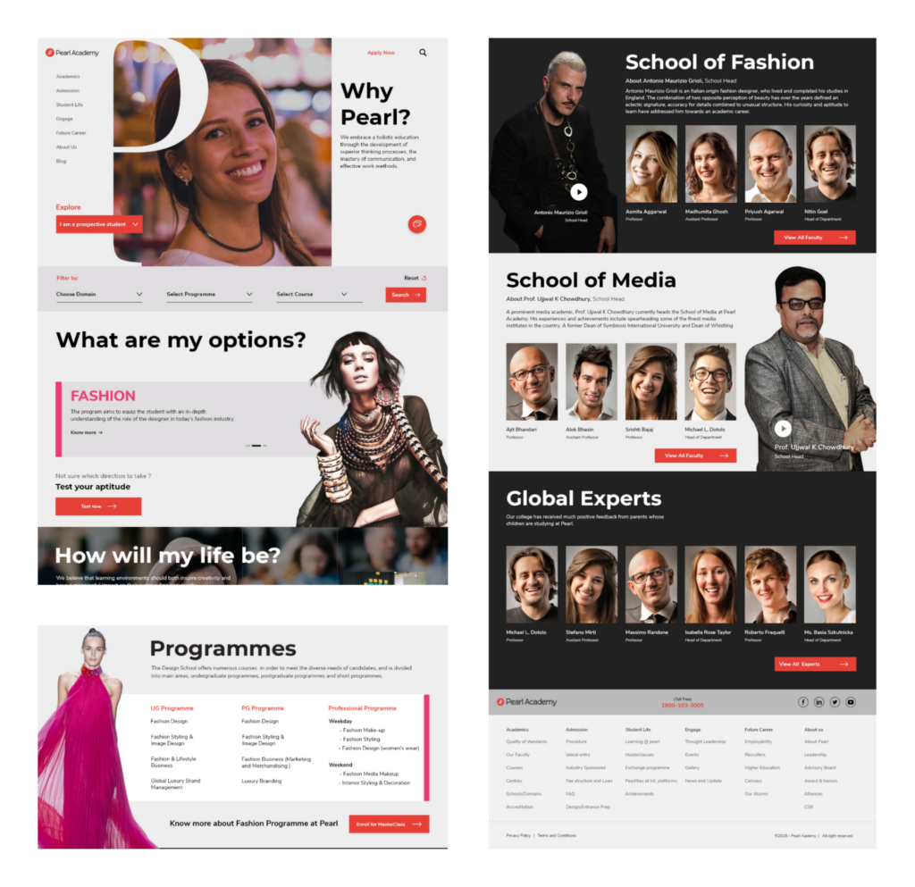
The uniqueness of the brand was envisioned to manifest using a magazine-style layout which could simulate the feeling of a prospectus, reasserting its identity as a world-class institution.
02
Engaging Key Users
Persona-driven content was designed to engage and answer queries of stakeholders through a compelling visual and content narrative, drawing to address problems driven from their key motivations.
03
Incorporating Contemporary Design
A less templatized, dynamic, and visually captivating look was created to bring in the contemporary angle of a creative and new-age institution.
04
Creating Brand Guidelines
The visual direction set for the website is now guiding the format for the brand’s other communication material and has created direction for all its creative communication.

DESIGN ACTIVITIES
Stakeholder
Workshop
Competitive
Research
Product Definition
Design Principles
UI UX Design
Visual System
Front-end
Prototyping
Front-end
Development
Product Impact and Outcomes
Having delivered in line with the academic calendar, the education platform’s UX design has set the precursor to driving more admissions and is being appreciated by key stakeholders. The project also received India’s Best Design Project In 2019.
AWARDS


