Our Strategy
The Thinker Approach
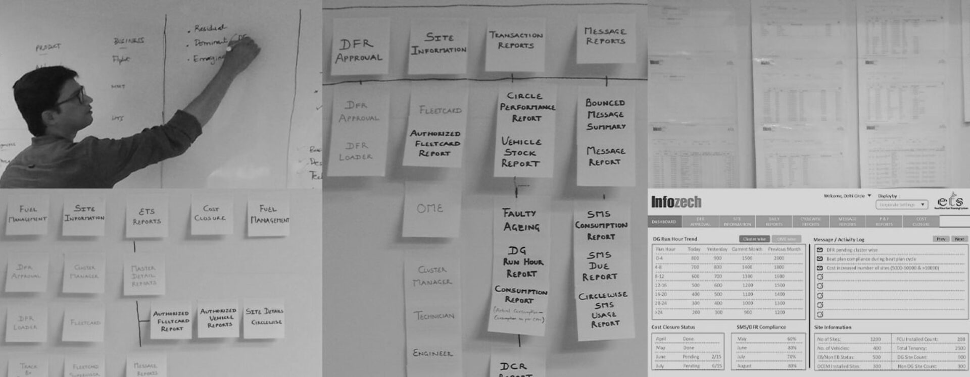
We began by aligning with stakeholders to understand the business vision, product capabilities, and the operational realities of telecom infrastructure monitoring. Through workshops and collaborative sessions, the team mapped key use cases for different user groups, including monitoring teams, operational managers, and maintenance personnel.
Personas and task models were developed to understand how users interact with tower monitoring systems—whether reviewing alarms, tracking site performance, or managing maintenance workflows.
These insights helped define the information architecture and interaction patterns required for the dashboard.
Given that monitoring users often work with large display screens in network operation centers, the design process also involved testing visual layouts on monitoring displays to evaluate readability, color contrast, and usability in real-world operational environments.
Insights We Drew/ Insights Inferred
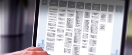
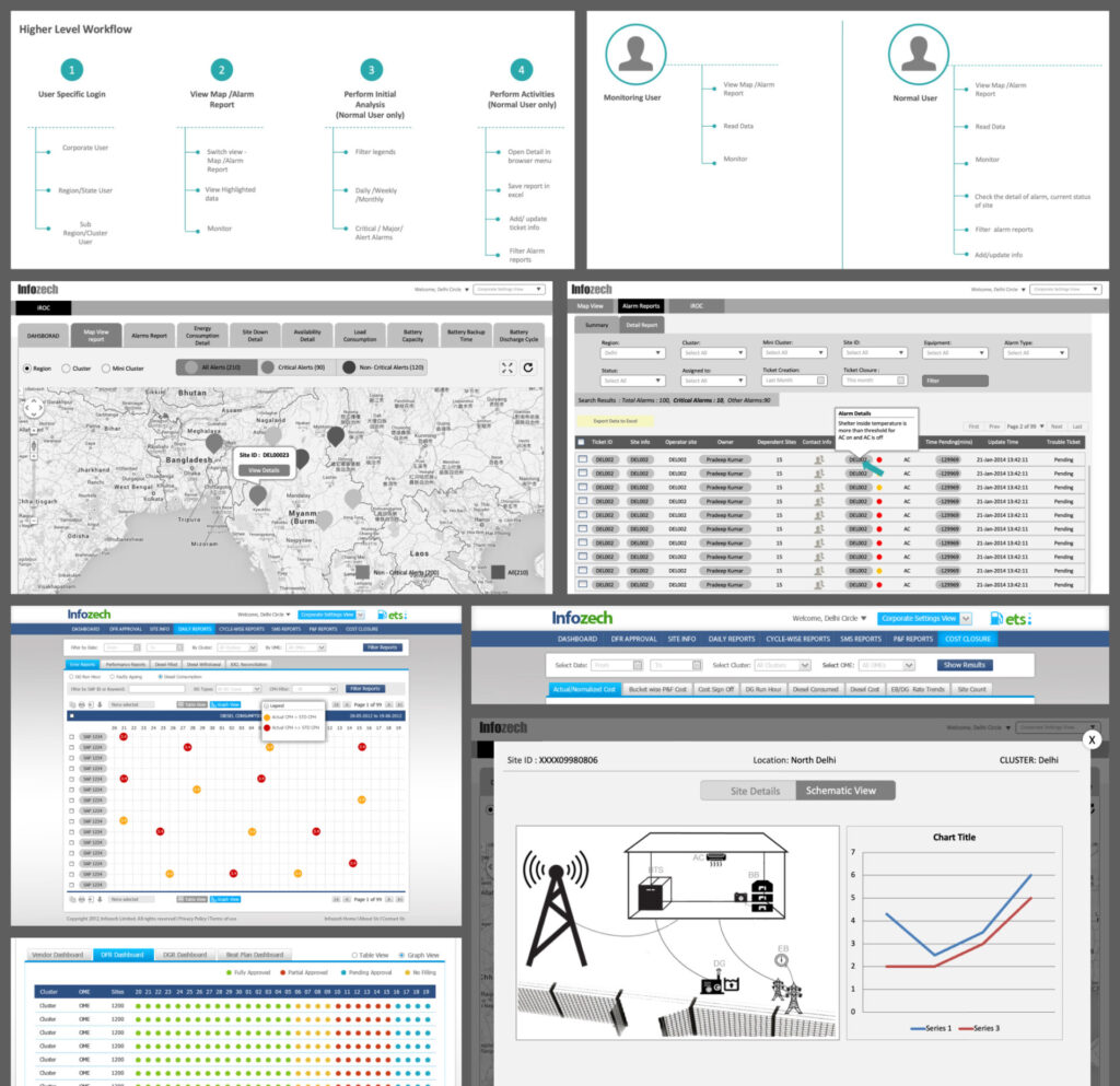
Operational dashboards often struggle with the tension between data depth and usability. Telecom monitoring systems generate a vast number of alerts, metrics, and reports, which can easily overwhelm users if not structured carefully.
Our research revealed that users needed clear prioritization of critical information, faster drill-down access to site-level data, and a visual hierarchy that allowed them to interpret complex datasets at a glance. The design challenge was therefore not simply to display more data, but to surface the right insights at the right moment.
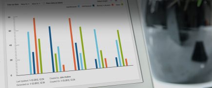
By restructuring information flows and visualizing operational metrics more clearly, the platform could support quicker decision-making for telecom operations teams.
Key Strategic Interventions
Information architecture restructuring
Organized large volumes of operational data into a clearer hierarchy for easier navigation and analysis.
Critical alert prioritization
Designed visual indicators to highlight alarms, alerts, and site criticality for faster response.
Dashboard-driven workflows
Enabled quick drill-down from summary dashboards to detailed operational views.
Visual data coding
Introduced consistent color coding and visual patterns to help users identify critical issues quickly.
Large-screen monitoring optimization
Designed layouts optimized for monitoring center displays used by telecom operations teams.
KEY FEATURES
01
Best Value Recommender
An analytical interface that enables enterprise users and customer service teams to analyze customer usage patterns and recommend optimal plans through an intuitive single-screen experience.
02
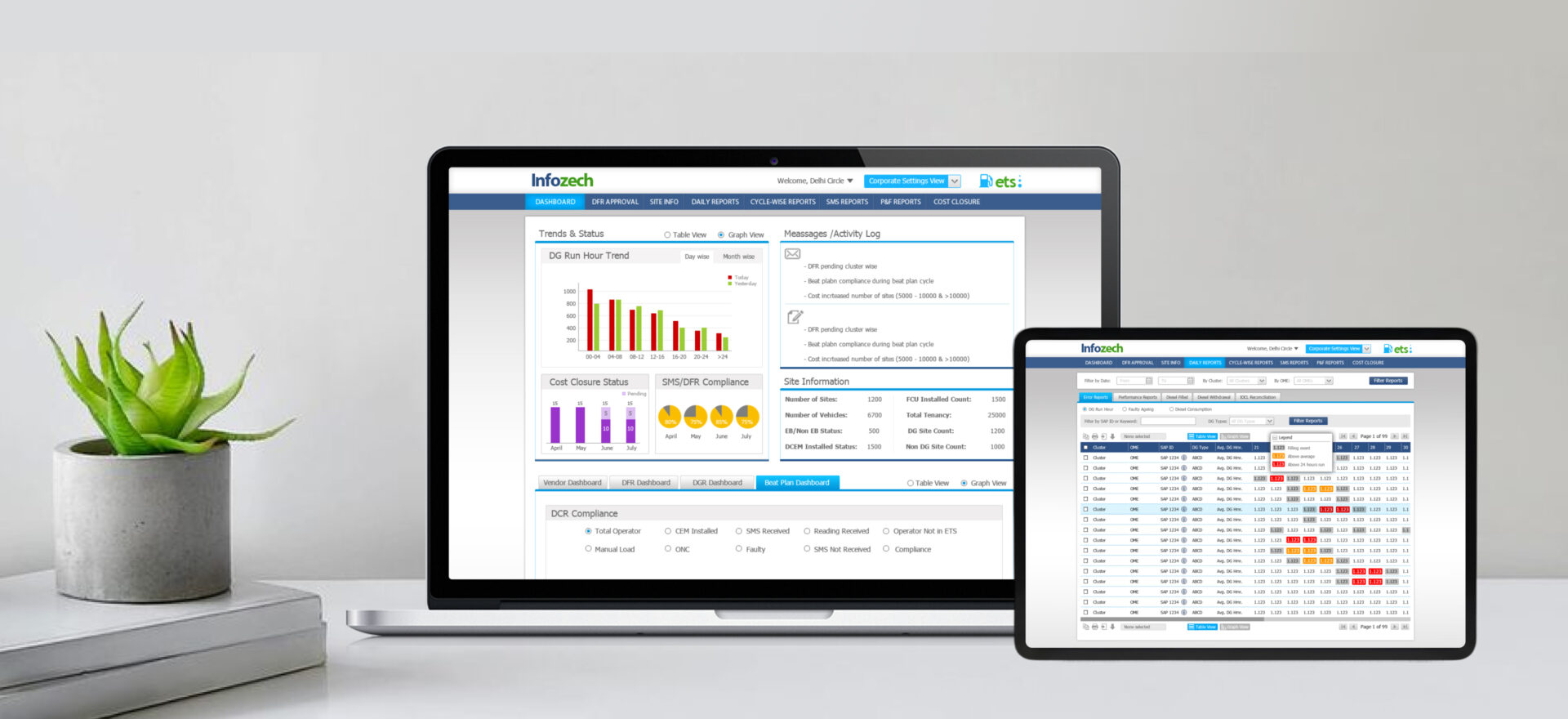
Energy Tracking System (ETS)
A dashboard that allows tower infrastructure providers to monitor energy usage, track operational issues, and manage infrastructure performance across multiple locations.
03
EnergySense Mobility Application
A mobile application designed for field maintenance personnel to track issues and manage operations without relying on manual paperwork.
04
Monitoring Application
A platform-agnostic monitoring system that allows operators to track alarms, analyze infrastructure performance, manage reports, and take timely actions across tower networks.
DESIGN ACTIVITIES
Consulting
Stakeholder
Workshop
Wireframing
Visual System
User Testing
Front End
Development
Product Impact and Outcomes
After its launch in 2013-14, the redesigned iTOWERS ecosystem enabled telecom infrastructure operators to monitor large networks more effectively by translating complex operational data into intuitive dashboard experiences.
By prioritizing critical information and simplifying navigation across multiple layers of analytics, the platform improved the usability of monitoring tools used by operations teams. The dashboards enabled faster issue detection, clearer infrastructure visibility, and more efficient operational workflows.
The project demonstrated how strategic enterprise dashboard design services can transform large-scale operational data systems into actionable decision-support platforms for enterprise environments.