Our Strategy
The Thinker Approach
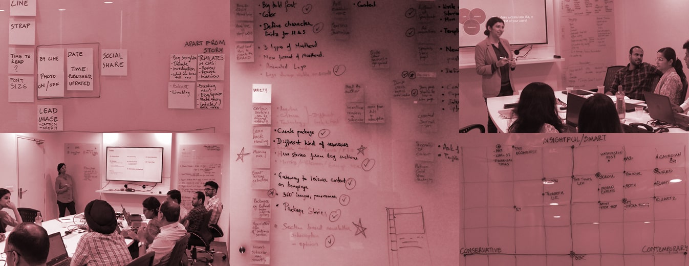
We began by conducting a strategy and alignment workshop with the Telegraph digital team, aimed at capturing business objectives, insights, and vision for the product to ensure we had the right context and data for the media publishing platform UX design.
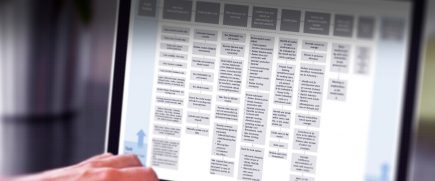
Competitor analysis of direct and indirect competitors helped us establish benchmarks. This gave us an overview of the features commonly integrated across the industry. The team engaged in a perpetual mapping exercise to map competitors against relevant metrics.
Technology aspects were also considered to narrow down constraints for potential design directions.
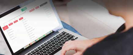
Finally, user journey and behavior were understood by exploring all possible scenarios, including their entry and exit on the website utilizing the insights we gained from competitor analysis. This altogether helped us craft design direction.
Insights We Drew/ Insights Inferred
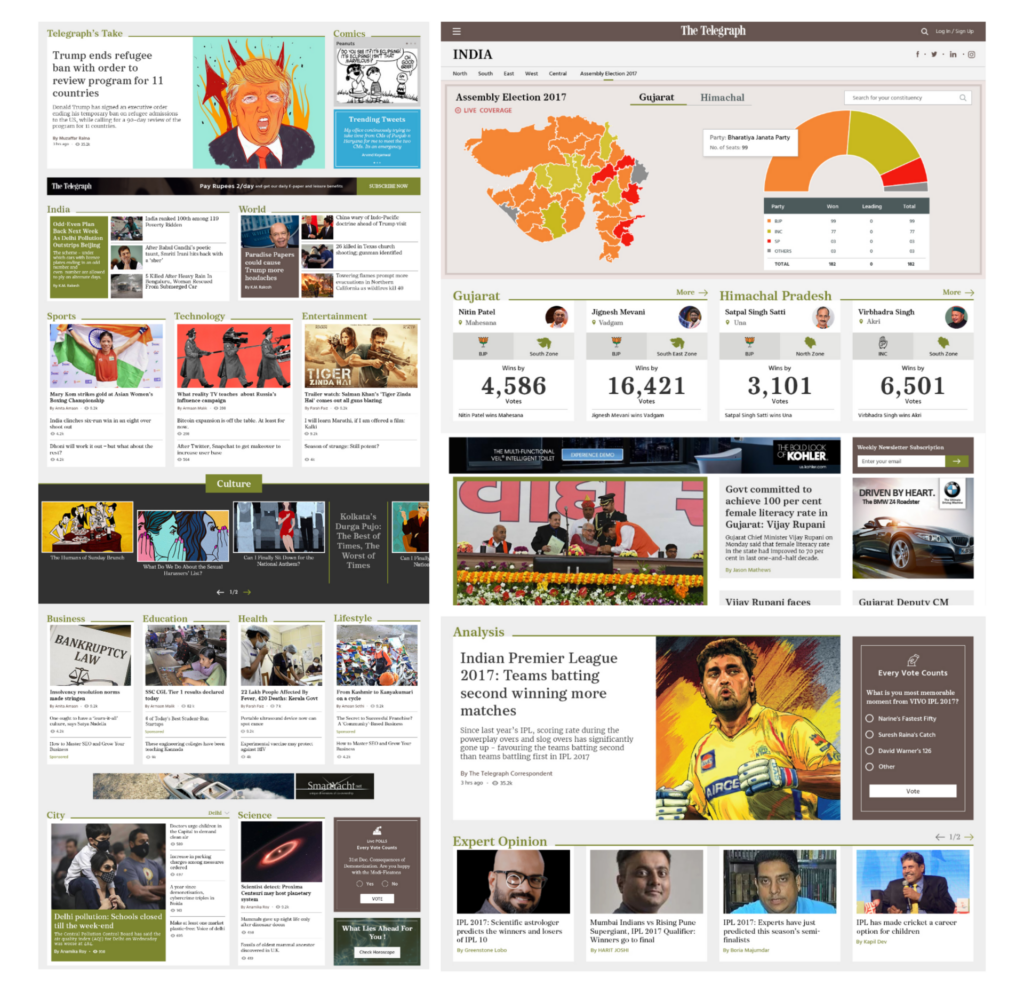
What differentiates Telegraph from other newspapers in India is its curated, fleet street and fearless journalism. This outstanding positioning had to be accurately represented in the digital medium through an effective design strategy and news portal UX best practices.
Key Strategic Interventions
Hierarchy in Visual Design
Visual hierarchy in the news portal UX was made easy for users to consume, through visual hierarchy.
Simpler Navigation
Simpler navigation for users to quickly move within the website.
Influenced by the Newspaper
Retaining the essence of the newspaper in the digital medium was critical for an effective experience.
KEY FEATURES
01
Enhanced Navigation
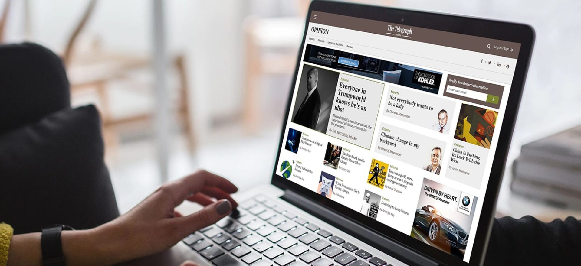
Similar stories and articles were stringed together, bringing them together through effective visual hierarchy news portal UX. This connection allowed for easy navigation, ushering users to traverse through more news articles around the central piece of content they initially landed on.
02
Packaged to Differentiate
- The blogs, articles, and news were differentially highlighted to bring forth their essence powerfully.
- The editors for every bit of content were given the much-deserved limelight through author-driven placements and page structuring across the website.
03
Extended Reach
By following responsive news website design patterns, we aimed to establish the brand for a pan-India and global audience. Making it accessible for users to consume news on any device was a critical step.
04
Telegraph’s Essence Kept Alive
Keeping in mind the tenets of bold headlines and fearless journalism, the design was conceptualized to reveal a visual interpretation of the same.
DESIGN ACTIVITIES
Consulting
Stakeholder
Workshop
Strategy and
product Definition
Visual System
UI UX Design
Prototyping
Front End
Development
Portal development
Product Impact & Outcomes
The transformed web news portal went live in 2018 and has been garnering superior user engagement.