Challenge
Think Design joined hands with Zeta Interactive to revamp their proprietary tool, Zeta Mail with advanced set of features, flexible framework, responsive design and a strong emphasis on the user.
User Centered Design among Enterprise IT companies was a new phenomenon in 2013. Staying true to the cause of our design principles and getting consensus on the approach and methodology across the board was a challenge to start with.
Our Methodology
We set off in the right direction by first involving stakeholders in our methodology and why we were spending time on what. We proposed to undertake user research in addition to our audit and stakeholder inputs in order to triangulate insights adequately.
USER RESEARCH
Personas were identified based on role, expertise and tasks; thereafter, we shadowed these Personas and made observations in the real context. Efficiency and task flow related concerns were readily identified during this exercise. A quick questionnaire with the users, helped us understand users’ key tasks and expectations while using the application and generic concerns.
In order to understand usability issues concerning novice users, Talk aloud was employed. This, coupled with shadowing resulted in understanding cognitive load, bottlenecks and frustrations.
Expert review technique was used after user research, to arrive at key usability concerns, bucketing and prioritization of actions and way forward.
WORKSHOP AND CONCEPTUALIZATION
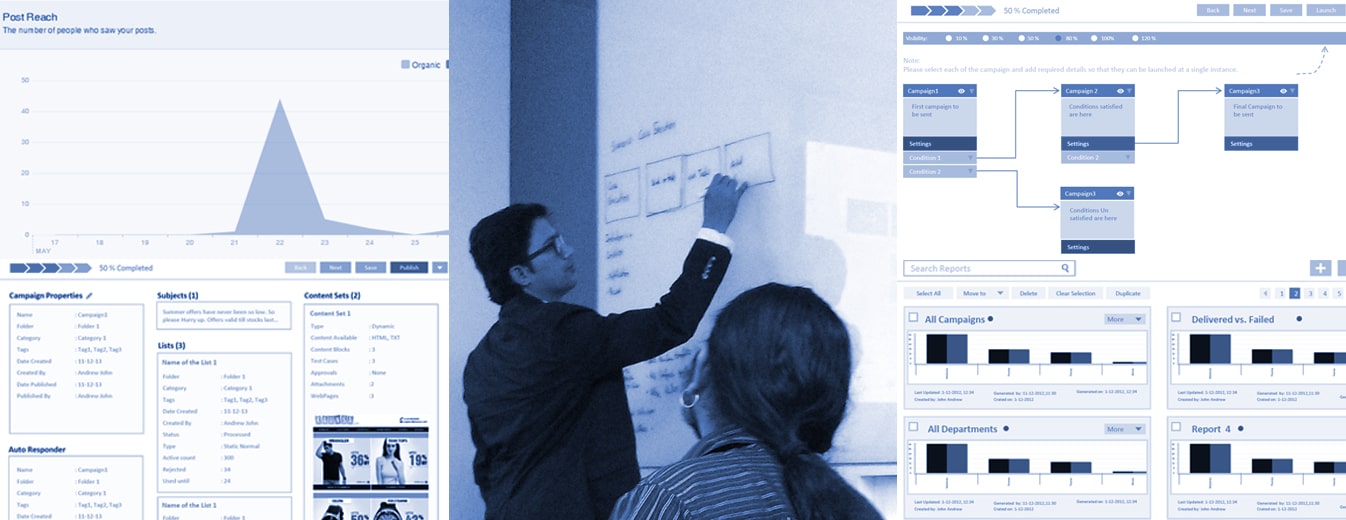
Workshop for building the new product helped teams establish technical and business objectives; and work towards a shared goal. Concept alternatives followed by discussions and feedback further aligned all teams.
SMART FRAMEWORK
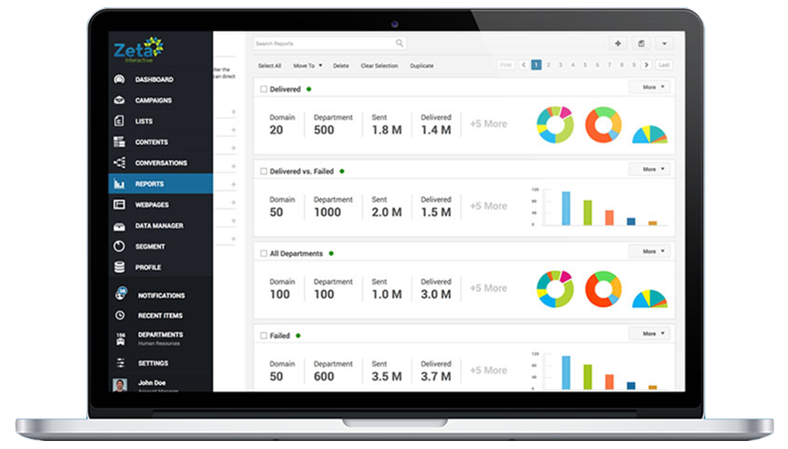
With numerous modules involving complex task flows, it was very critical to build a simple and user friendly tool without disrupting the process, existing users have adopted over years. A three-layered framework housed main menu – global tools – content area with context tools in single screen. This allowed for visual simplicity without compromising on the amount of information seen and ability to switch modules on the fly.
INTERACTION AND VISUAL DESIGN
Visual Design was dictated by seriousness and intensity of usage of this suite by its core users. Approach called for clear visual hierarchy, uncluttered information representation and use of neutrals and tertiaries. Interactions were designed to give affirmative feedback to users throughout the modules.
LIQUID LAYOUT
Being 100% desktop use application, it wasn’t needed to design the layout for mobiles. However, a certain level of scalability was incorporated, by making layout liquid from tablet landscape orientation to HD. This covered the entire breadth of devices and users of Zeta hub.
DESIGN ACTIVITIES
UX and Strategy workshop, User Research, Audits, Wireframing, Storyboarding, UI Design, Visual System, Front end development.
CURRENT STATUS
The new avatar of Zeta Mail was launched to the market in 2014.
ZETA MAIL
Intuitive enterprise solutions relevant to users needs
