We are at the threshold of a culture where data-driven decision making and data-driven organizations will become a common phenomenon. But how reliable, expedient and impactful are these decisions? As we explore the promise of data storytelling, we also inquire how critical can this be in helping us make decisions, which are both meaningful and actionable.
Hari Nallan & Mohita Jaiswal - March 2020 - Updated February 2023

Between the winter of 2013 and the fall of 2014, a hundred and forty thousand noise-related complaints were registered in New York City. In November, Margaret Chin, a councilmember from lower Manhattan, introduced a bill that would require the Department of Environmental Protection to start sampling noise across the city.
If you were a councilmember of the city, what would have driven you to make an impactful decision?
Consider three representations of data.
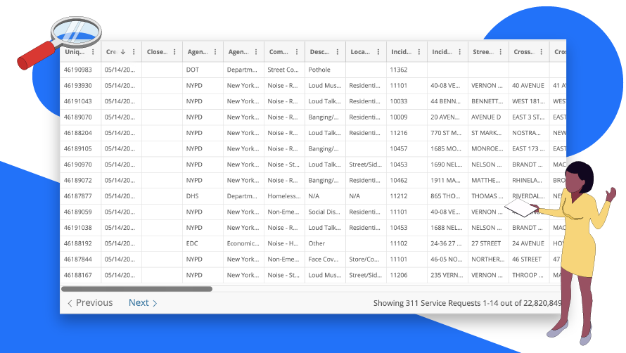
Data around noise complaints made by New Yorkers including type of complaint, time, place of complaint and the message
*Source
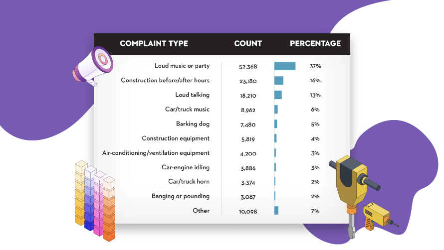
Bar chart indicating that the maximum number of complaints raised are around loud music or noise made around construction
*Source
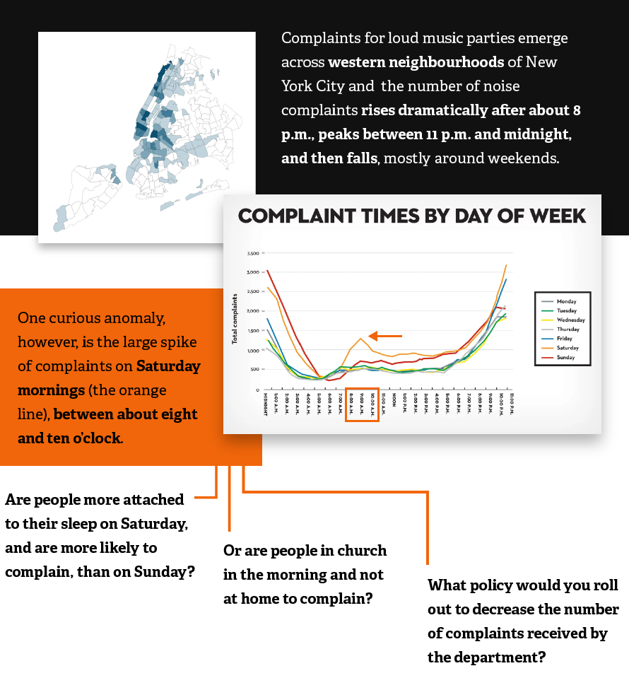
When are we driven to actions?
Simple data is complex to understand.
Using data tables to inform decision making can be overwhelming for a user, when rows and columns are used to represent data. Data visualization however, whether simple or complex, helps us make sense of data. When visualizations are created using charts which fit the context of the audience, they elicit greater comprehension and making out of insights.
Yeah I get it.
Now look back at the 3 boxes shared above, again. What do each one of these evoke in you?
- Is what you see memorable?
- Is it engaging enough to make you open to listening and enquiring more?
- Is it driving you to take actions?
The third box goes ahead in sharing a narrative. While facts (as in representation a) simply present data; whereas, a narrative provides context, which augments our understanding and drives valuable insights. While data visualizations represent a point in time, a data story (narrative) can elicit out a flow through time.
The power of data stories is its ability to generate insights that stimulate action.
Plugging in the missing link
When storytelling is added to the combination of data and visuals, we leap ahead from just sharing material/information to giving decision makers an experience. Stories are powerful as they transport ourselves in other people’s worlds and in doing so they change the way our brains work, and potentially change our brain chemistry.
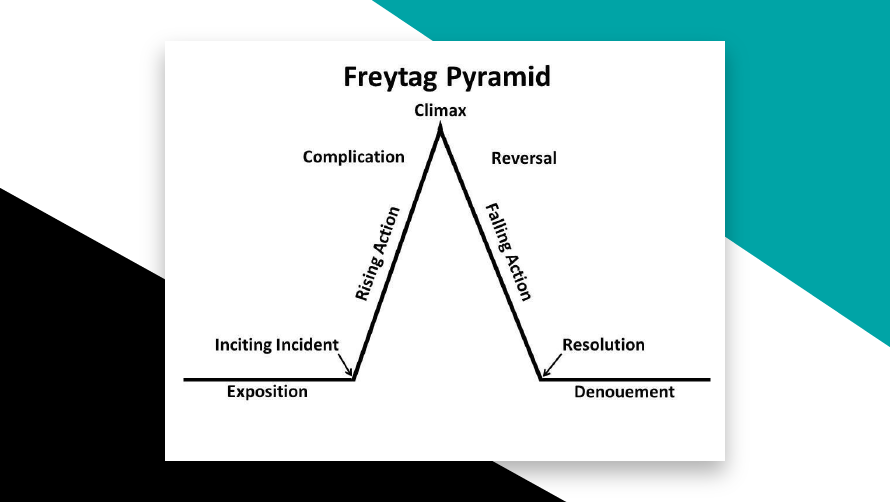
In the 19th Century, a German playwright and novelist, Gustav Freytag, talked about using a dramatic arc to inculcate in how we create stories. He drew a simple triangle to represent dramatic structure and highlighted seven parts he considered necessary to successful storytelling. The idea of what could keep people glued came to the forefront with the potential of impactful storytelling.
BI tools, dashboards, infographics and spreadsheets can all make out the complete advantage of opportunities data holds for businesses, when they begin to inculcate data storytelling as an important aspect in how they communicate insights to users. The most important aspects of telling a data story includes:
- Understanding the context – While data needs to be accurate, data also needs to be collected, analyzed, and understanding the context in which it needs to be presented. What goals or decisions need to be made using the insights from data, who are the people who will engage with this data, what are their challenges?
- Choosing an effective visual – An effective visual is necessary because it can eliminate the clutter(information which is not relevant) while making insights to stand out intuitively for the target audience. An effective data visualization is also tailored to the context of the audience to ensure that they are able to relate to it easily.
- Focusing attention through sharing a compelling narrative – Because stories have always been an easier form for the transmission of meaningful information, tying the visualization with a narrative, it answers some important questions. Users get to understand not just what happens, but the why behind it, the why behind why their data is behaving in a particular way.
- Ending with a set of options or questions – A data story starts out like any other story, with a beginning and a middle. However, the end should never be a fixed event, but rather a set of options or questions to trigger an action from the audience. This enables meeting the goal of data storytelling – to encourage and energize critical thinking for business decisions.
Changing behavior to change neurochemistry
Business decisions are not solely taken upon logic. As per neuroscience, decisions are often made upon emotion as emotions help to navigate the alternatives and help us to come to a timely decision, as compared to relying solely on logic.
Detailed information is found to stimulate only two areas of the brain -the language centers i.e. Broca & Wernicke areas whereas when someone is interested in a story it stimulates more areas of the brain. Information does not stimulate 5 other areas of the brain that have to do with images, sound, smell, movement, taste, etc.
So a series of events or data leaves us flat. While a well-told story is memorable, it makes us emotionally engaged as we suspend disbelief and can improve persuasiveness to action, as it urges us to take action and know the end.
As leaders around the world are relying on data-driven insights to make crucial organizational decisions, a coherent data storytelling strategy can by its nature drive them to more expedient, informed and impactful decisions.
What story does your data tell?


