Price comparison prevention makes it difficult to compare the price of offers or products with other offers or products leading to an uninformed decision.
Stuti Mazumdar & Symran Bhue - June 2022

How this pattern gets its name?
Price comparison prevention gets its name from the way the pattern works – it prevents comparing the price of similar products, services, offers, or bundles because there is no uniformity with respect to units that can be compared to make an informed decision about price and value for money.
How to identify this pattern?
This dark pattern is asymmetric (not in terms of presenting the information but in terms of the information itself) and deceptive. The metric being prioritized is conversion or revenue.
This dark pattern is implemented by designing bundled offers or services where it becomes difficult to compare the price of different bundles because of the composition of these bundles.
Examples
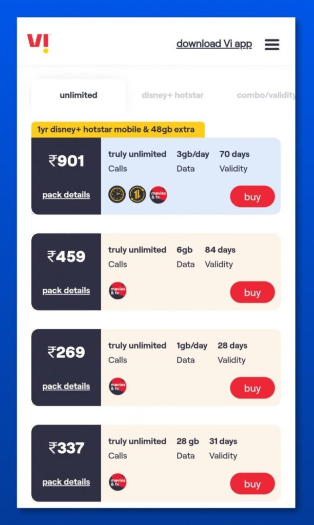
This kind of dark pattern can be seen anywhere where offers and services are sold in a bundle. For example, telecom websites, some e-commerce sites, and web hosting websites are full of price comparison prevention dark patterns. Let’s take a look at a simple example of a telecommunications company ‘Vi’. Vodafone is a British multinational telecommunications company that made an alliance with Idea in India and is registered as Vodafone Idea Limited. Vi is a pan-India integrated GSM operator offering 2G, 3G, 4G, 4G+, VoLTE, and VoWiFi services.
If as a consumer one visits the Vi app to choose which Talktime, SMS, and Data plan suit their needs the best, one can get thoroughly confused. If one only looks at the basics, there is no uniformity between the plan validity period and the data being offered, even if the Talktime is unlimited as well as in most cases so are the SMSs. To confuse the users further, most companies are also offering subscriptions to a streaming platform (In this case, Disney + Hotstar) bundled with the plans which again makes comparison with the rest to only one parameter almost impossible.

How to make it an ethical design pattern?
Making this dark pattern ethical is fairly simple and the way to do that is to allow easy price comparison for users to make an informed choice.
One, bundling in such a way that there is uniformity across all but one parameter rather than more than one parameter will allow users to make easy comparisons. Two, transparency in the rationale of bundling will give users a fair idea of how to go about making a selection of the right bundle for them. Three, bundling only when required or allowing the users to create their own bundles will move the scale in your favor and in the user’s interest leading to greater brand loyalty.


