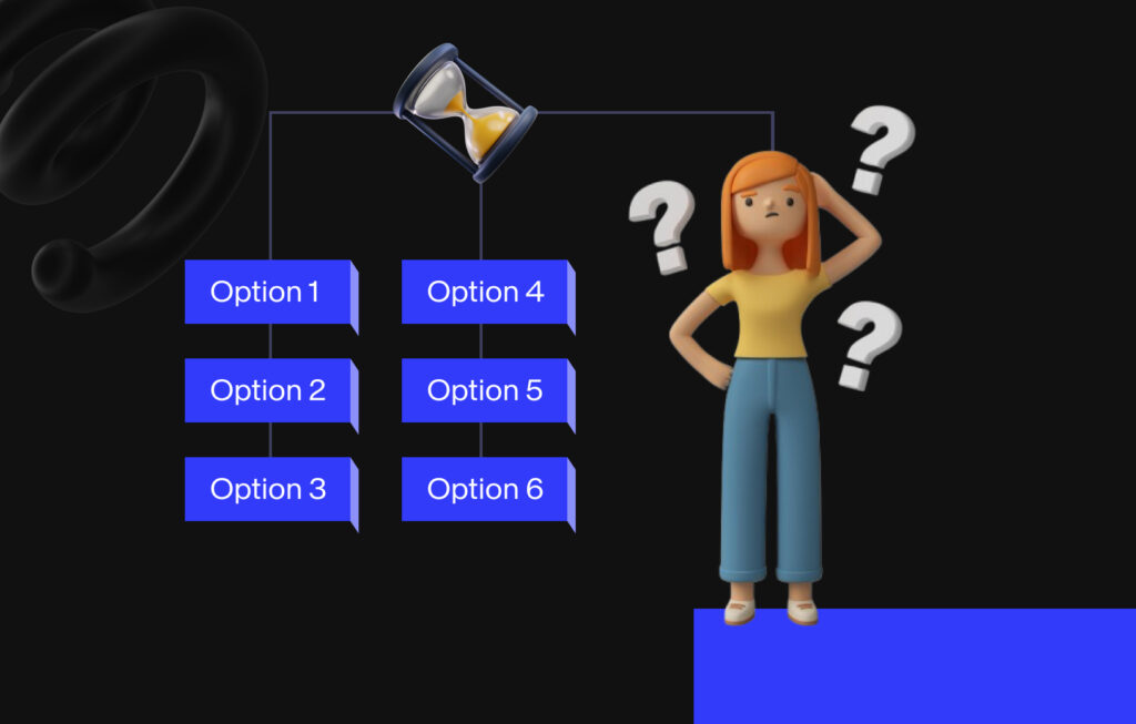
To fully appreciate Hick’s Law in UX Design, it’s important first to understand the decision-making process. When a user is presented with too many options, the brain has to filter out unnecessary information, leading to what is known as choice overload. This can result in frustration, abandonment of the task, or even decision fatigue, where users do not decide at all because the cognitive load is too high.
As UX designers, applying this principle helps us understand the impact of too many choices on users’ decision-making processes, particularly in navigating user interfaces. In this blog, we’ll explore the Hick-Hyman Law in detail, how it associates with UX, and how to effectively apply Hick’s Law to improve the user experience.
Stuti Mazumdar - December 2024

The Decision-Making Process and Why It’s Important
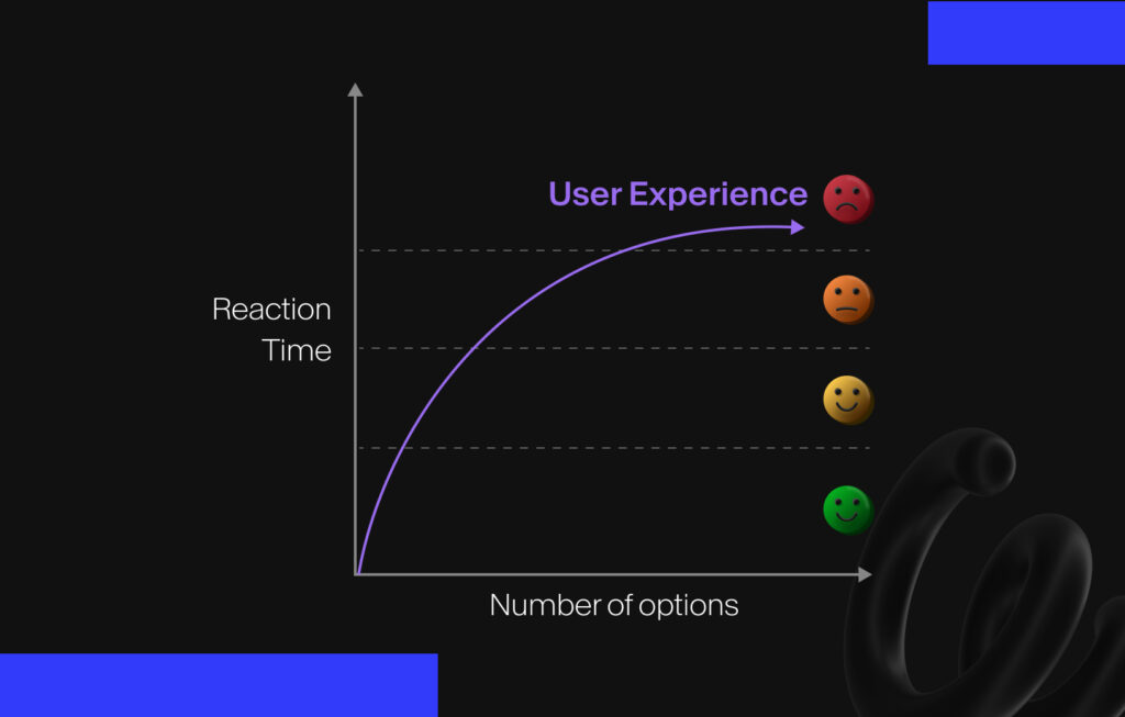
The law states that, given multiple choices, users will take a longer time to decide. But, not all choices are equal. The complexity of each option, its relevance to the task, and how it’s presented visually—considering that they are all subjective aspects in nature—can also impact decision-making time. Therefore, understanding Hick’s Law helps UX designers optimize user interfaces by reducing the cognitive load on users.
What is Hick’s Law?
Applying Hick's Law in UX Design

1. Simplify Navigation Across the Journey
For example, categorizing options into hamburger menus may be an old technique in the textbook but it works! Additionally, instead of displaying every possible option on the homepage, categories and subcategories break down the choices into more manageable chunks, allowing users to quickly navigate to the section they need.
2. Group Related Information
Reducing the number of options doesn’t always mean eliminating choices. It could involve grouping related choices to make it easier for any user to make a decision. For instance, when designing an e-commerce site, a designer might group items into categories such as “Gender Neutral”, “Men’s,” “Women’s,” and “Kids.” This allows the user to first narrow their options, which simplifies the decision-making process.
3. Prioritize Important Actions at All Times
Another way to apply Hick’s Law in any digital design project is to prioritize primary actions and make them more prominent—akin to the way we study hierarchy. Highlighting the main call-to-action (CTA) buttons while not highlighting the less important choices can hint at the suggested next step for users to make faster decisions. For instance, on a checkout screen, prioritize a “Proceed to Checkout” button over “Continue Shopping”. By reducing the number of equally prominent choices, users can make faster, more confident decisions.
4. Use Progressive Disclosure
Roadblocks in Applying Hick’s Law to a Design Framework

While Hick’s Law is a useful design principle, it’s important to recognize that it doesn’t apply equally to all situations. For instance, the number of choices alone doesn’t always determine the reaction time of a user. Factors such as familiarity with the interface, known design patterns used, visual hierarchy, accessibility, and the clarity of choices displayed (content design) also play a significant role in the decision-making process.
Additionally, not all tasks require the same level of cognitive processing, some tasks may involve complex decision-making processes. For instance, users may need to evaluate multiple factors before choosing a scenario that involves customization, while others may require simple yes/no decisions. Thus, the constants that depend on the task are important in determining how Hick’s Law will affect user behavior.
In modern UI and UX design, Hick’s Law is applied in various ways to create seamless experiences. SERPs have moved toward minimalist design to ensure users get relevant search results with the least friction. Moreover, large-scale media companies have been making it increasingly easy for users to stay on their platform through recommendation systems that personalize your experience and help you make quicker decisions.


