Typography has long been the backbone of graphic design, shaping the way we absorb information, feel emotion, and experience visual storytelling when trying to connect not only with products but also with digital experiences globally. But as design continues to evolve, so does typography—breaking free from tradition and embracing the unconventional. Experimental typography design challenges these rules, introducing fluid structures, unexpected placements, and types that defy readability conventions.
At Think Design, we see typography as more than just a vessel for words. It’s a crucial design element in itself—one that carries meaning beyond its literal message, one that’s a standalone aspect of design rather than just being married to the content displayed as part of the experience. Experimental typefaces aren’t just about aesthetics; they’re about provocation, expression, and reshaping how we perceive design.
Stuti Mazumdar & Vidhi Tiwari - August 2024
“Display type is a visual voice. Without, reading, it imparts its message.”
— Laura Worthington | Award-Winning Typeface Designer
But how far can type go before it becomes unreadable? And in a world where digital interfaces require clarity, how do designers balance experimental typography with function? Let’s explore with our experts here, at Think Design.
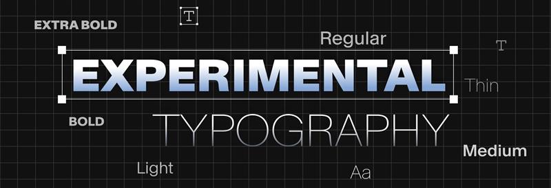
Experimental Typography: What & Why?
Key elements to creating a successful experimental typeface often include:
- Distorted letterforms that challenge readability for users.
- Layered typefaces that interact with images or textures, often playing with the maximalism graphic design aesthetic that is currently trending.
- Non-linear compositions that break the traditional text alignment rules that most designers still follow.
- Kinetic typography that moves and transforms dynamically, often based on the interactions of the user with the experience.
It’s always about making people feel something—even before they read the words or grasp the essence of what’s being conveyed.
Typography is evolving beyond its role as a “neutral” design component. Today, it’s an active participant in storytelling. Designers must often begin with free experimental fonts that embrace irregularity or bespoke experimental typefaces that redefine legibility, this design approach aims to engage audiences in new ways.
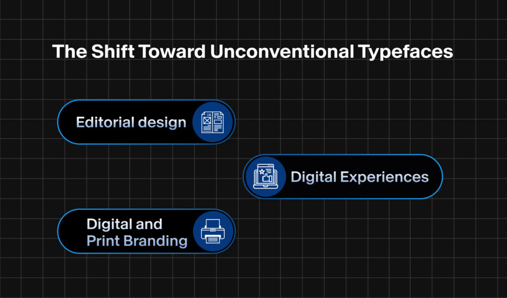
The Shift Toward Unconventional Typefaces
Historically, sans serif typefaces ruled the digital world owing to their clean lines and legibility—loved by all. But designers are increasingly embracing experimental typefaces that defy expectations including serifs with exaggerated strokes, condensed forms, or letters that seem to be melting or expanding.
This shift can be witnessed in
- Editorial design: Magazines using experimental fonts to create dynamic layouts.
- Digital and Print Branding: Logos that lean into distortion and anomaly for a unique identity.
- Digital Experiences: Using typography that adapts, moves, and interacts with users.
The resurgence of free experimental fonts has also democratized this initiative, allowing independent designers and brands to experiment with fonts without the need for massive budgets.
We see this as a natural response to the oversaturation of minimalist branding. As brands fight for individuality and the much-needed spotlight to survive in the cutthroat industry, typography becomes their voice.
Legibility vs. Expression: How to Create the Perfect Balance?
In the world of branding and marketing, expressive typography helps build recognition. However, for product designers, clarity still wins. However, that doesn’t stop designers from experimenting with typefaces. Even digital interfaces can incorporate subtle experimental elements, like animated typography or asymmetrical layouts.