In the world of digital design, we often focus on color as an integral part of UI to guide users through an experience, show visual feedback, and create visual delight when the user does an action. But what happens when a user can’t distinguish between the colors you’ve chosen? That’s the reality for hundreds of users who suffer from color blindness, also known as color vision deficiency.
Stuti Mazumdar - July 2025
Understanding Color Vision Deficiency (Color Blindness)
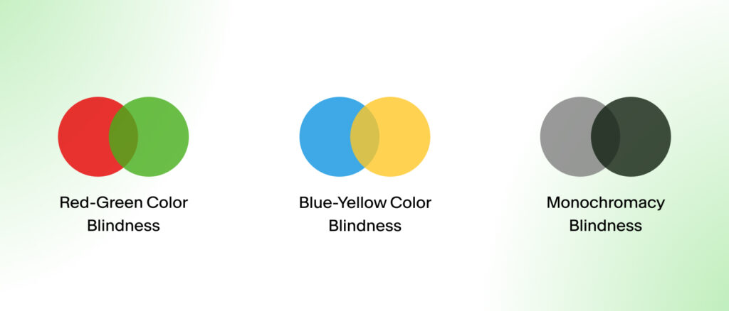
1. Red-Green Color Blindness
This is the most common form, often taught about in school as an exercise to diagnose students at an early age. People can suffer from several variations of this:
- Protanomaly: Red appears dull or greenish
- Deuteranomaly: Green appears red.
- Protanopia or Deuteranopia: People can’t tell the difference between red and green at all.
Red and green are widely used in UI for opposite states: accept and decline, success and error, submitted and rejected. If those two hues are indistinguishable for some, the entire experience makes no sense.
2. Blue-Yellow Color Blindness
Much less common amongst people around the world, but the people suffering from this condition make up a large part of our users:
- Tritanomaly: Yellow and red or blue and green are hard to tell apart.
- Tritanopia: Blue and green, purple and red, or yellow and pink become confusing for people.
In such cases, using extensive data visualizations and elaborate CTAs is often the biggest pain point.
3. Monochromacy
This rare form affects only 1 in 30,000 people. Also known as achromatopsia, people with this condition see only black and white. All colors and hues disappear, leaving only contrast and shapes to communicate meaning.
Why Does Inclusive UI Design for Colorblind Users Matter?
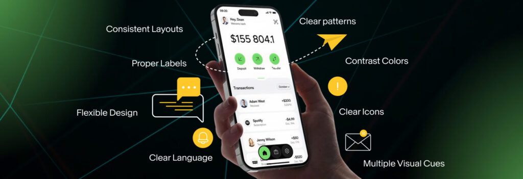
Design is more than just aesthetics. It’s about communicating and skillfully navigating users through digital products. When we rely only on color to communicate, we cut off access for a large portion of our user base. We may end up greatly overlooking colorblind people who find it impossible to recognize an alert if it’s in red; identify disabled and active states if they’re greyed out; read charts or filters that rely on color coding; and find links if they aren’t underlined or clearly interactive.
People who don’t suffer from colorblindness often take these “naturally” occurring cues for granted, often alienating a large population of users and pushing them away from the digital experience being crafted.
Best Practices for Designing Accessible Interfaces
Here’s how to make sure your UI design are not only captivating but also functional for all users—including those with a color vision deficiency.
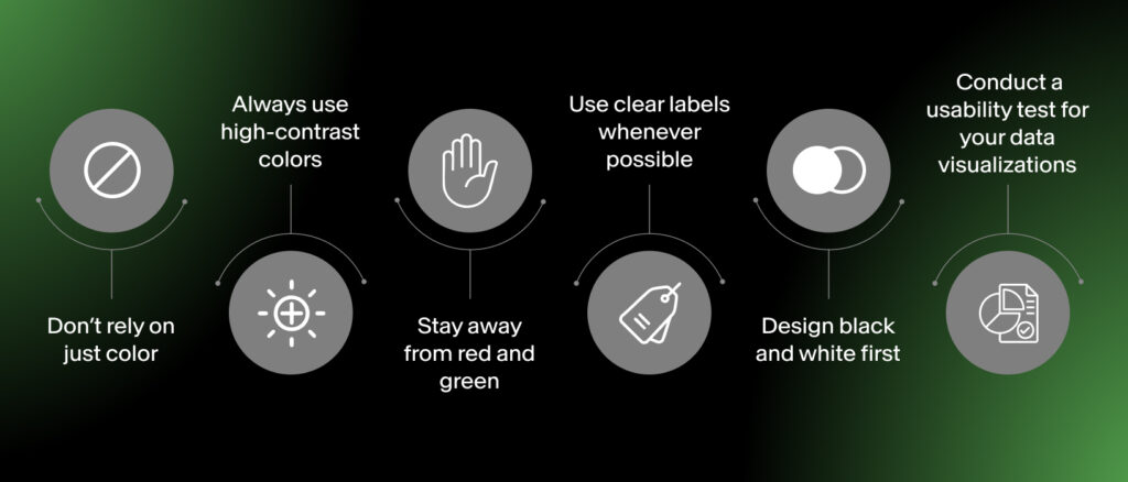
1. Don’t Rely on Just Color
Always ensure you pair the colors you choose with another kind of visual cue to help everyone identify the action easily. For instance, use a check icon over a green background, or use a warning sign with an error message instead of using just the color red. If you’re designing for accessibility, never assume color alone will do the job.
2. Always Use High-Contrast Colors
Even among users without visual impairments, low contrast makes text and UI harder to read. For those with color blindness, high contrast can mean the difference between usable and unusable. Use tools like Contrast Checker and the like to maintain at least a 4.5:1 contrast ratio for body text or smaller text like tooltips, and at least a 3:1 for large text or bold headlines and subheadlines.
3. Stay Away From Red and Green
Since red-green blindness is the most common, avoid pairing these colors to indicate opposite actions. Use alternative combinations, different hues, or add icons whenever possible to distinguish meaning.
4. Use Clear Labels Whenever Possible
In products and services where users are selecting colors (for instance, an online store or design tool), label each color with an identifier other than the color itself. Instead of just showing a swatch, add text like “red”, “blue”, or “green”.
5. Design Black and White First
If the UI you designed works well in grayscale, it will likely work well for users with extreme cases of visual impairment, too. Ensuring that you cater to such users at the very beginning of your design process makes the process of Many designers now prototype in black and white to focus on layout, contrast, and hierarchy—then layer color in afterward.
6. Conduct a Usability Test for Your Data Visualizations
It’s highly recommended to conduct a thorough usability test to ensure the icons, data visualizations, data charts, and illustrations are screen reader-compatible, clearly labeled (not simply color-coded), and colorblind-friendly.