As we witness the growing complexity of digital products, breadcrumbs aren’t just navigational aids anymore, they visualize a user’s mental models when navigating through an experience. A subtle but powerful design element, breadcrumb navigation is often overlooked in conversations around UX innovation. But when designed with intention, breadcrumbs can become the invisible thread that weaves structure, clarity, and confidence into your user journey.
At Think Design, we often say that “good design disappears into the experience.” Breadcrumbs are a classic example of that philosophy—when they’re doing their job right, users barely notice them. But as you take them away in a complex interface, users start to feel lost. Let’s discover how breadcrumb navigation works, when to use it, and how to design it.
Stuti Mazumdar - July 2025
What Are Breadcrumbs in Design?
Breadcrumbs are a form of secondary navigation that shows a user their location within the digital hierarchy of an experience. Think of them as the trail of links you leave behind while navigating through a product or website.
They’re typically located near the top of the page, displaying a clickable path from the homepage to the current page across your entire journey.
Why Breadcrumb Navigation Matters
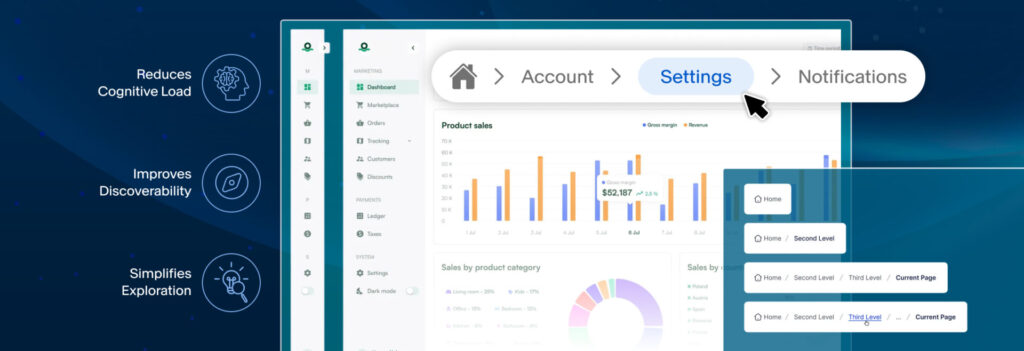
1. Reduces Cognitive Load
When users enter your site or product through an alternate entry point (for instance, an affiliate link or search results for a specific keyword), they might not know where they are within the information architecture you’ve created. Hence, breadcrumbs tell them instantly where they are and where they need to head next.
2. Improves Discoverability
Breadcrumbs act as a secondary map that help in discoverability. If a user landed on a specific category page in an eCommerce site (through a shared link), the breadcrumb trail helps them explore the overarching category it’s under, without needing to hit the back button endlessly.
3. Simplifies Exploration
Breadcrumbs help users branch out into categories and content directly linked to the page they are currently viewing. Instead of exiting the experience when they’re done, users may feel encouraged to continue the journey by exploring relevant information, thus, improving user retention and reducing bounce rates.
Types of Breadcrumb Navigation
Choosing the right structure depends on your content, information architecture, and the user behavior you wish to drive across the experience. Here are the types of breadcrumb navigation you can choose from:
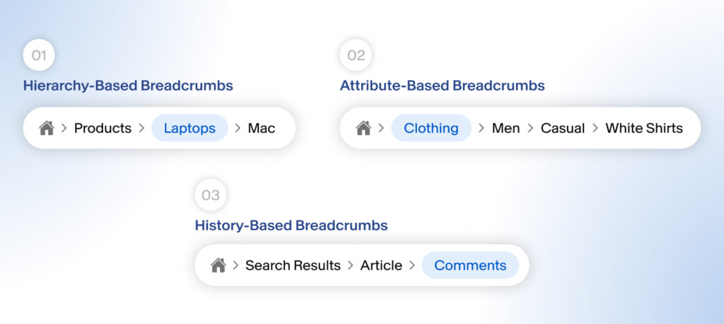
1. Hierarchy-Based Breadcrumbs
This is the most common type, showing the path from the homepage to the current page. Also known as location-based breadcrumbs, they highlight the page’s place within the site’s overall organization, like a site map.
For instance, Home > Products > Laptops > Mac
2. Attribute-Based Breadcrumbs
Most commonly found in e-commerce experiences, these reflect product filters or tags to effectively communicate a user’s current position in the experience.
For instance: Home > Clothing > Men > Casual > White Shirts
3. History-Based Breadcrumbs
These are simple. They reflect the user’s click history, similar to the browser back button.
For example, Home > Search Results > Article > Comments
When (Not) to Use Breadcrumbs
Breadcrumbs are incredibly useful—but they’re not always necessary. They may clutter your screen or cause unnecessary confusion if used incorrectly or when not needed. Here’s how we make the distinction.
When can we use them?
- Your product has more than two levels of hierarchy. That is, your information architecture has 2 levels.
- Users are likely to enter in the middle of a pre-defined journey, including search results, links, etc.
- You want to promote contextual discovery, improve engagement and retention.
When to avoid them?
- The experience is linear.
- You don’t have a clear hierarchical structure.
- If your product serves a singular purpose with minimal navigation.
Best Practices for Designing Breadcrumb Navigation
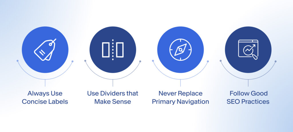
1. Always Use Concise Labels
The breadcrumb should reflect the page title or category name, clearly and in a concise manner. Keep labels short and easy to scan, as no one spends time reading them. It’s highly recommended to use known keywords as your page labels.
2. Use Dividers That Make Sense
Most breadcrumbs use a greater-than symbol (`>`) to indicate progression. But in some cultures and contexts, other dividers (`/`, `→`) may be more intuitive. Maintain consistency with the design language across your experience.
3. Never Replace Primary Navigation
Breadcrumbs are secondary. They support the user by guiding them as part of the content on the page or experience. Don’t use them as a replacement for your main navigation bar or hamburger menu.
4. Follow Good SEO Practices
They can also enhance SEO by helping search engines understand page structure. Ensure you use keywords globally understood to allow web crawlers to map your page better for SERPs.