Digital design trends directly reflect continually evolving industries and the technology integrated within them. And as design continues to evolve, so do its principles. It moved from skeuomorphic interfaces, which mimic real-world objects in design, to the sleek and minimalistic design era. However, in recent years, skeuomorphic design has made a subtle but strategic comeback.
While skeuomorphism was once dismissed as an outdated aesthetic, its resurgence as one of the modern digital design trends is not just about nostalgia—it’s about enhancing usability, engagement, and accessibility.
In this blog. Our experts explore skeuomorphic design’s origins, modern applications, and limitations.
Stuti Mazumdar - March 2025
What is Skeuomorphic Design?
Skeuomorphic design is a design approach that mimics real-world objects, textures, and materials on digital interfaces through various elements throughout a product or experience. For instance, consider the early save icons on iPhones; they were shaped like a real floppy disk. The buttons across the iOS experience resemble glossy buttons, making them look like real ones, and photos appear with white borders to give users the illusion of physical photographs.
To help new designers identify skeuomorphism in the wild, here’s a list of elements our experts have curated to help designers identify attributes unique to skeuomorphic design:
- Realistic shadows, textures, and gradients mimic depth in elements just like the real world.
- Microinteractions that mimic real-world behavior. For instance, buttons that “press down” when clicked or tapped on.
- Familiar visual icons that make for an intuitive experience. For instance, using a trash bin icon for deleting files.
The foundation of skeuomorphism was set during the early days of graphical user interfaces (GUI), helping users transition from physical processes to digital interfaces easily by creating familiar affordances.
Why Did Skeuomorphism Fade Away?
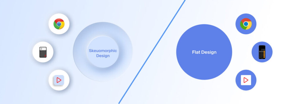
While skeuomorphic design was critical to early UX design practices, it was eventually overtaken by modern design trends with the rise of flat design and minimalism.
Some of the critical reasons that led to the downfall of skeuomorphism as a design trend were:
- Cluttered Interfaces – Heavy textures and gradients made UIs feel busy.
- Performance Issues – High-detail elements slowed down devices.
- Over-Reliance on Realism – Realism compartmentalizes designers and their vision, causing iconography and UI to not match the overall aesthetics of the product or experience being created.
Modern Uses of Skeuomorphic Design
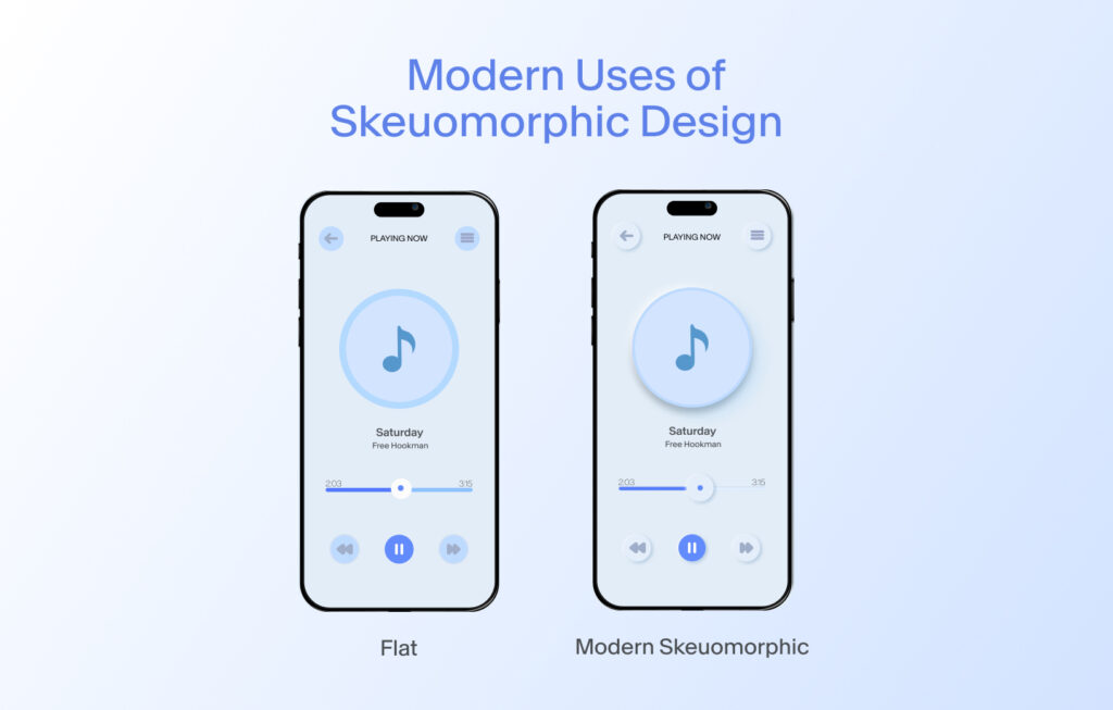
Today, skeuomorphic elements are strategically integrated rather than dominating entire interfaces. Here’s where skeuomorphism still plays a vital role:
1. Enhancing User Engagement in Digital Products
Modern apps use subtle skeuomorphic elements to create engaging, interactive experiences, especially through micro-interactions that still bring delight to new-age users.
2. Improving Accessibility & Learnability
One of the strongest arguments for skeuomorphic design is its usability for non-tech-savvy users. Real-world metaphors reduce the learning curve. For instance, smart home interfaces use realistic buttons, switches, and dials for all the appliances to help users intuitively understand functions.
3. Elevating AR and VR Experiences
With AR/VR technology growing, skeuomorphic design is crucial in creating immersive, interactive environments that feel intuitive and familiar to the users. For instance, automotive AR dashboards use skeuomorphic dials and indicators to maintain familiarity for drivers interacting with a virtual experience.
Striking the Right Balance Between Skeuomorphism and the Modern Design Principles
The key to effective experience design is not defining a strict boundary between skeuomorphism and the minimalistic design style—but rather a balanced integration of both. Here’s how Experience designers are doing it for optimal usability:
- Using Skeuomorphism Minimally: With subtle depth effects, shadows, and lighting to enhance UI affordances without cluttering the overall interface.
- Utilizing Neumorphism: This is a modern take on skeuomorphism, focusing solely on soft shadows and depth for a sleek, futuristic UI.
- Integrating Adaptive Skeuomorphism: Using contextual realism in AR/VR and haptic-based UI where needed.