Waterfall Chart
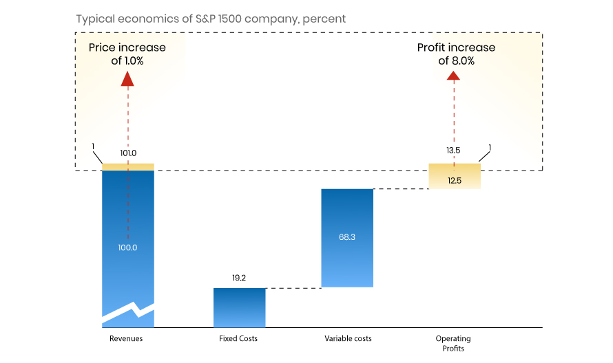
History of Waterfall Popular as the flying bricks chart due to its apparent suspension of columns (bricks) in mid-air, the waterfall chart is also known as a Mario Chart. Often in finance, it has also been referred to as a bridge. The waterfall chart is often used by strategy consultants to show the sources of […]
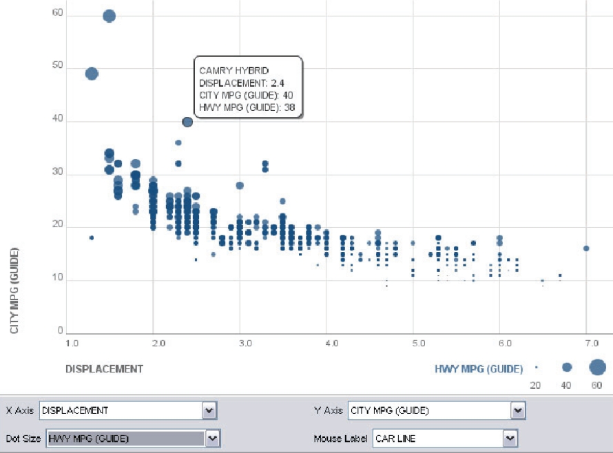
Scatterplot
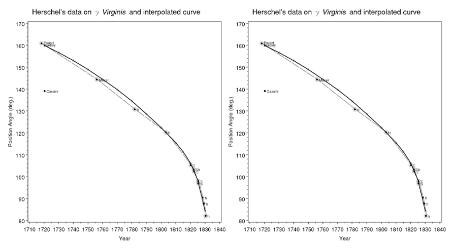
History of Scatterplot Statistician Edward Tufte notes scatterplots comprise over 70% of scientific publication charts. The first appeared in 1833 by John Frederick W. Herschel, plotting double star positional angles against measurement year to uncover orbital relationships, not mere trends. Herschel’s data on the orbits of Virginis, together with his eye-smoothed, interpolated curve (solid line, […]
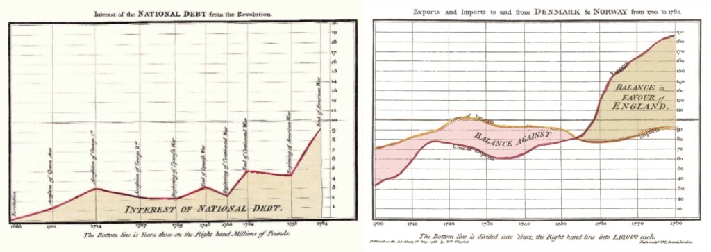
Line Chart
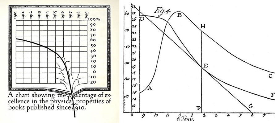
History of Line Chart Early pioneers include Francis Hauksbee, Nicolaus Samuel Cruquius, Johann Heinrich Lambert, and economist William Playfair. Playfair’s 1786 Commercial and Political Atlas featured 43 line chart variants exploring economic/political time-series data. Lambert used them in 1767 physics discoveries. By 1919, parody graphs like Dwiggins’ printing standards critique showed their cultural reach. Published […]
Histogram
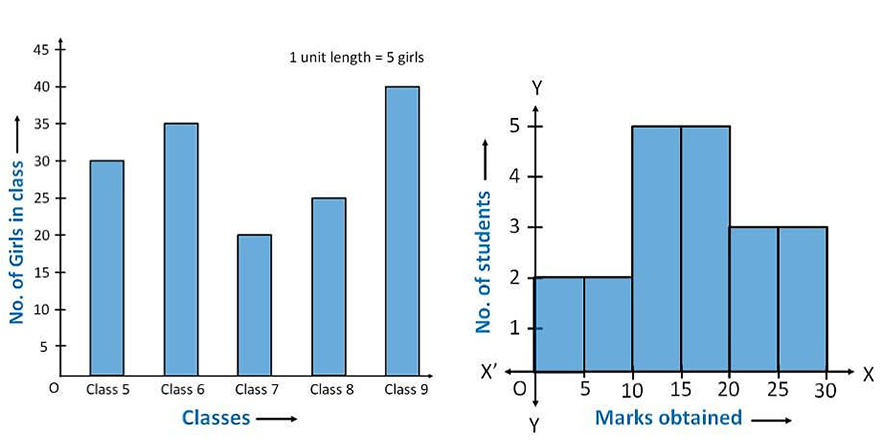
History of Histogram Karl Pearson, a pioneering English mathematician and statistician, introduced the term “histogram” in 1891. He developed this statistical tool to represent continuous data through a diagram like a bar chart. Pearson envisioned histograms as a “historical diagram” meant to chart temporal data such as historical time periods, which inspired the name deriving […]
Bubble Chart
History of Bubble Chart Bubble charts were introduced by Fernanda Viegas and Martin Wattenberg as visualizations using labelled circles, where the area of each bubble is proportional to its data value. This design performs a visual square-foot transformation, making it an effective way to display hierarchical or quantitative data. Since their introduction, bubble charts have […]
Area Chart in Data Visualization
There are different types of area chart, including stacked and 100% stacked charts, which layer multiple data series to illustrate their contributions to a whole. This makes area charts especially useful in scenarios where the relationship between components and totals is important, such as revenue versus expenses or segment-wise sales over time. Tools like Power […]