Choropleth
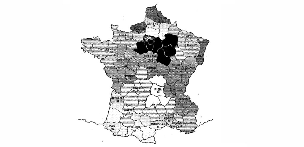
History of Choropleth The history of the choropleth map dates back to 1826, when Charles Dupin created the first one to depict literacy levels by department in France. These early visualizations were called “cartes teintées” or color maps. The term “choropleth” was introduced in the mid-20th century by John Kirtland Wright of the American Geographical […]
Cartogram Map
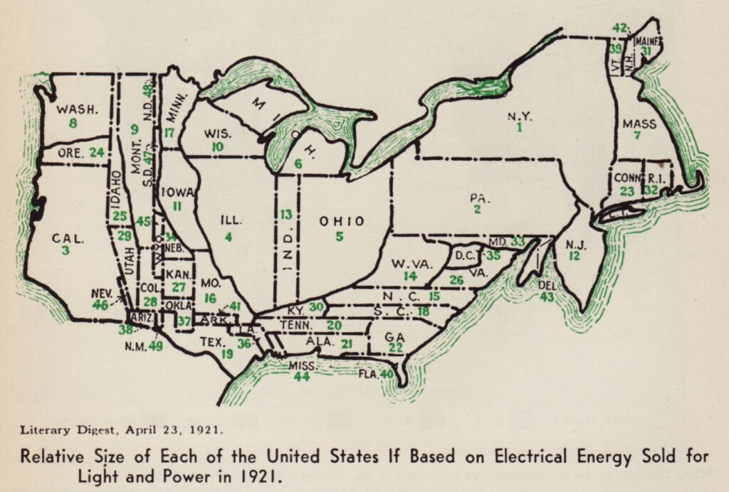
History of Cartogram In 2025, cartogram maps continue to evolve as powerful tools for visualizing complex spatial data. Modern cartograms not only distort shapes to emphasize data patterns but also incorporate advanced techniques such as color-coding and interactive features, enabling users to explore data dynamically. These maps are widely used in fields like politics, economics, […]
Bar Chart in Data Visualisations for Better Decision-Making
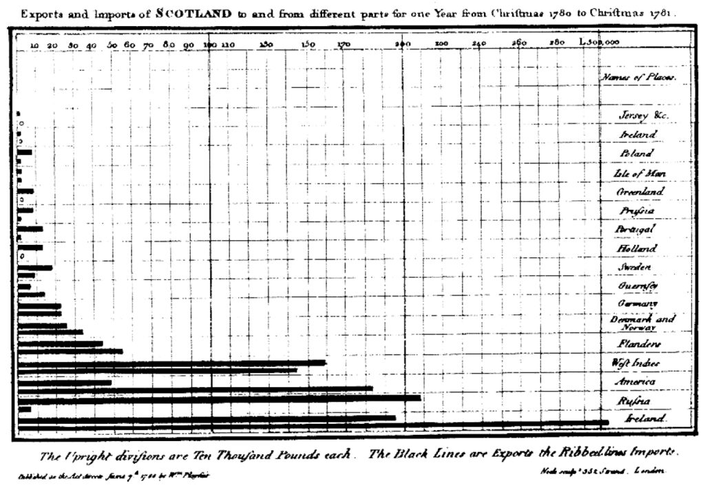
Bar charts are a fundamental tool in data visualization, widely used for their simplicity and effectiveness in making comparisons across categories. Following best practices in bar chart design – such as starting the value axis at zero, maintaining consistent bar widths, and using clear labels, ensures accurate and honest representation of data. Whether you’re creating […]
Area Chart in Data Visualization
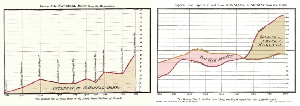
There are different types of area chart, including stacked and 100% stacked charts, which layer multiple data series to illustrate their contributions to a whole. This makes area charts especially useful in scenarios where the relationship between components and totals is important, such as revenue versus expenses or segment-wise sales over time. Tools like Power […]