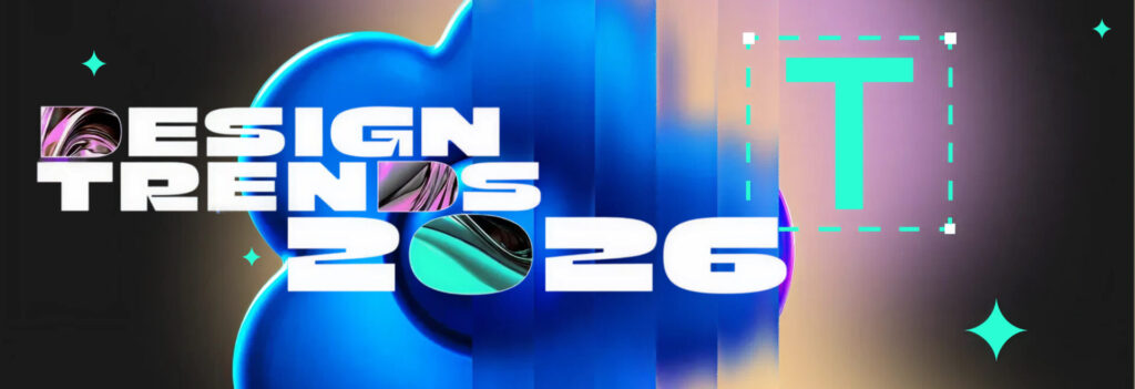
Design in 2026 sits at an interesting crossroads. We’re no longer debating whether digital design matters to business outcomes—that argument is settled. The conversation now is about how visual design can keep up with a world where AI generates layouts in seconds, users live simultaneously across devices, and brand identities are expected to feel real even when they exist only on screens. This is a moment of possibility: the tools are more powerful than ever, but so is the responsibility to use them with intent.
What follows are seven design trends in 2026 that actually matter; not because they look good on moodboards, but because they’re reshaping how we create visual elements, build products, and express brands in the digital world.
Stuti Mazumdar - February 2026
“Trends are observations, not instructions. The question isn't whether tactile textures or AI-generated systems are 'in’. It's whether they solve the problem your users actually have.” —Deepali Saini, CEO at Think Design Collaborative
1. AI-Generated Visual Design Systems Need Human Strategy
AI can now spin up visual elements—and to a certain extent, design systems including color palettes, layouts, icon sets, even brand identities—in minutes. The result: 88% of executives are increasing their AI budgets for agentic functionality, betting that automation will transform how teams create visuals. This acceleration is rewriting production timelines in digital design. But speed has a cost: AI tends to optimize for pattern-matching, not for meaning, differentiation, or long-term coherence linked to the brand or organization.
The real opportunity is in treating AI as an extension of the design team, not its replacement. Use AI to generate multiple directions quickly, explore style combinations once your team creates design guidelines especially suited for the model you’re using, or propose alternative visual elements, but let humans decide what aligns with the product’s purpose and the brand’s voice—after all, they are the ones that make the brand what it is today. AI can suggest hundreds of options; only a strategy can tell which one belongs in the ecosystem of an organization. The most compelling visuals that feel right in 2026 are those where automation handles the volume, and designers handle the judgment.
2. Tactile Textures and Hand-Drawn Details Make Digital Feel Real
After a decade of hyper-polished interfaces, there’s a noticeable shift: users are gravitating toward visuals that ‘feel’ human. Tactile textures like grain, paper-like surfaces, and hand-drawn details are appearing across websites, apps, and brand identities. Mixing photography, scribble-like typography, cut-out shapes, etc. are blurring the lines between digital and physical at the moment. Interestingly, searches for “tactile design” have grown 30% year over year, as designers are increasingly reaching for texture and distinctiveness in an increasingly synthetic digital world.
This isn’t nostalgia for its own sake. In the digital space, flooded with AI-generated content, tactile cues signal intention and authorship. The key is balance: a single hand-drawn accent or subtle texture can anchor an otherwise clean interface, giving users something to emotionally connect with without sacrificing clarity or performance.
3. High Contrast Color Palettes Are About Function, Not Just Style
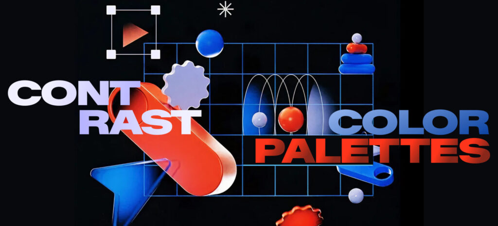
High contrast color palettes are everywhere in 2026, and it’s not only because they look bold on social media. High contrast improves legibility, supports accessibility, and creates instant visual hierarchy in dense digital spaces. As interfaces compete for attention in crowded feeds and multi-tasking workflows, low-contrast, washed-out designs simply don’t stand a chance.
The strongest design systems use contrast with precision. Primary actions, alerts, and navigation get the highest contrast, while long-form reading areas remain more muted to reduce eye strain. Don’t be alarmed, brand identities can still be soft, nuanced, or understated but when it comes to core user flows, high contrast is no longer optional. It is the difference between “design that feels nice” and design that can be used quickly, by more people, in more conditions.
4. Spatial Design Adds Depth When Needed
Spatial design is moving from experiment to execution. With mainstream hardware supporting AR, VR, and mixed reality, we’re seeing more interfaces that use depth, layering, and 3D positioning to organize information in the digital space. A clear indication lies in the XR hardware shipments that were projected to hit 40M+ units by 2026, driven largely by Apple Vision Pro and competing devices pushing spatial computing into everyday workflows.
Done well, this can make complex systems easier to navigate: think dashboards where panels sit in layers, or product experiences where 3D visual elements reveal information as you move around them. The trap is treating 3D as a visual gimmick. Spatial layouts should earn their place by clarifying relationships between objects, steps, or states, not by adding visual noise.
“In 2026, the question is less “Can we make this spatial?” and more “Does depth make this easier to understand or navigate?” If not, flat still wins” — Gaurav Shravage, Head of Design & Emerging Practices at Think Design Collaborative
5. Multimodal Interfaces Blur the Lines Between Seeing, Touching, and Saying
Single-mode interfaces that are purely visual, voice, or gesture may feel increasingly limited. Users move between environments constantly: quiet homes, noisy streets, open offices, and commutes. In each context, the most comfortable way to interact with a product changes. Design trends in 2026 reflect this with multimodal systems that combine visual elements, touch, and voice in fluid ways.
This shift changes how we create visuals. Buttons need clear affordances for touch. Layouts must still read well when users glance at them between voice commands. Microcopy must work whether it’s read silently, spoken aloud, or heard via a screen reader. The winning experiences don’t force users into one mode, they move with them. They let them start with touch, switch to voice, and confirm visually, seamlessly. The design challenge is to keep these layered interactions intuitive rather than overwhelming in the digital space.
6. Accessibility Is Reshaping Visual Design Systems
Accessibility is no longer just a badge of good intent; in many markets, it is a regulatory requirement. While accessibility standards continue to expand to include neuro-inclusion and cognitive accessibility, it is redefining everything from color palettes and typography to interaction patterns and motion. High contrast is now a baseline. Clear focus states, generous tap targets, and predictable layouts are non-negotiables. Moreover, motion (in the form of micro-interactions) has to be meaningful, optional, and respectful of cognitive load.
When you design for neurodivergent users, for aging eyes, for assistive technologies, you inevitably create visuals that feel clearer for everyone else too. The result is a design feel that is cleaner, more intentional, and more robust across devices, contexts, and abilities.
7. Anti-Minimalism: Visuals That Feel Like the Brand, Not the Template

Minimalism isn’t going away—but minimalism as a default is. In 2026, more brands are moving beyond generic clean layouts to expressiveness that matches their personality. This shows up as whimsical hero sections, hand-drawn typography, asymmetric grids, and visual elements that refuse to sit in perfectly regular frames. The goal isn’t chaos; it’s distinction.
In the digital space, where many products share similar UX patterns (and rightly so, for usability), brand identities increasingly live in the edges: what makes us different, what helps us stand out, how an illustration feels, what kind of textures or shapes show up in the background, or what kind of feedback do users regularly crave. The discipline lies in tying this expression back to strategy: expressive, where it reinforces who the brand is, and restrained, where users need speed and clarity.