In the world of digital design, corporations are often obsessed with bringing the users closer to the desired business goal—one that brings them closer to the targeted sales, predicted impressions, required sign-ups, etc. They manifest as carts with a high order value, populated dashboards in a SaaS tool, longer activity time on a social media app, and more. But what about the moments when nothing shows up on the screen?
That’s what we call the empty state, and it’s one of the most overlooked components of digital product design. Yet, when done right, it’s also one of the most persuasive interfaces, providing you with unlimited potential to persuade the user towards a particular action. They set the tone, nudge the user forward, and can quietly influence conversion, retention, and trust.
Stuti Mazumdar - August 2025
What is an Empty State?
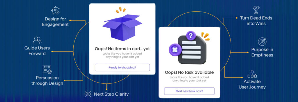
Considering the traditional definition of an empty state, it is a screen that appears when there is no content to show. That could be due to multiple reasons:
- A new user has just onboarded the experience for the first time
- A cleared list (for instance, no saved items, no notifications)
- Most commonly, a search with zero results
- The first interface of a new user journey in an app (for instance, when the user interacts with a new feature for the first time)
But the empty state is not a void. The user expected to find something, and they didn’t. That’s an opportunity. And what you design there can influence what they do next.
Conversion Begins With Context
An effective empty state addresses the user when they hit a dead end effectively. Was the user too early (no data to show)? Was their action unsuccessful (did they do something wrong)? Are they expected to do something next (an alternative action to wrong steps)? That context sets the tone for the content they read and the CTA they click/tap on.
Use the empty states to orient and guide. Show a glimpse of what the experience could look like once data flows in. In case of errors or no-result states, provide helpful suggestions or revise the query while encouraging them to try again. And in case of cleared lists or completed actions, offer a next best action that may include ‘Explore’ or ‘Return’. Clarity in the context set across the journey reduces confusion and builds trust, ultimately leading to conversion.
From Passive to Persuasive
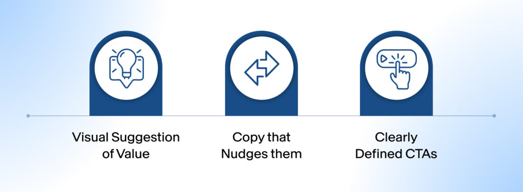
Most empty states are passive. They state the obvious with text like “You have no tasks yet” and stop there. But a persuasive empty state does something else: it uses that moment to move the user forward. Here’s how seasoned UX professionals handle it:
1. Visual Suggestion of Value
Displaying the potential filled state of the interface may help users learn what the end result of this journey looks like and how to complete the required actions to receive those results. You could do so with a well-designed illustration, blurred content preview, or mock UI assets to spark motivation.
2. Copy That Nudges Them
“Try…” or “Start by adding your first…” sounds generic and impersonal. Instead, use copy that mirrors intent and speaks to the user’s goals. “Your insights will appear here—get started with…” is more actionable.
3. Clearly Defined CTAs
Don’t scatter options. Drive attention to a single, meaningful next step. A button, a shortcut, a link, or even a drag-and-drop message can make a blank screen feel meaningful.
How Does Emotional Design Fit Here?
An empty state may feel anticlimactic or even disappointing to many, after all, it is a roadblock to the users’ end goal. But it can also feel light, human, and comforting. That’s where content, microanimations, and illustration step in.
Use illustration or animation not as decoration, but to mimic actions or echo empathy. The tone of an empty state can shift the perception of the entire product—serious or playful, formal or conversational, minimal or expressive. Even humor (when used with care) can reduce friction.
Think of empty states as part of the journey. They’re transitional scenes in a user’s product story. When designed with intention, empty states become moments of activation, pushing users toward value, driving ideal behavior, and continually yet subtly guiding conversions.