Dashboards sit in a strange place. They look simple—just some charts, numbers, and filters, but they often carry the weight of critical decisions in organizations across all scales. When dashboard design goes wrong, it doesn’t just look off; it leads to missed signals, misread data points, and bad calls. When it works, users quickly understand what’s going on and what to do next.
In 2026, creating dashboards is less about packing in more data and more about presenting data so people can act with confidence. Screen sizes, tools, and expectations have evolved, but the foundations of effective dashboard design haven’t changed as much as the noise around them. Here’s a set of do’s and don’ts for modern dashboards grounded in data visualization, the impact of AI on data design, and the new requirements of users across the globe.
Jody Torfs - January 2020

DO: Start With Users and Decisions
Before thinking about pie charts, bar graphs, or color palette choices, ask one simple question: what decisions is this dashboard supposed to support? An effective dashboard isn’t a data dump. It’s a data display designed to:
- Help users quickly spot what’s normal vs what’s off
- Guide users toward the right next step
- Reduce the time between seeing something and acting on it
To get there, you must:
- Talk to actual users, not just stakeholders. What do they look at every day? What do they ignore? What do they absolutely don’t need?
- Map the top three decisions they make using this dashboard. Design around those, not around every possible data point.
- Separate “must see every time” metrics from “only when needed” details.
This upfront clarity will influence everything you do—from chart types to what sits at the top of your dashboard
DO: Prioritise Information and Layout
A dashboard is not a long-form report. It’s a page layout optimized for scanning. Users don’t read dashboards; they glance at them. Good dashboards guide users by:
- Placing the most critical, high-level metrics in the top left or primary focus area, where eyes usually land first.
- Grouping related data points together so users can compare at a glance.
- Using size, position, and white space to signal importance.
Think of the visual hierarchy across your dashboard:
- Above the fold: status and key KPIs (are we okay, or not?)
- The middle: trends and comparisons (what’s changing, and where?)
- The bottom / drill-down: details, breakdowns, and filters (why is this happening?)
If a user has to hunt around to figure out whether things are on track, your dashboard design isn’t doing its job.
DO: Build for Accessibility
Dashboards must work for all users, including those with visual impairments, motor challenges, or cognitive differences. Some key practices that can help you ace this are:
1. Keyboard navigation
2. High contrast and readability
Use appropriate contrast ratios for text and avoid relying on colour alone for meaning (we mean: pair with icons, text labels, or patterns).
3. Screen reader compatibility
Charts need descriptive alt text or ARIA labels. Data tables should have proper headers and structure. To do this, test your dashboard design with tools like NVDA or VoiceOver.
4. Scalable and responsive
Ensure dashboards work at 200% zoom and across devices to allow all your users to use it comfortably. Ensure you use no tiny fonts or overlapping elements.
5. Focus management
Clear, visible focus indicators for keyboard users are ideal. Ensure you integrate a logical tab order that matches the visual flow.
DON’T: Misuse Chart Types
Chart types are not interchangeable. Some help users quickly see patterns. Others slow them down.
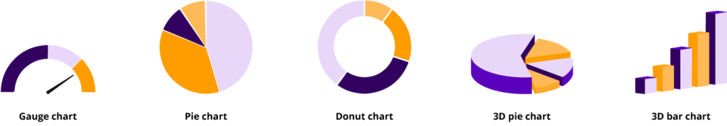
1. Pie charts for anything complex
They look familiar, but once you have more than a few slices, they’re hard to compare accurately. Even worse when slices are similar in size. In most cases, bar charts are better for comparing parts to a whole or categories against each other.
2. 3D or overly stylised charts
They might make the dashboard feel “premium” at first glance, but perspective and shadows distort perception. Keep charts clean and flat; your users care about truth, not theatrics.
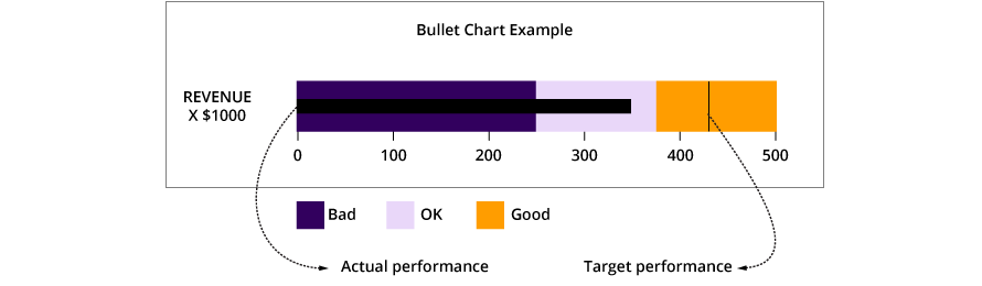
3. Gauge-style charts that eat space
Single-value gauges look impressive but often waste a lot of space for very little information. Consider sparklines, bullet charts, or small multiples instead, as they carry more context in less space.
DO: Make the Data Display Instantly Scannable
Users shouldn’t have to decode your dashboard. Design it so the structure speaks:
- Use consistent color meaning. If blue is “current period” and grey is “previous period” in one chart, keep that mapping everywhere.
- Keep your color palette restrained. A few intentional colors work better than a rainbow. Too many colors turn the dashboard into noise.
- Use font settings consistently. This means using the same sizes and weights for titles, labels, and values across the board. UI design details like alignment, spacing, and typography heavily impact how quickly users can understand what they’re seeing.
Always remember, consistency reduces cognitive load. The more predictable your patterns, the faster people can move from reading to reasoning.
DON’T: Rely on Color Alone
Dashboards often live in environments where users are multitasking, tired, or under pressure. Some users may also have color vision deficiencies. If your entire logic depends on “green is good, red is bad,” you’re excluding part of your audience and risking misinterpretation. To avoid this, ensure that you are:
- Pairing color with icons, labels, or patterns (e.g., arrows for up/down, badges for warning states).
- Using text to state the status clearly (“On Track”, “At Risk”, “Blocked”) instead of color only.
- Avoiding subtle color differences for critical distinctions; use clear contrast where it matters most.
DON’T: Overcrowd or Over-Automate Everything
In 2026, it’s tempting to plug every data source into a single dashboard and call it powerful. But there’s a fine line between “comprehensive” and “overwhelming.” Some things to watch out for are:
- Too many real-time widgets when users don’t actually need real-time for every metric.
- Auto-refreshing everything just because you can, not because it supports better decisions.
If users regularly ignore large sections of your dashboard, that’s a sign to simplify, not to add more.
DO: Make the Dashboard Feel Cohesive
Beyond data, there’s a dashboard feel that users notice: does it feel calm and reliable, or chaotic and noisy? This greatly impacts how often and how well they use your dashboard. To create a cohesive feel:
- Use a unified visual language with similar card styles, consistent spacing, and harmonised chart styles.
- Keep alignment tight; misaligned modules make dashboards look messy and harder to navigate.
- Apply a modest yet intentional color palette that supports, rather than distracts from, the data.
DON’T: Forget That Dashboards Are For People, Not Just Data
At the end of the day, good dashboard design is about helping people do their jobs better. It’s not about showing everything you know or proving how advanced your data visualization stack is. So as you’re creating dashboards, keep circling back to a few questions:
- Can a first-time user tell what this dashboard is for in under 10 seconds?
- Can a user answer their most common questions without thinking too hard?
- Does the layout naturally guide users toward meaningful action, not just passive viewing?
If the answer is yes, you’re on your way to an effective dashboard. If not, it’s rarely a missing widget or fancy new chart. It’s usually a matter of focus, hierarchy, and clarity—getting the do’s and don’ts right at the foundation.
How AI Is Changing Dashboard Design in 2026
AI has moved dashboards from passive data displays to proactive decision partners. In 2026, the best dashboards don’t just show data—they predict, prioritise, and recommend. Some of the key shifts evry design must know:
1. Predictive insights
Instead of static trends, AI forecasts outcomes (“Churn risk up 15% next week”) and suggests actions (“Target these 3 segments first”), similar to a summary—but better.
2. Conversational querying
Natural language processing has helped users to now talk to the interfaces. They can interact with a dashboard and ask, “Show sales by region last quarter, instead of clicking filters. This lowers the barrier for non-analysts while keeping power users fast.
3. Adaptive layouts
AI adjusts what you see based on role, time of day, or recent behavior. Executives get summaries; analysts get drill-downs. The dashboard “learns” your priorities. Design accordingly.