In the world ruled by digital products, we often talk about “good design” and “bad design” like they stand at two opposite ends at all times. But what actually sets the two apart? Why does one experience feel so natural that you barely notice it, while another feels turbulent enough to cause immediate frustration? A very well-known truth is that good design is often invisible. Poor design draws attention to itself, mostly for all the wrong reasons. In an era where technology is deeply woven into our daily lives, the difference between good and bad design can make or break a product’s (ergo, a company’s) success.
Today, we’ll break down what distinguishes thoughtful user experiences from experiences that miss the mark while drawing inspiration from several design legends.
Stuti Mazumdar - May 2025
Good Design Is Invisible, Bad Design Shouts
One of the simplest truths about good UX is that you barely notice it. It guides you effortlessly through an interface, supports your goals with copy that tells you exactly what you need to know, and removes friction from your path in achieving said goals. As Don Norman, the pioneer of user-centered design, emphasized in The Design of Everyday Things, the best design feels “obvious” to the user, even when it is meticulously constructed.
On the flip side, bad design forces users to consistently pause and work harder than necessary to reach the end goal of a journey. Excessive cognitive load through confusing UI elements and unclear navigation, all draw attention to themselves, and not in a good way.
When we think and discuss the nuances of good and bad design, it’s impossible not to mention Dieter Rams, the German industrial designer famous for his Ten Principles of Good Design. Though Rams worked decades ago, his philosophy still shapes how we approach product design today. According to him, good design is innovative. Good design is honest. Good design is as little design as possible.
Bad design, by contrast, often tries too hard to impress. It clutters the screen with features users don’t need, too many choices they can’t easily absorb, and a lot of consistent visual noise that disrupts clarity.
The Real Impact of Poor Design: More Than Just Frustration
When we talk about good and bad design, it’s easy to think in terms of user satisfaction at its centre. But poor design doesn’t just frustrate users, it also impacts the profit (or loss) of any organization.
Research shows that confusing or slow experiences can lead to higher bounce rates, lower conversion rates, and plummeting customer loyalty. In the eCommerce industry alone, even a slight delay in page load times can reduce conversions drastically. After all, the cost of friction compounds fast in digital products.
What Good and Bad User Interface Design Looks Like?
While we talk about how it impacts us, let’s take a closer look at what makes good and bad design.
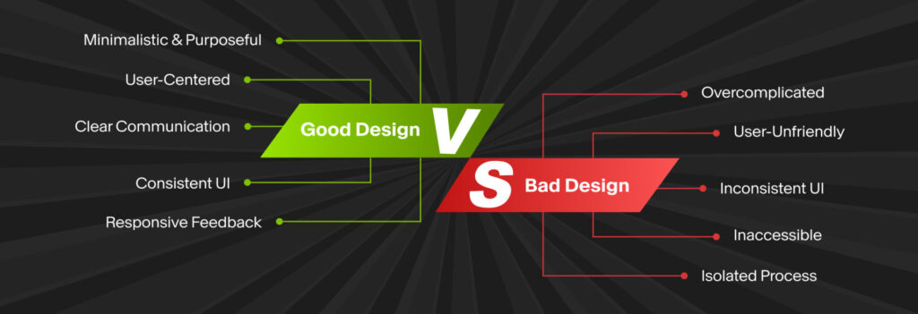
Some aspects of what makes a good design can be:
- Aligns closely with user mental models (e.g., using familiar icons and interaction patterns that users are used to).
- Communicates hierarchy clearly through typography, color, and layout.
- Leverages consistency in UI elements to reduce cognitive load.
- Offers auditory and visual feedback for all user actions.
- Prioritizes accessibility for diverse audiences.
While bad user interface design often includes the following:
- Buries essential actions in unfamiliar places.
- Clubbing of dissimilar information across the experience.
- Overuses complex jargon.
- Forces unnecessary steps between the user and their goal, increasing the number of clicks it takes to finish the task at hand.
- Inconsistently applies style guides or UI patterns.
- Ignores accessibility, creating barriers for people with disabilities.
Design and Development Work Together for Design That Hits The Spot
One of the most common traps in creating digital products is treating design and development as separate. In reality, great UX emerges when designers and developers collaborate from the very beginning to envision an experience that’s feasible, right from the top.
When design and development are aligned, planning and crafting an intuitive and accessible experience becomes easier. The goal isn’t just to create good wireframes or polished screens; it’s to deliver experiences that feel inevitable to the user. That can only happen when everyone involved treats design as a core part of the digital products, not just an aesthetic afterthought.