Misdirection is when the user is purposefully led toward one thing to distract them from another.
Stuti Mazumdar & Symran Bhue - June 2022

How this pattern gets its name?
This dark pattern gets its name because the design pattern purposely misleads, misguides, and misdirects the user towards a goal that is of interest to the organization that has designed the pattern. In an effort to prioritize organizational goals, the user is taken down a path where they may sign up for a service or purchase a product that they may not have originally intended.
How to identify this pattern?
This dark pattern is asymmetric and covert. The metric being prioritized could be new sign-ups or revenue.
In order to identify this dark pattern, the user needs to keep their eyes open for any information that has been underplayed on the web page or application during browsing. Misdirection can be identified on websites where the user journey is not straightforward the way the user had imagined – the right options or the options of interest for the user are actually not put forth clearly or at a glance. These dark patterns are used aggressively at the time of sign up or purchase where even if the user has a choice to opt-out, it is not very obvious and the intuitive next step is a confirmation of a purchase or subscription.
Examples
This type of dark pattern is the worst. It can be seen anywhere and everywhere – on e-commerce websites when they want to direct a user to make a purchase, during airline web check-in when they want a user to pay for a seat selection instead of random seat assignment, or even on digital wallet apps that want you to set up automatic payments.
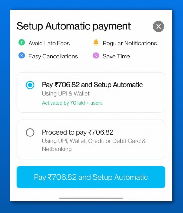
Paytm is an Indian multinational financial technology company specializing in digital payment systems, financial services, and e-commerce websites. One can use Paytm for any kind of online recharge such as DTH, data cards, metro cards, or any kind of bill payments such as mobile, electricity, gas and utilities, etc. Every time one pays their mobile bill, for example, Paytm tries to misdirect the consumer to set up automatic payments. The option isn’t asymmetric, but since the automatic payments choice is selected by default, a hurried user may not notice that they are not just paying their mobile bill but also setting up automatic payments for future bills.

How to make it an ethical design pattern?
Though very obvious for all dark patterns but specifically true for misdirection – design from the user’s perspective. In retail physical spaces, the customer is given plenty of breathing room to make a decision. In case of misdirection, forget breathing room, the users are not clear about their options or choices because they are not presented to the users clearly.
This dark pattern can be easily avoided by making all options available to the users known to them, giving every option equal importance, and always confirming the choices made by the users.
Making the user’s experience as intuitive and user-friendly as possible will enable building trust and loyalty by the users who will not only repeat purchases but also recommend the product or service to their family and friends.


