Bait and switch is a dark pattern where the user sets out to do one thing but a completely different undesirable thing happens instead.
Stuti Mazumdar & Symran Bhue - April 2022

How this pattern gets its name?
Bait and switch have been a very common practice in the retail sector. It gets its name from the bait (a desirable item) that is offered to the user to draw them in and which is later switched with another offer (an undesirable one) either without the user’s knowledge or at a point when the user may not withdraw from the process given their loss aversion.
How to identify this pattern?
This dark pattern is covert, deceptive and hides information. The metric being prioritised is new sign-ups and conversions.
By the time the pattern is identified by the user, it could be too late to back out but this dark pattern is implemented in one of two ways: one, where the user clicks through many pop-up windows such as those in case of a software application installation and suddenly changing the meaning of a button to trick the user to continue. And two, luring the users by offering a desirable deal – taking them through a long purchase process which involves giving up personal data or credit card information and then switching the deal last minute into something undesirable.
Examples
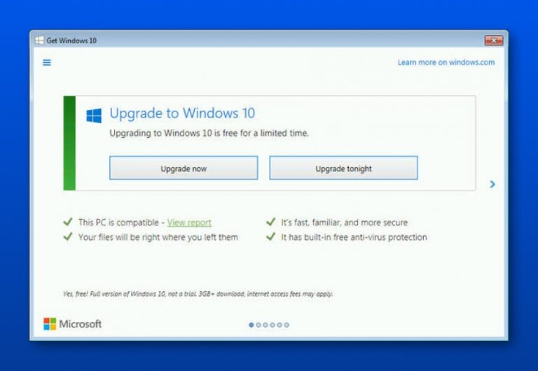
Flight and hotel reservation websites are full of the Bait and Switch dark pattern. Once the user is lured through a lucrative deal, and they have progressed further into the checkout process, the deal is switched at a stage when it’s too late for the user to opt-out. But, the darkest of dark patterns you’ll ever hear about in the history of Bait and Switch is the way Microsoft employed this tactic in 2016 in an attempt to force the users into upgrading their Operating System to Windows 10.
Until 2016, the red ‘X’ on the top right corner of a Window’s pop-up meant ‘close’. Windows switched the conventional meaning of users associated with ‘X’ to ‘Yes, I would like to upgrade to Windows 10’. This switch caused a huge backlash from users of previous versions of Windows.


