Trick Questions are questions that when read quickly seem to ask one thing but when read carefully seem to ask something else altogether.
Stuti Mazumdar & Symran Bhue - May 2022

How this pattern gets its name?
Trick Questions are like riddles – they can be questions or statements that elicit a certain call to action by the user but at first glance, the question or statement is framed in a such a way that the user gets confused about how to answer the question and when they do make a choice, the end result is not what the user had intended or in their best interest. Trick Questions are devised carefully to trick the user into taking a certain action which is in the interest of the application or company asking the question.
How to identify this pattern?
Trick Questions are Asymmetric and deceptive. The metrics being prioritised by employing these dark patterns are ‘new sign ups’ or ‘app installation/new downloads’ or even retention.
These questions are presented to the user when they are filling up a form, following a process such as an installation of an app or tool or when they are simply browsing. Trick Questions are part of a process that the user must complete, to reach their end goal. They are carefully integrated into the sign-up or installation process with the help of confusing and tricky language, sentence construction and use of double negatives in the statement/question and call to action. In order to identify these patterns, the user must read statements a couple of times before taking the action to avoid undesirable outcomes for themself.
Examples
If you’ve ever read a question such as ‘Are you sure you want to cancel your subscription’ and see two options which read ‘cancel’ or ‘continue’, you’ve experienced this dark pattern before.
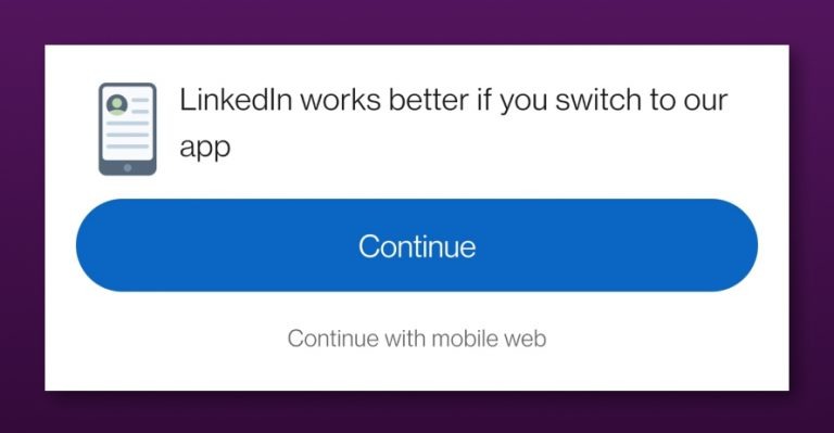
Let’s look at how this pattern can be weaved into a statement. Imagine a user is searching for something on their mobile browser and there is a list of relevant articles that pop up on the search engine. They click on one specific item on the list which happens to be posted on LinkedIn. Now, if the user hasn’t downloaded the app, they will see the message as shown in the image before they are taken to the article. There are two calls to action presented along with the statement – both say continue but if one doesn’t read carefully or is in a hurry, they may opt to continue and end up downloading the app rather than continuing on the mobile web.


