Data visualization is the cornerstone of contemporary data analysis, helping organizations and large corporations interpret complex garnered data efficiently. But when it comes to choosing between static vs interactive data visualization, the decision isn’t always straightforward. Both approaches serve distinct purposes and understanding when to use each can significantly impact the clarity and effectiveness of the data story you’re trying to intertwine with your product.
In this blog, we’ll explore the differences between static and interactive data visualizations, what sets them apart, their key features, and more. By the end, we hope that you’ll be equipped to make informed decisions about which approach best suits your business intelligence needs.
Stuti Mazumdar - January 2025

“Data are just summaries of thousands of stories—tell a few of those stories to help make the data meaningful.”
— Dan Heath, Author & Orator
The Role of Data Visualization in UI/UX Design

The goal of any product design initiative is to present complex data in a way that users can easily interpret and act on with no-to-negligible cognitive load. Visualizing data effectively enhances the usability of the experience crafted, informs design decisions throughout the process, and supports data-driven storytelling. Designers often grapple with choosing between static and interactive approaches, balancing simplicity with the need for deeper user exploration.
What is Static Data Visualization?
Static visualizations are fixed representations of data—think of it as a bar chart or line graph embedded in a report, usually in a single page layout, as a visual aid to the information displayed as a body of text. As part of a digital product, static visualizations are often used in dashboards, generated reports, or prototypes to deliver clear, concise insights.
Some key features that drive this visualization are:
- Clarity: Static visualizations present predefined data points and help avoid overwhelming users with unnecessary complexity.
- Non-Interactive: Users view the information passively without tools for further exploration; simply to absorb information and not interact with it.
- Predictable Layouts: These visuals are static and optimized for both screen and print formats before being embedded into the design.
How can one use static visualizations when crafting a data-centric experience?
- Dashboards: To display KPIs for quick business intelligence insights on data points within a static time range.
- Downloadable Reports and Presentations: Summarizing findings in a visually appealing, easy-to-consume format for all stakeholders involved in the project.
- To sum it up: static visualizations excel in communicating a specific data story where the message is straightforward, and user interaction isn’t necessary.
What is Interactive Data Visualization?
Interactive data visualizations are dynamic and user-driven, offering means for users to explore and manipulate the data story shared through the experience. This kind of data visualization is essential for digital experiences where users need to stay engaged for consistent data exploration, such as dynamic dashboards, data analytics tools, and customer behavior tracking systems.
Some key features that drive this visualization are:
- User Interaction: Users can filter, sort, and drill down into the data for deeper analysis in these visualizations.
- Exploration-Friendly: Interactive tools are ideal for people to understand complex data and discover patterns that they see fit based any use case.
- Dynamic Updates: Often connected to live data streams, these visualizations make them suitable for real-time monitoring.
How can one use interactive visualizations when crafting a data-centric experience?
- Customer Behaviour Analysis: Allowing marketers or product teams to study user patterns through filters like demographics or behaviour trends in real-time allows them to craft marketing and product strategies on the fly.
- Data Exploration Dashboards: Users, when in decision-making capacities, need in-depth control over what data they see to gather intelligence in making informed organizational decisions. In such cases, the ability to manipulate the data comes handy.
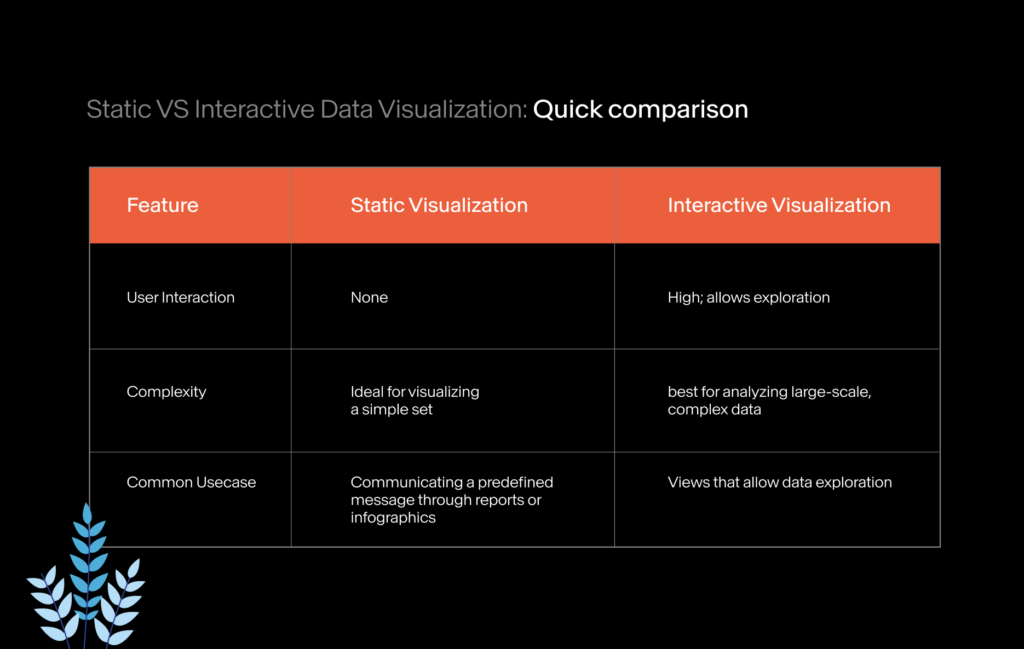
Static vs Interactive Data Visualization: A Quick Comparison
Design Principles that Guide Data Visualization
Regardless of the type of visualization you choose for a particular experience, certain design principles are universal to ensure clarity and usability in the user experience. Let’s explore some that everyone should keep in mind when crafting a data-centric experience:
1. User-first, always
Always consider the target audience, their goals, and technical literacy to ensure that the design is as simple and user-friendly as possible.
2. Use appropriate visualizations
Select visualization chart types that best represent the data story you’re trying to show through the experience. For example, line charts are best used to display trends, whereas bar charts for comparisons.
3. Keep your eyes on the key insights
Highlight critical data points or irregularities using visual cues like contrasting colours or labels, to help users easily identify the area of concern.
4. Clarity is paramount
Avoid cramming excessive data points or information within a single experience. Simplicity ensures users can grasp the message at a glance.