Every detail of a user journey in an e-commerce product matters, but none more so than the checkout. You can drop the biggest lead magnets for acquisition, build the most engaging product pages, provide users with compelling offers, and even drive users all the way to the cart. Yet if checkout feels clunky, trust in your brand breaks in seconds, and so do your conversions.
Studies in behavioral economics consistently show that digital shoppers are impatient decision-makers. In fact, a delay of just three seconds at checkout—whether from slow loading, overwhelming forms, or unclear pathways—can reduce conversion rates by as much as 25%. This “3-second rule” has become an unofficial benchmark for good e-commerce UX, forcing brands to rethink how they evaluate the checkout experience as a driver of revenue. But, what exactly happens in these three seconds? Why are they so critical? And more importantly, how can you design an experience that passes this test with flying colors?
Stuti Mazumdar - December 2025

What and Why is the 3-Second Rule Important in E-Commerce?
Human decision-making at checkout is influenced by both cognitive load and trust building. By the time a customer reaches the checkout interface, they’ve mentally “bought” the product, after considering multiple moving variables involving their habits, routine, experiences, wants, needs, and more. What they expect now is confirmation and closure. Any friction at this stage signals risk: “Is my data secure? Will this take too long? Do I really need this right now?” And three seconds is enough for doubt to creep in.
A confusing form field or even a lagging progress indicator can nudge users toward abandoning their carts. The psychology is simple: the brain seeks a fluid, simple experience at checkout. If the path feels too complex, users defer the decision and exit altogether. Or worse, move to a competitor.
Principles to Designing a Good Checkout Experience
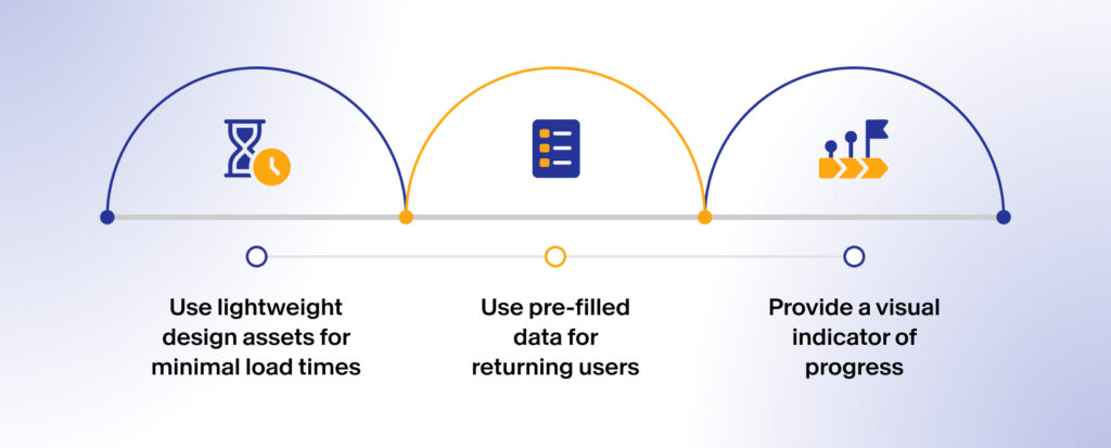
1. Speed Helps Create Confidence
Slow load times are the biggest silent killers of conversions. According to Google, 53% of mobile users abandon sites that take longer than 3 seconds to load. In checkout, this percentage can get even higher since your customers are already in a “high stakes” situation as they choose to make a purchase.
Best Practices:
- Use lightweight design assets for minimal load times
- Use pre-filled data for returning users
- Provide a visual indicator of progress
Here, design doesn’t just improve performance, but brand perception too. It signals professionalism. A fast-loading, smooth checkout tells the user: this brand values my time and can be trusted with my money.By setting the foundations of the design process in user research, UX researchers help ensure that the product solves a real-world problem, meeting user needs. This user-centered approach increases the likelihood of user satisfaction and product success.
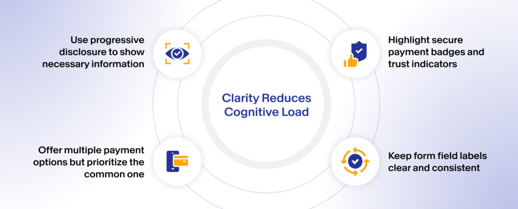
2. Clarity Reduces Cognitive Load
Ever encountered a checkout form that asks for unnecessary details like “Middle Name (optional)”, “Company email ID”, etc. in mandatory fields? Small details like these become barriers when users expect speed.
Best Practice:
- Use progressive disclosure to show necessary information
- Offer multiple payment options but prioritize the common one
- Highlight secure payment badges and trust indicators
- Keep form field labels clear and consistent
When checkout feels like a smooth conversation instead of a tedious last step of the journey, conversion rates climb.
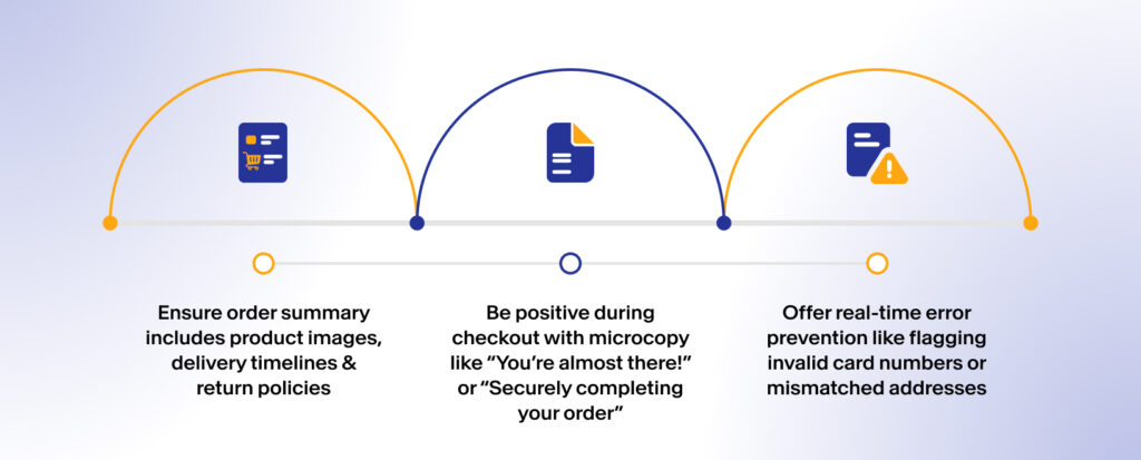
3. Reassurance Builds Loyalty
The final seconds before payment are about reassurance, not persuasion. Your users have already made their decisions; help them feel that they’ve done the right thing by building the experience well. Users want to feel safe pressing “Pay Now.” This is where emotional design and microcopy play crucial roles. These, when used right, help usher users towards checkout quickly, ensuring conversions.
Best Practice:
- Ensure order summary includes product images, delivery timelines & return policies
- Be positive during checkout with microcopy like “You’re almost there!” or “Securely completing your order”
- Offer real-time error prevention like flagging invalid card numbers or mismatched addresses
These subtle cues reduce uncertainty and make the act of payment feel like the logical conclusion of an enjoyable journey.
How Does The 3 Second Rule Save Conversions?
The “3-second rule” is not just about performance speed; it’s about facilitating decision speed. When users can complete checkout within that critical threshold, without any technical or experiential hiccups, their confidence remains high that lead to significantly higher completion rates.
For e-commerce leaders, this isn’t just about UI/UX efficiency, it’s about crafting an experience that leverages the revenue growth strategy. After all, improvement in checkout conversions could mean millions in additional sales annually for large platforms. That’s why organizations with mature UX practices treat checkout optimization as a strategic growth initiative, not just a design task.
How to Design Checkout Experiences That Users Trust?
Passing the 3-second test isn’t a one-off fix. It requires embedding user psychology into the larger e-commerce design system:
1. Consistent Branding
Users shouldn’t feel like they’re leaving the store when they reach checkout. Consistency between product pages and checkout boosts trust.
2. Omnichannel Presence
Customers may start checkout on mobile and finish on desktop. Designing for continuity across devices ensures they don’t drop off due to unfamiliar UI.
3. Real-Time Support
Embedding voice or text chat or FAQs at checkout can address last-minute anxieties regarding critical actions such as returns, delivery, or payment.
Ultimately, checkout isn’t just the end of the funnel—it’s the make-or-break moment of your entire sales cycle.