For designers and product teams, the arrival of Apple Vision Pro didn’t just launch a device; it launched a new dimension of interaction. As we move through 2025, spatial computing has evolved from novelty to necessity for a variety of critical reasons. The initial excitement has settled into a serious exploration of how visionOS design can redefine productivity, entertainment, and collaboration between systems that currently work in silos.
Designing for visionOS requires unlearning the constraints of 2D screens. It demands a shift from “pixels on a page” to “objects in a room.” This guide refreshes our foundational understanding with new insights, updated best practices, and a forward-looking perspective on creating immersive visionOS apps that feel native, intuitive, and magical.
Stuti Mazumdar & Bhavini Kumari - December 2023

The Core of visionOS: Understanding Spatial Design
While traditional UI is bounded by screen edges, Apple Vision Pro works in an infinite canvas. However, infinite space doesn’t mean infinite chaos. The most successful visionOS UI respects the user’s physical reality while enhancing it with digital depth.
Let’s take a look at some of the features that make VisionOS:
1. Space: visionOS provides a large, open space where people can view virtual content like windows, objects, and scenes.
2. Immersion: Users may switch between various levels of immersion. This can range from a shared space where multiple apps can run simultaneously to a full space where only one app can run.
3. Passthrough: The ground truth of visionOS UI is Passthrough. It allows people to see their real surroundings as they interact with virtual content.
4. Spatial Audio: Spatial audio makes audio sound natural in the user’s surroundings.
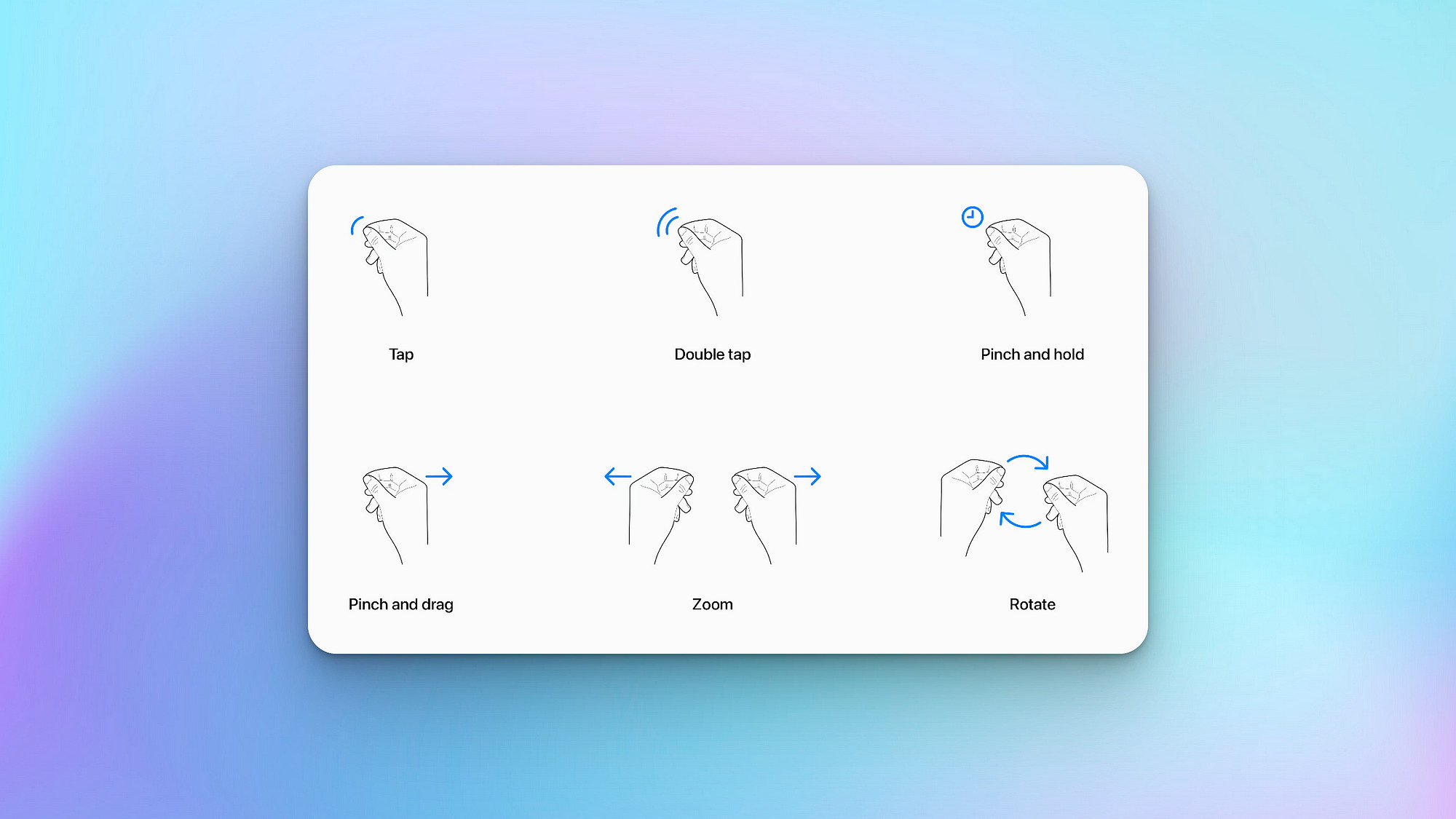
5. Focus and gestures: People interact with visionOS using their eyes and hands. They can look at a virtual object to bring focus to it, and then tap it to activate it. They can also touch a virtual object with their finger.
6. Ergonomics: visionOS is designed to be comfortable to use. The system automatically places content, so it is relative to the wearer’s head, and it does not require people to move around to interact with content.
7. Accessibility: visionOS supports a variety of accessibility technologies so the users can perform the interactions that work best for them.
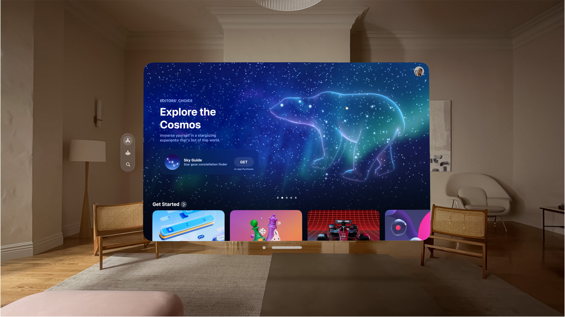
14 Guidelines to Keep in Mind When Designing for visionOS
Designing for spatial computing introduces new constraints and opportunities. Here are the updated guidelines for creating high-quality visionOS UI.
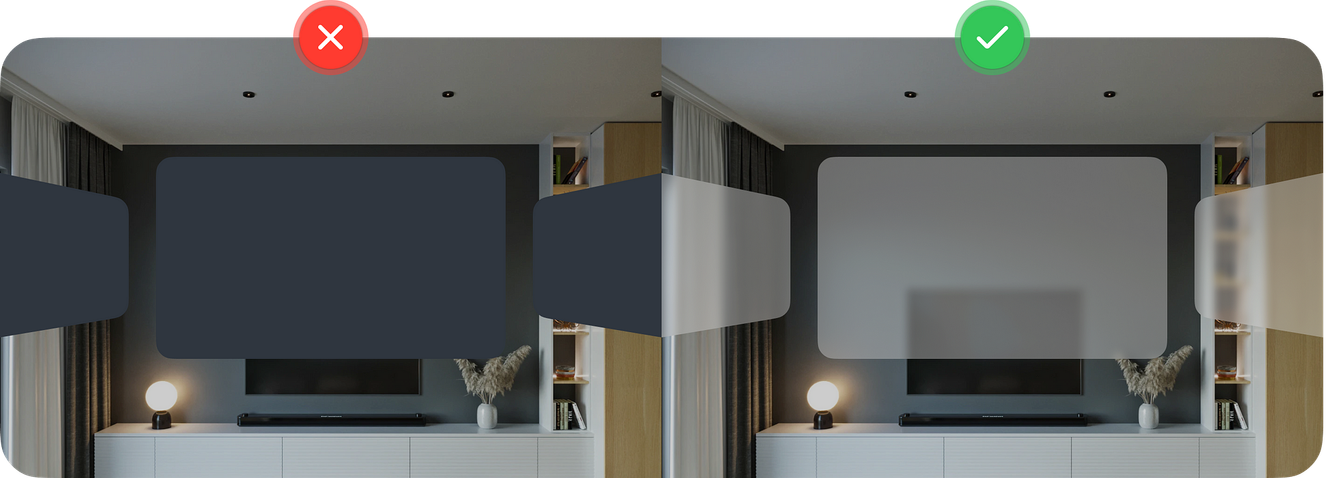
1. Prioritize Transparency: Avoid solid, opaque backgrounds that block the user’s view. Use the system-defined glass material to let the physical world show through, grounding your app in reality.
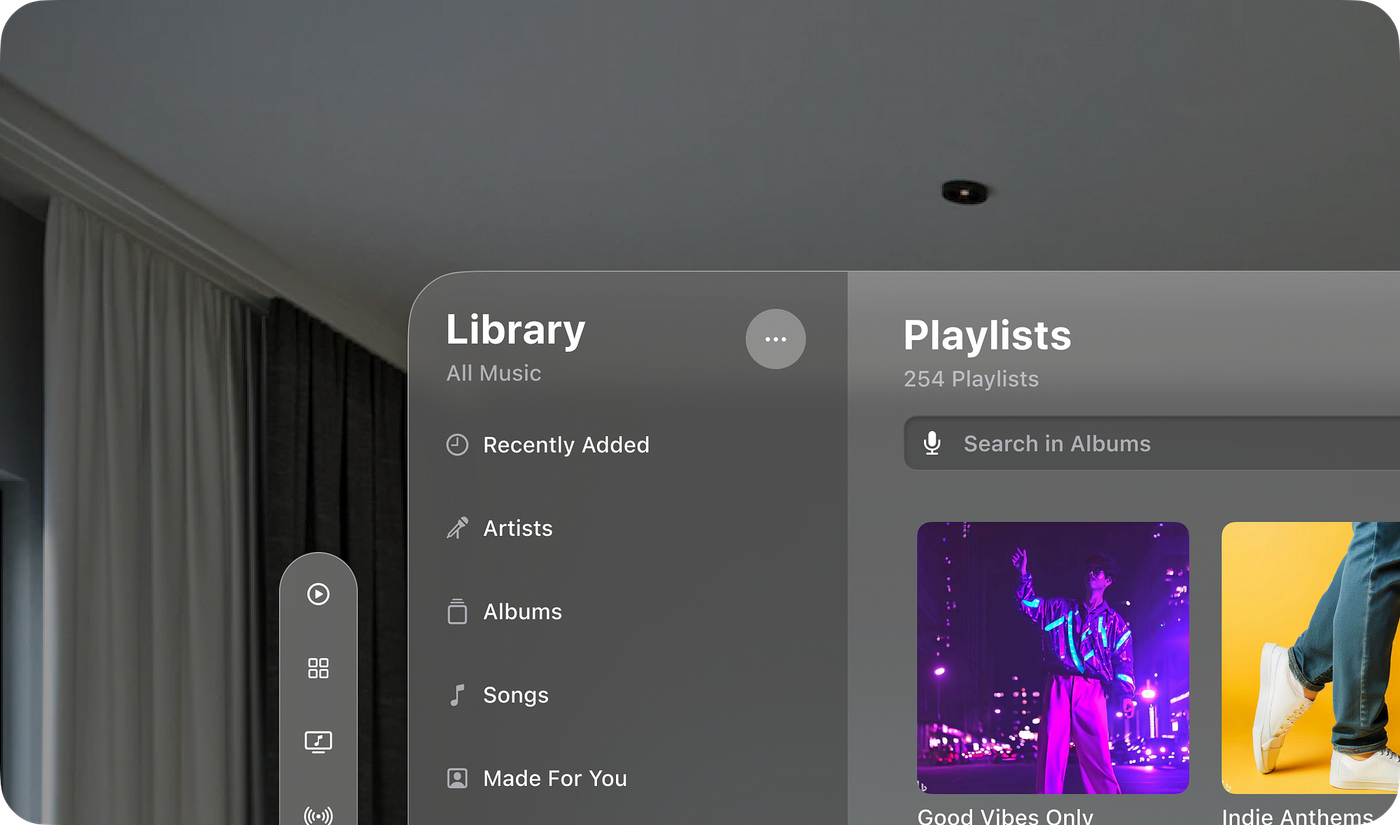
3. Layer Colors Carefully: If you use color, apply it to background layers cautiously. Glass materials shift color based on the physical environment, which can impact contrast.
4. Avoid Stacking Light Materials: Stacking multiple translucent layers reduces legibility and contrast. Keep hierarchies flat and simple.


5. Use Bolder Typography: Spatial text needs weight to be readable. Use slightly bolder font weights than you would on iOS to ensure clarity against complex real-world backgrounds.
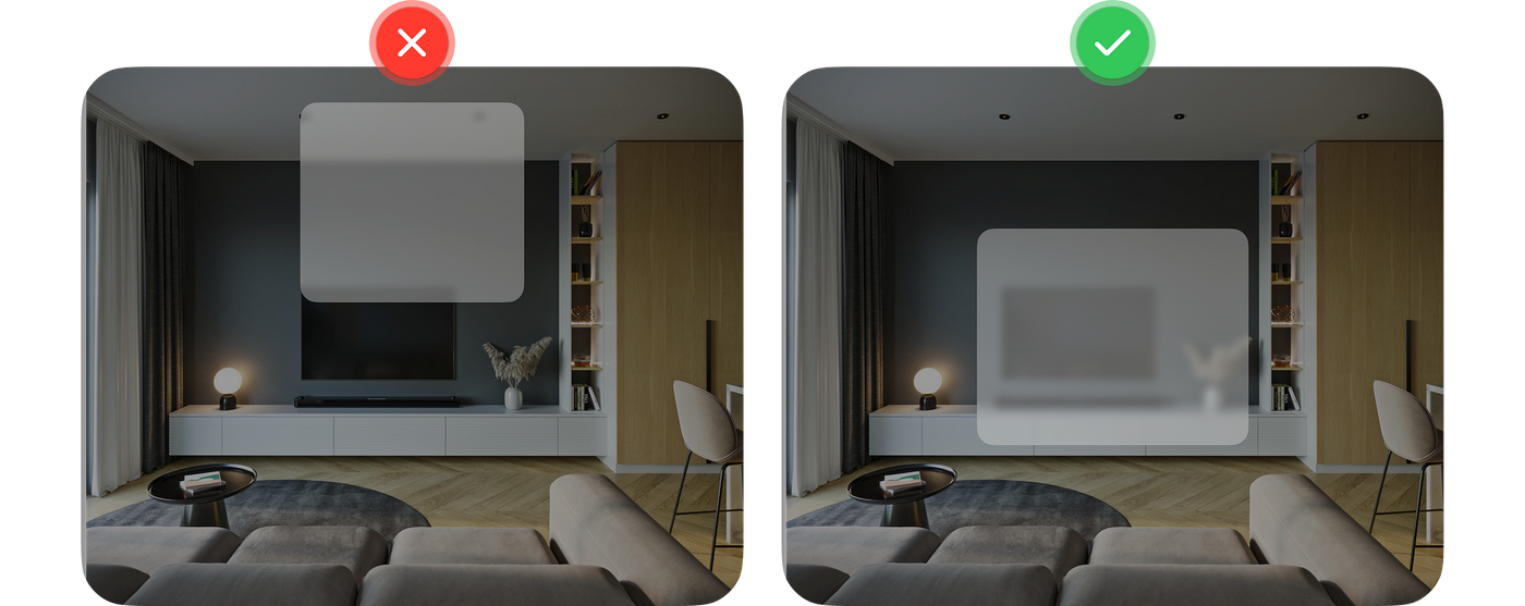
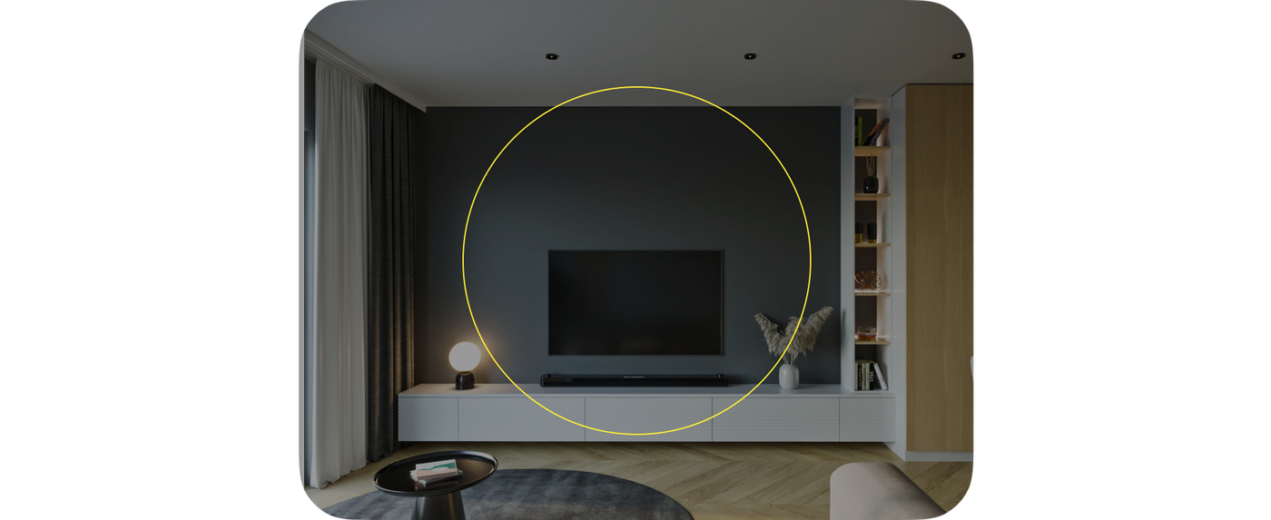
8. Target Size Matters: VisionOS design elements must be hit-friendly. Ensure interactive targets are at least 60×60 points to accommodate eye-tracking precision.
9. Clear State Indicators: Feedback is vital. Use the system’s “hover effect” to highlight elements as the user’s eyes sweep across them, signaling interactivity.
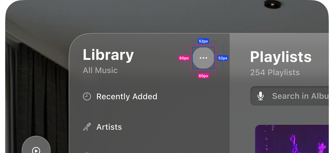

10. Consistent Spacing: Give interactive elements breathing room. A minimum of 4pt spacing prevents accidental selections when eye tracking drifts.
11. Nested Corner Radii: Follow the mathematical harmony: Inner Radius = Outer Radius – Padding. This keeps nested UI looking organic and polished.
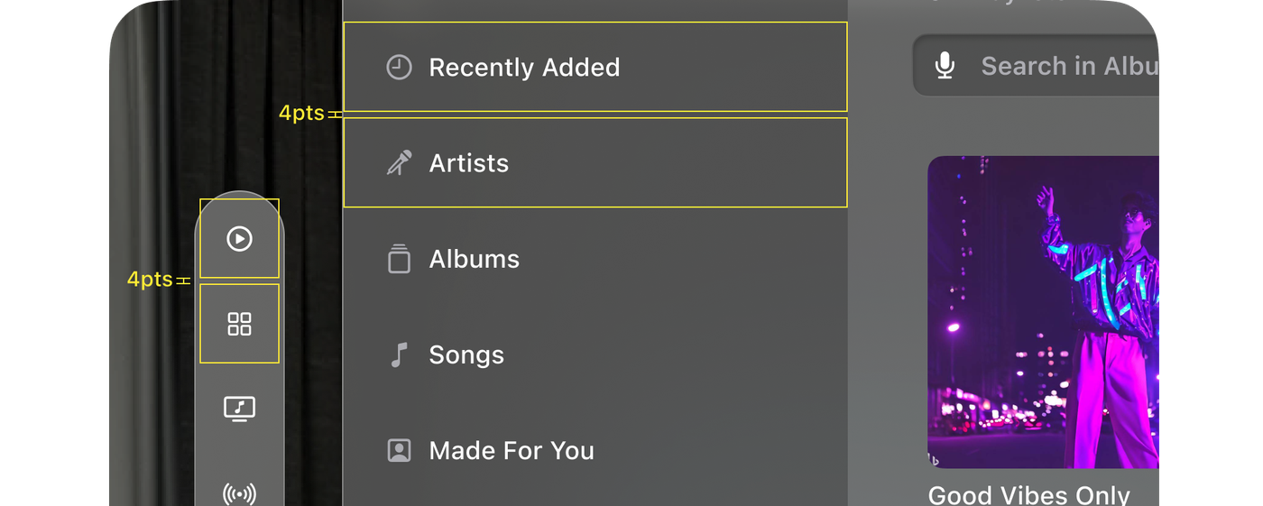

12. Limit Tab Bar Items: Spatial interfaces can get cluttered. Stick to a maximum of 6 items on a tab bar (sidebar) to reduce cognitive load.
13. Ornament Placement: Ornaments (floating toolbars) should overlap the bottom edge of a window by 20pts to anchor them visually.
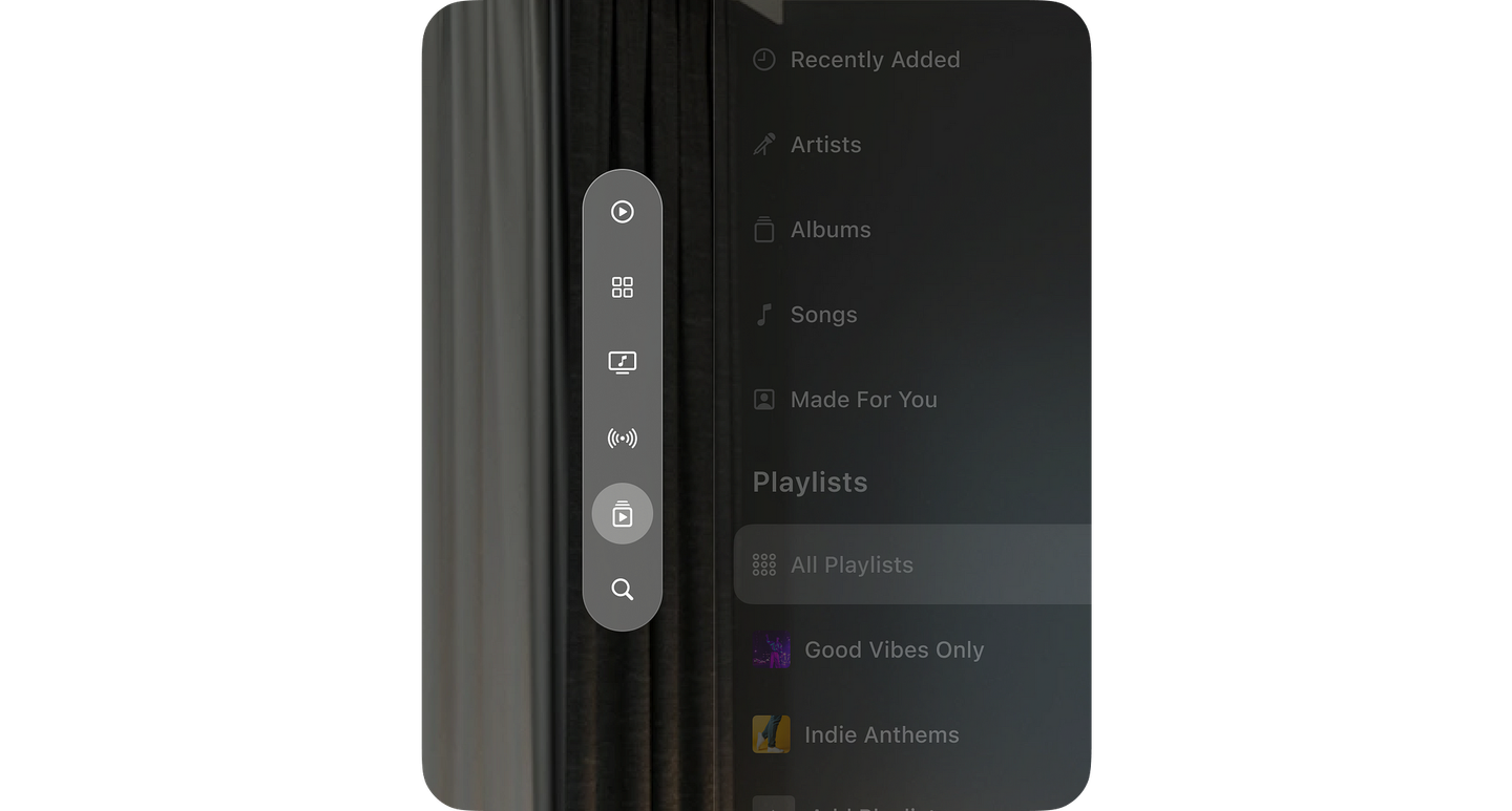

14. Focus via Dimming: When a user opens a modal or focuses on specific content, subtly dim the background to direct attention without losing context.

All guidelines are derived from this source.
The visionOS Pathway: Mastering Eyes and Hands
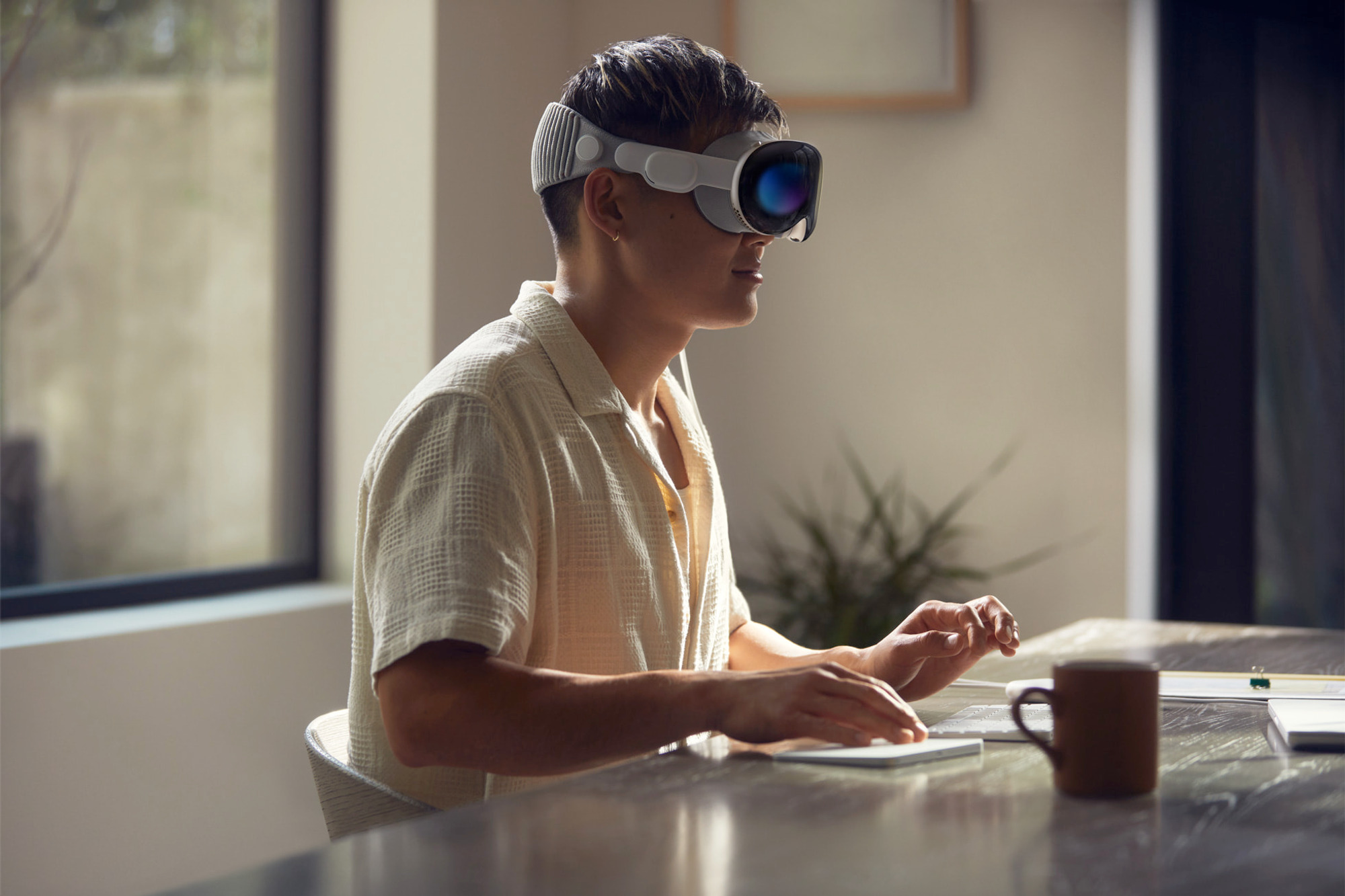
The leading spatial computer, Apple Vision Pro, has a three-dimensional user interface that responds to natural actions such as eye tracking, hand movements, and voice commands. It combines the digital and physical worlds by way of this new input system that responds to your eyes, hands, and voice, providing limitless opportunities for productivity, entertainment, and immersion.
1. Eyes as the Cursor
Design your visionOS app to respond instantly to eye movement. Hover states should trigger the moment a user looks at an object, confirming “I see you.”
2. Hands as the Click
The “pinch” gesture is the new click. It requires no physical effort—users can rest their hands in their lap. Avoid interactions that require large, tiring arm movements.
3. Direct vs. Indirect Manipulation
While users can reach out and touch a window, indirect gestures (looking and tapping) are preferred for ergonomics. They allow users to control the system from a comfortable, seated position.
Best Practices for Designing Seamless Spatial Experiences
As we look toward the future of visionOS, the apps that will win are those that feel “at home” in the user’s space.
1. Make it approachable and familiar
Users should be able to use your app without feeling overwhelmed or confused. Use familiar UI elements and interactions, and make sure the content is easy to understand.
2. Take advantage of the unique features of visionOS
Use space, spatial audio, and immersion to create immersive and engaging experiences. But do not forget about passthrough, focus, and gestures. These features can help people stay comfortable and safe while using your app or game.
3. Consider the entire spectrum of immersion
Not every moment in your app or game needs to be fully immersive. Sometimes, a windowed, UI-centric experience is more appropriate. Decide what is best for each key moment in your app.
4. Use Windows for contained UI-centric experiences
Windows is an effective way to present content that needs to be organized and controlled. They are also easy to move around, so people can find the perfect spot for them.
5. Prioritize comfort
People should be able to use your app or game for extended periods of time without getting tired or uncomfortable. Display content within their field of view and avoid using motion that is too jarring or fast.
6. Support indirect gestures
Indirect gestures are the best way to interact with visionOS apps and games. They allow people to use their eyes and hands to control the experience without having to move around too much.
This is just the beginning of the technological boom in this era. As hardware becomes lighter and software becomes smarter, spatial computing will move from a novelty to a core component of digital workflows. Devices like the Apple Vision Pro will no longer remain an anomaly. We are no longer designing screens to be looked at; we are designing environments to be lived in. For designers and product teams, the opportunity is massive. We are currently designing the foundations for a new language of interaction. The apps that will define this era won’t just be “ported” from mobile; they will be reimagined for depth, presence, and human connection.


