In the digital age, design is no longer a visual luxury—it’s a functional necessity. Every interaction, every tap and scroll, every form fill carries the weight of the digital experience. And yet, so much of that user experience hinges on a silent distinction we often underestimate: the difference between good and bad design. While digital products multiple with each passing day, only a few stand out for their seamless navigation, usability, clarity, and thoughtfulness. The rest often frustrate users more than they help them solve a pressing problem.
We asked our resident experts to unpack what truly sets great UX apart, drawing on the philosophies of design pioneers, and reflecting on why good design is often described as “invisible,” while poor design is clunky and demands your effort, attention for all the wrong reasons.
Stuti Mazumdar - June 2025
Good Design is Invisible. Bad Design is Inevitable.
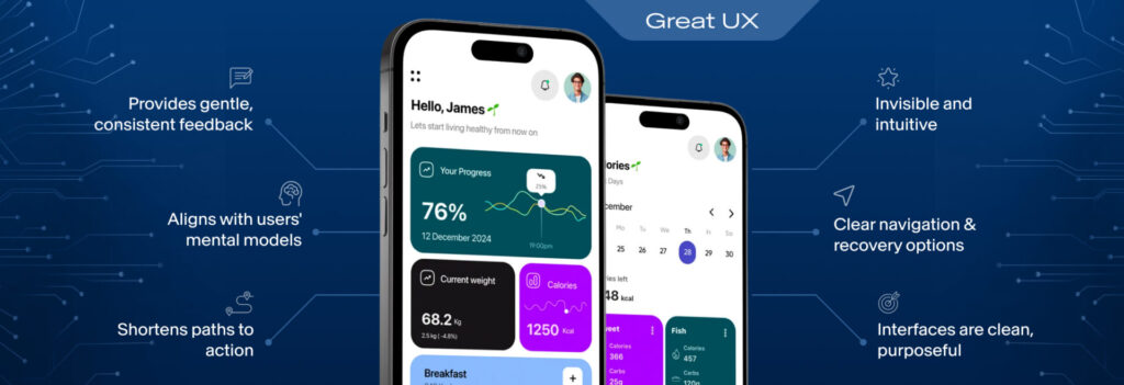
One of the most resonant quotes in UI/UX design today comes from Don Norman, who famously said that when design is done right, users shouldn’t even notice it. This isn’t just poetic propaganda, it’s a fundamental design principle or practice. In a well-crafted digital interface, everything just falls into place for a user—whether they’re engaging with the experience for the first or the nth time. Users should know where to click, how to go back, how to recover from errors, and how to get what they came for without having to think about it hard and often. This isn’t magic, they’re outcomes of deliberate decisions made as designers and other UX professionals grounded in research, psychology, and seasoned design practices.
What is the Foundation of Good Design?
To talk about good and bad design without quoting Dieter Rams would be missing the point. The legendary German industrial designer crafted a set of 10 principles that continue to shape both physical and digital experiences. Among them were stellar quotes such as, “Good design is innovative,” “Good design is honest,” and most famously, “Good design is as little design as possible.”
Applied to modern digital products, this means creating interfaces that are clean, purposeful, and grounded in clarity. Incorporating design that doesn’t overwhelm users with features, but guides them toward meaningful interactions. It means building systems that are easy to understand, instead of asking users to learn how to use your design.
The Real Cost of Poor Design
It’s tempting to treat poor design as merely an aesthetic failure but it’s much more than that. The true cost of poor design is bad UX. Simply put, friction. It’s lost conversions, broken trust in the brand, and unmet needs of users interacting with the experience. In the realm of digital products, even a slightly confusing layout or a one-second delay in load time can push users away.
On the flip side, good user experience builds loyalty, creates moments of delight, shortens paths to action, and it ensures that technology feels like an enabler, not a hurdle.
What Do Good and Bad User Interfaces Look Like in Practice?
A good user interface aligns with users’ mental models. It uses familiar, simpler language and interaction patterns. Visual hierarchy is clearly established through thoughtful use of typography and color. Interactive elements are consistent, accessible, and responsive. The design gives users constant, gentle feedback—like a subtle microinteraction that confirms a button press or a toast notification that confirms success.
In contrast to this, poor design feels disconnecting and isolating. Users may feel stuck in the middle of their journey with no means to resolve the problem at hand. Essential tasks are hidden behind unfamiliar icons. Similar-looking elements behave differently. Jargon takes the place of plain language, making it difficult for them to navigate through the experience. Worst of all, accessibility is ignored—leaving behind users with disabilities or non-mainstream needs.
Design and Development: Partners in Creating Impact
Many digital products fail because they create silos for design and development into separate streams. When design is tossed over to the developers with little context and no proper handover, or when engineers begin building before design is validated, it is evident. And businesses pay a heavy price.