Hisory of Sankey
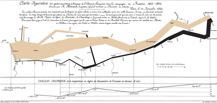
Sankey’s original 1898 diagram showing the energy efficiency of a steam engine. b)Minard’s classic diagram of Napoleon’s invasion of Russia, using the feature now named after Sankey.
Source
When to Use a Sankey?
Many-to-many process mapping
Perfect when flows merge or split across process stages. Emphasize one critical resource while color-coding categories or state transitions. Wider arrows = greater quantities, intuitive at a glance.
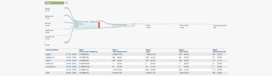
Google Analytics using Sankey Diagram to show how traffic flows from pages to other pages on a web site
Source
Source-to-endpoint journeys with depth
Trace total breakdown from origin through intermediates to destinations. Interactive Sankeys support high-level overviews, detailed drilldowns, or predetermined depth levels for layered storytelling.
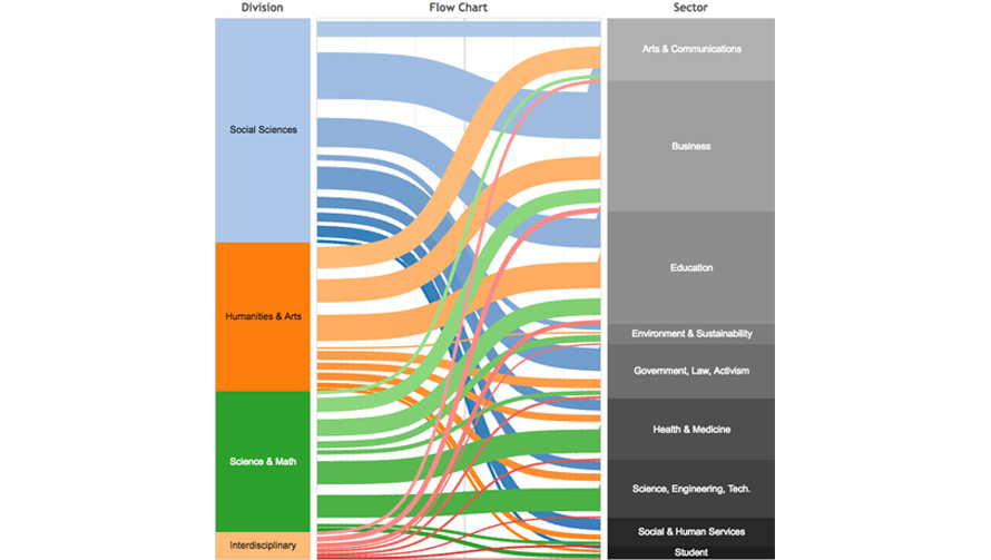
Alluvial Sankey Diagram
Source
Spotting dominant flows
Visual weight falls naturally on major contributions. Instantly see connection strength—not just what connects, but how much—revealing process bottlenecks, inefficiencies, optimization opportunities.
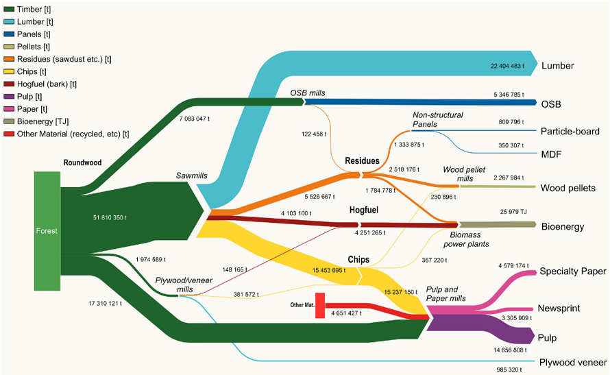
Sankey diagram showing the downstream flow of wood fiber from Canadian forests to products
Source
Types of Sankey Diagrams
1. Alluvial Diagrams
Sankey variant with vertically grouped nodes (steps), often representing timestamps or process phases.
When Not to Use a Sankey?
Overly complex datasets
Too many connections create unreadable clutter. Dismiss minor flows or switch formats when actionable insight drowns in visual noise.
Comparing similar-value flows
Width differentiation fails when flows approximate equal magnitude. Node positioning matters; crossing-minimizing algorithms help but stacked bars compare reliably.