In today’s data-driven world, organizations are flooded with data as a consistent stream of numbers, charts, and raw datasets. However, without context, data often remains a collection of abstract figures, struggling to resonate with the overall experience one tries to create for their audience. This is where the art of data storytelling steps in—transforming complex information into narratives that not only communicate insights but also inspire action.
At Think Design, we believe that blending brand or product narratives with interactive data visualizations is a powerful way to present data. By integrating compelling stories and intuitive design with visualization tools, we transform raw data into meaningful and actionable insights for a global audience to consume. At its core, it’s about making data accessible, engaging, and impactful, ensuring that it drives decision-making in the real world.
Stuti Mazumdar - February 2025

The Need for a Narrative in the Real World
Data on its own is mute—much like design. To bring it to life, we must pair it with compelling narratives that fit within the context of your digital experiences. A well-crafted story creates a bridge between the raw data and the audience, enabling them to grasp the meaning behind the numbers you display and the data story you wish to share. This is especially critical in a world where decisions increasingly rely on data analytics for organizations across industries.
Consider how a healthcare organization, such as a hospital, might present complex patient data in front of a panel of board members. Without a narrative, it’s just numbers. With a story, it becomes a compelling case for policy modifications or resource assignment. When designing a new business strategy or crafting a brand launch campaign, the combination of data narratives and intuitive design helps convey critical insights in ways that engage and impact the audience to steer the conversation in a way you want to.
Breaking Down the Elements of Effective Data Storytelling
Now that we know the importance of data storytelling, let’s focus on a few key principles that can help you craft the same.
1. Identifying Key Insights
The true foundation of any compelling data story is the ability to distill key insights from complex, vast datasets. This involves leveraging data analytics to uncover patterns and trends that matter most. It’s not just about finding answers but framing those answers in ways that address the audience’s needs.
At Think Design, we emphasize transforming complex data into digestible narratives that are relatable and actionable. By focusing on the “so what?” of data analysis, we ensure that every insight adds value to the overall story within the context of the digital experience for all cohorts of users who interact with it.
2. Blending Narrative and Visualization
Data visualization alone isn’t enough. Pairing charts, graphs, or any other visualization technique with a narrative provides the context needed to make the visuals meaningful.
While it is of critical importance to know the distinct difference between the impact of a bar graph and a line chart to depict a trend in the dataset, ensuring the user is made aware of the problem statement, history of the data collected, and a conclusion with actionable insights is paramount.
By weaving narrative and visualization seamlessly, you ensure that audiences not only see the data but also understand its implications.
3. Designing Interactive Charts
Static visuals can only go so far. Interactive charts allow users to engage with the data dynamically, exploring different perspectives and uncovering deeper insights. This approach is especially effective when dealing with large datasets that represent complex information.
For example, an interactive dashboard that visualizes company performance across multiple regions allows individual stakeholders to focus on relevant information and kill the clutter around it. This level of personalization across business units amplifies the power of data storytelling.
How Can You Maximize Collaboration and Workflow?
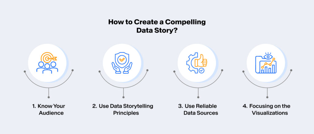
1. Know Your Audience
Every data story must begin with a deep understanding of the audience. Are they data-savvy professionals, or do they require a simplified narrative? Tailoring the story for them ensures it resonates effectively.
2. Use Data Storytelling Principles
Turning raw data into compelling narratives requires the use of storytelling techniques. This includes framing the story around challenges and solutions, setting a clear background for the data shared, effectively sharing insights when users interact with the visualization, and concluding with actionable takeaways.
3. Use Reliable Data Sources
This goes without saying—a strong story is built on trustworthy foundations. Using credible and diverse data sources not only enhances the narrative but also ensures that you’re compliant with national and global laws as well as instills trust in your audience. Transparency about where data comes from and how it was analyzed is essential to win them over.
4. Focusing on the Visualizations
Choosing the right type of data visualization technique is key to presenting data effectively. Whether it’s bar charts, heat maps, or infographics, each visual element should be chosen to highlight the most critical aspects of the story.
The Think Design Approach: Data Narratives Inspiring Action Since 2004
At Think Design, we understand that data storytelling is both an art and a science. Our approach combines innovative frameworks, cutting-edge visualization techniques, and a deep understanding of audience needs to craft narratives that transform complex data into impactful stories.
Ready to create a compelling data story? Let’s start the conversation.